Today we got double treat!
Both Steemit and Busy deployed their new designs. Let's compare them.
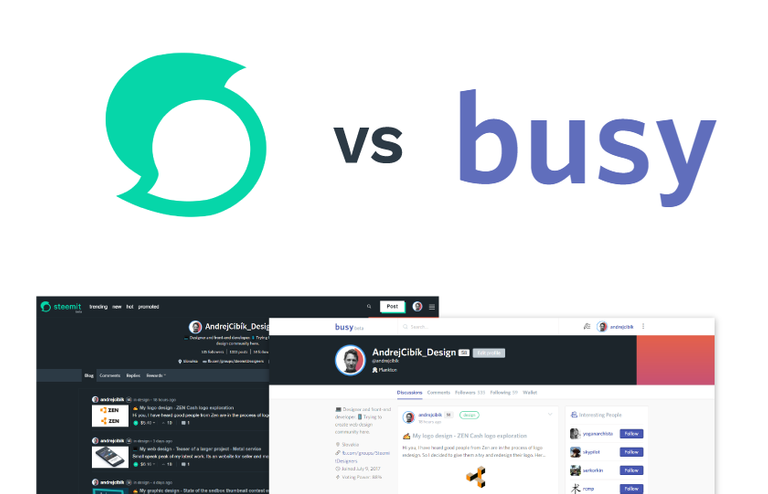
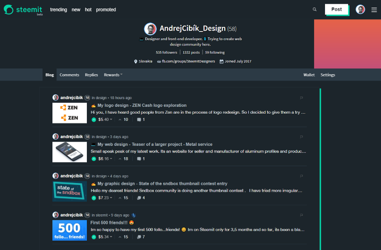
New Steemit
My first imporession of the logo was not very good. I like the color, but the symbol seems unbalanced. It has more weight on the left side. It looks like a dude's head with mohawk :D
I absolutely adore the new night mode!
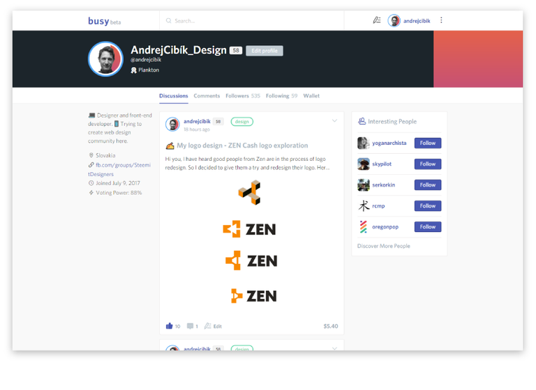
New Busy
I like overall design of Busy. It's much more modern and friendly. Better typography and icons. The best feature of busy is for sure post editor.
It's still under development and some key features are still missing, but I can see myself switching to it completely.
We shall see.
What do you think fellow designers? Which one is for you?

Andrej Cibík @andrejcibik
Web design | Web development | Logo design
I think the new logo is so-so. I feel bad for the people who have made graphics and real-world items to try and promote steemit who are going to need to update all of their branding. Such is life.
People don’t necessarily need to update their branding. The Steem logo has stayed the same, is Creative Commons, and still very relevant. That was the main reason for the new Steemit logo, helping people realize that Steemit and Steem are two very different things. Steemit is only one part of the much greater Steem system.
That's a good point.
i did not have a clue about busy.org. Thank you for enlightening. Busy looks and feels way better.
Spread the word if you like it :)
I was again horrified when I opened the page. It happens way too often last month :D.
The colour is nice as you say.
And I like that the website compositoin changed.
But the UI ... not a fan. It feels like somebody randomly puts Teal colour under things for the heck of putting teal colour under things. But at the same time trying to hide it as if he was embarrased about it.
Or maybe that's just how it looks on my browser ...
I also think the logo is too far left. It needs more space.
I am really liking busy.org these days .... especially since they give me 70 cents every time I post something.
Please consider joining my banner creation post.