In this post, we take a look at How to Create Diverging Bar Plot in R. In this type of the bar plot, you would get an idea of how to represent certain type of the dataset and it's results here. You would be able to get pretty cool results and output with it.
Previously I created a chart in R language which was based on the violin chart visualization. And so it was covered here - Violin Chart in R. You can check out this post and see if you can create your own modification of that data.
Make sure to download the RStudio IDE. This IDE is free and a good option for creating your visualization and also to run the r code and scripts. So make sure to download it and try out the code explained in the tutorial here.
I have created a video to give you an overview on How to Create Diverging Bar Plot in R. You should give this one a try.
Let's start.
First thing like any other tutorial our goal is to get the sample dataset and the library part sorted. From that part onwards you can go ahead and make sure to set everything for the code and the output part.
install.packages("ggplot2")
library(ggplot2)
Here we are first making sure that we are downloading the ggpot2 library and adding it into our code. This way we can make sure to use it in the plot which is kind of necessity. Let's also add some sample data into the code.
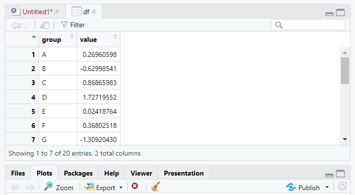
set.seed(6)
df <- data.frame(group = LETTERS[1:20],
value = rnorm(20))
We have the sample data now in our application.
Now let's try to draw the chart from the entire code.
library(ggplot2)
ggplot(df, aes(x = group, y = value)) +
geom_bar(stat = "identity",
show.legend = FALSE) +
xlab("Group") +
ylab("Value")
That's it. Now let's try to view the chart.
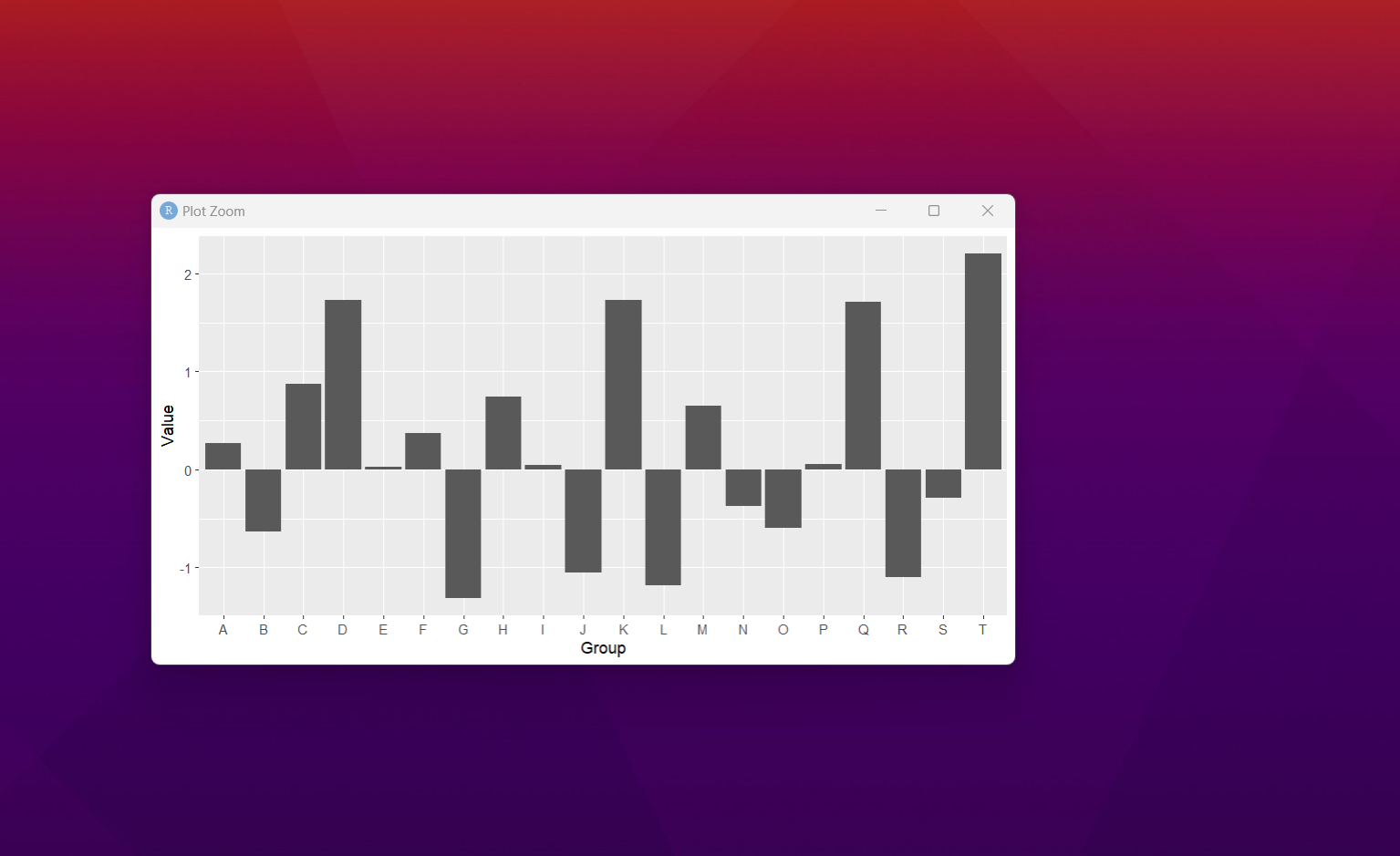
This way we can get the idea of how the chart would look like in the RStudio's plot tab. I would also see that it can be a good option for plotting some configurations as well.
Now you can go ahead and make some modifications to your chart. And this way you can get the proper sorting of the chart variables and overall configurations can be modified. Some of the changes that you can do with the chart would give you an idea.
Next few charts would also cover the ggplot series. I may have to try some of the packages randomly. So the waterfall chart is likely to be the next chart in the line. But we have to also think of the interesting data that I have yet to cover but it's not going to be any easy plotting now.
I have done few tutorials on the PowerBI and the R language. So there are more interesting things to cover as well. So we have to check some of these and let's try and find out what we can do better out of the same. I know few interesting charts that can be done on the PowerBI too and some day I may cover that.
I have youtube channel as you can see and where I cover the data, database, data science and the DevOps too. So you may want to keep tab on variety of those topics over there. I have managed to put up the free content on channel. So if you like and subscribe that would be a good favor on me.
If you happen to like this content, do give me feedback over there and that would help me improve my efforts in near future.
Glad to see data oriented posts here !
I would be very glad to see more interesting post about data engineering, science, viz and all.
I just started to post on LinkedIn hoping to attract some professionals here!
By the way, what would be, in your opinion, the advantage of using R over Python for data science projects?
Simplicity. Especially in context of exploring, cleaning and using the data. However Python is the real thing and should be used for data science in my opinion for job and serious work. R seems to lack on the server side if you are playing with big data, analytics and data streams. For small visualization and to do simple dataset work I prefer R but that's just personal choice.
Ok, thanks. As I don't do Data Science for a living I just followed a small introduction course on R and never used it again after. And I don't see my Datascientist colleagues using it, hence the question.
Thanks for your contribution to the STEMsocial community. Feel free to join us on discord to get to know the rest of us!
Please consider delegating to the @stemsocial account (85% of the curation rewards are returned).
You may also include @stemsocial as a beneficiary of the rewards of this post to get a stronger support.