Thanks to everyone who responded with feedback to the logo suggestions yesterday. I think we have more than enough responses to make a decision - at least almost make a decision!
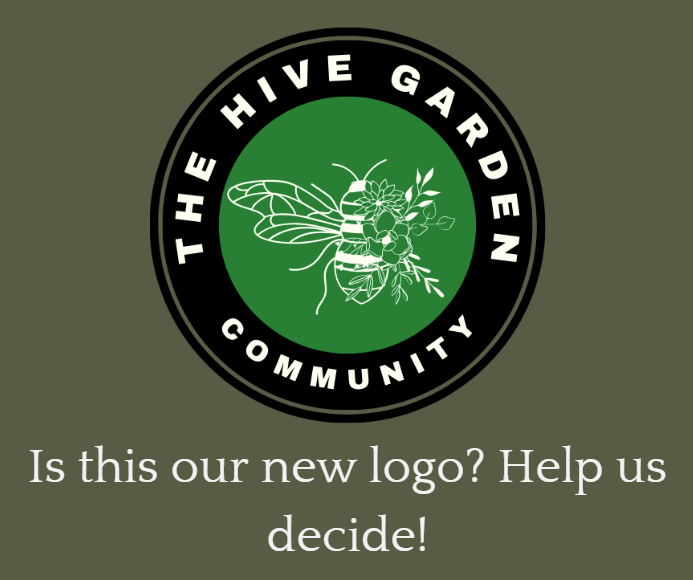
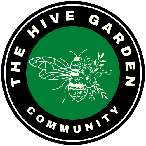
From the comments, a couple of things were clear. The most popular choice was Option B - it was pretty unanimous. People liked it's high contrast, the white enabling the bee to stand out against the dark background.
Option E had some support, mainly for the honeycomb design which represented community, but it didn't stand out against the background so well, so the design needed to be adjusted for better visiblity. Some colours were obviously hard to see in dark mode.
Some suggested changing the images, but as they're from Canva, it's not something I can easily do. I want to keep it simple.
So, keeping it mind the majority of comments, the final choices are as follows. Please let me know if there's anything glaringly terrible that simply doesn't work.
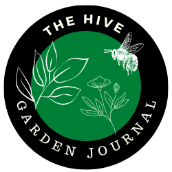
Option B: Most Popular Choice
- The font has been changed so it stands out more starkly.
- An extra ring around so it stands out against images on thumbnails eg the Garden Journal Challenge
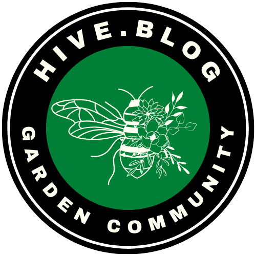
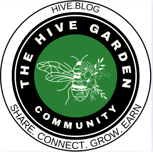
Someone also asked that the text be changed or divided so that it was easier to read. I can't decide which one works the best, so please let me know Option 1, 2, 3 or comment what you think!
Option 1
Option 2
Option 3

The Sticker
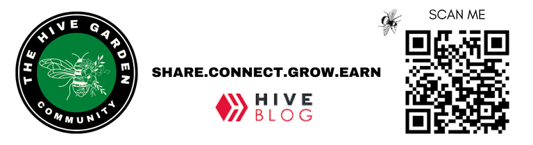
@akipponn will be handing out some stickers at the next Hive Creators gathering and where they can in Europe, so there's two options for these. Please let me know which one you think works the best.
STICKER OPTION 1 (CIRCLE)
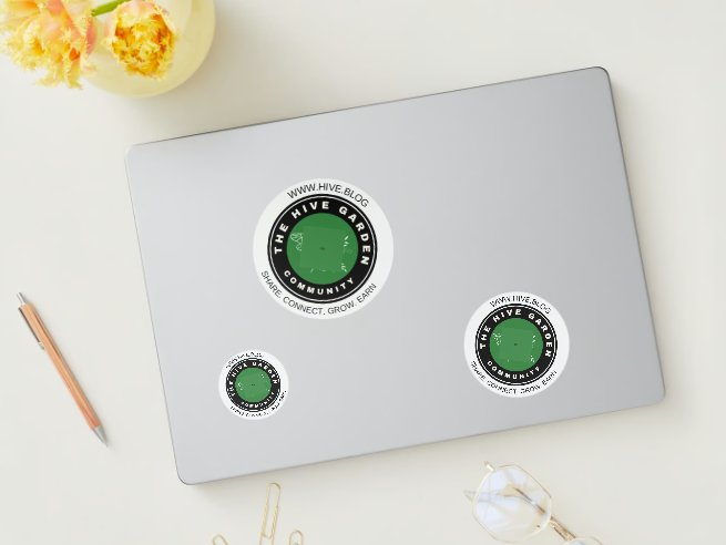
STICKER 2 - RECTANGLE
Thanks gardeners for your help and for being part of our community!
@plantstoplanks @jude9 @sofs-su @nikv @owasco @umirais @vesytz @buckaroobaby @farm-mom @thebigsweed @polesinns @andrastia @multifacetas @amygoodrich @jenthoughts @fanyokami @isdarmady @anafae @tanjakolader @yolithy24 @andrastia @minismallholding @goldenoakfarm @sanjeevm @nainaztengra @rem-steem @almi @leoplaw @denmarkguy @akiponn @dodovietnam @fermentedphil @galenkp @ifarmgirl @tomidiwirja @tengolengo @mysteriousroad
@ciadanmea @kennyroy @simplymike @dodovietnam @babeltrips @trangbaby @kaelci @shanibeer @proto26 @ifarmgirl @artemislives @edprivat @meesterboom @momogrow @antnn @luckylaica @blingit @traisto @fotostef @tydynrain @hindavi @steven-patrick @vibeof100monkeys @samstonehill @anttn @friendlymoose @jacksonizer @ciadanmea @tuocchu @gertu @artywink @dora381 @stortebeker @zakludick @maytom @juwell11 @chuch @maxdevalue @travoved @sunscape @alt3r @ninahaskin, @housecatharsia @promisedland @chidiadi65 @bigorna1 @actioncats @lifewithchel @aichel @hadrianwild @zekepickleman @futuremind @smithlabs
With Love,

Join The Hive Garden Community! The HIVE GARDEN COMMUNITYhere! supports gardening, homesteading, cannabis growers, permaculture and other garden related content. Delegations to the curation account, @gardenhive, are welcome! Find our community
Are you on HIVE yet? Earn for writing! Referral link for FREE account here!
Super! Thank you for arranging the sticker design poll 😊
I like the Option 2. As it has URL (give.blog) in the design already, I think it can be a sticker without the white surrounding like STICKER OPTION 1 (CIRCLE).
I’m excited to see the final design and bring the stickers to @hivecreatorsday and also to local markets to introduce Hive to gardeners 😉
Option 1 and sticker 1 for me!
Option 1 and BOTH stickers. Sticker 1 to hand out, sticker 2 to place in places where they may scan.
Great idea
🙂👍 Happy to help.
They all look cool to me and the folks who spent their time making a new logo and sticker design should all be commended. No particular preference, they all look great.
Option 3
So it is already option B - thats nice
First option is super
For the sticker number 1 I think it has too much different font and line weights - it can have same font size and outer line weight as logo
Sticker no 2 is good
I have not seen the other versions, but I think the logo is not easily viewable when small (which is often the case, it is never enlarged to that extent when in real use), therefore I had made the poll with the later view size, when I had created a logo (see here).
Also I would not refer to hive-blog, as this interface is really shitty compared to peakd.
I prefer Peakd too. I just thought as we are advertising Hive, that's the starting point. Another interesting dilemma.
option 1 and sticker 2
I like option 1 the best! 😁 🙏 💚 ✨ 🤙
Yay....
Option 1 ❤️
sticker 2 🌱🌱🌱🙏
Option 1 looks nice. AND sticker 1.
Greetings. Option 2 and sticker 1
I like Option 1 the best, but ... 😉 On my screen, the spacing between the letters is too much. I think it would read better, if they were closer together. As is, my eye sees the spacing between the letters as uncomfortably close to the spacing between the words ...
As for the Sticker choice, I did not give an opinion, as I like Option 2, but ... Prefer that it say PeakD, rather than Hive.Blog ...
P.S. Having said that, just looking at it on my screen, the spacing between the letters on it appears better / closer than logo Option 1 ... 🤷♂️
Thanks! I'll reduce the spacing
Delegations welcome! You've been curated by @amazingdrinks!
In my opinion Option 1 is better also I think that both sticker varieties should be available.
Option 1 for the logo looks neat...est of them all to me.
@gardenhive, I'm refunding 0.526 HIVE and 0.177 HBD, because there are no comments to reward.
Option 1 and sticker 2 for me💕