¡Saludos a todos amigos amantes del arte y diseño!
¡Greetings to all art and design loving friends!
Español
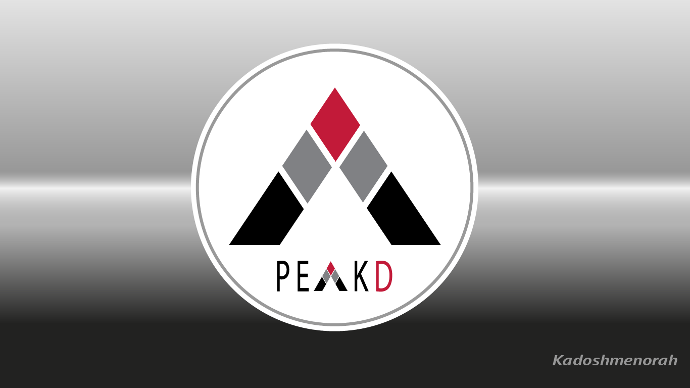
El día de hoy he querido dibujar el IMAGOTIPO de PEAKD.COM. Si te gusta crear logotipo y recién estas empezando en illustrator acá te comparto un pequeño tutorial de cómo hacerlo. Nuestro diseño de peakd.com se compone de un hexágono de tres lados mejor conocido como un triángulo dividido en varios segmentos, así que te invito con este diseño de hoy a cultivar tu mente creativa.
English
Today I wanted to draw the IMAGOTYPE of PEAKD.COM. If you like to create a logo and you are just starting in illustrator, here I share with you a little tutorial about how to do it. Our peakd.com design is composed of a three-sided hexagon better known as a triangle divided into several segments, so I invite you with this design today to cultivate your creative mind.

Programa usado: Adobe Illustrator 2020
Colores usados: Gris, negro y rojo
Tipografía: Calibri
Imagen de Referencia: https://peakd.com Fuente
About the design:
Program used: Adobe Illustrator 2020
Colours used: Orange, Grey
Typography: Calibri
Reference Image: https://peakd.com Fuente
PROCESO/ PROCESS
PASO 1
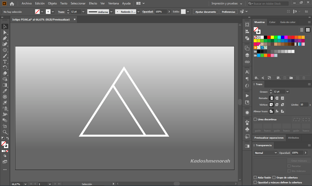
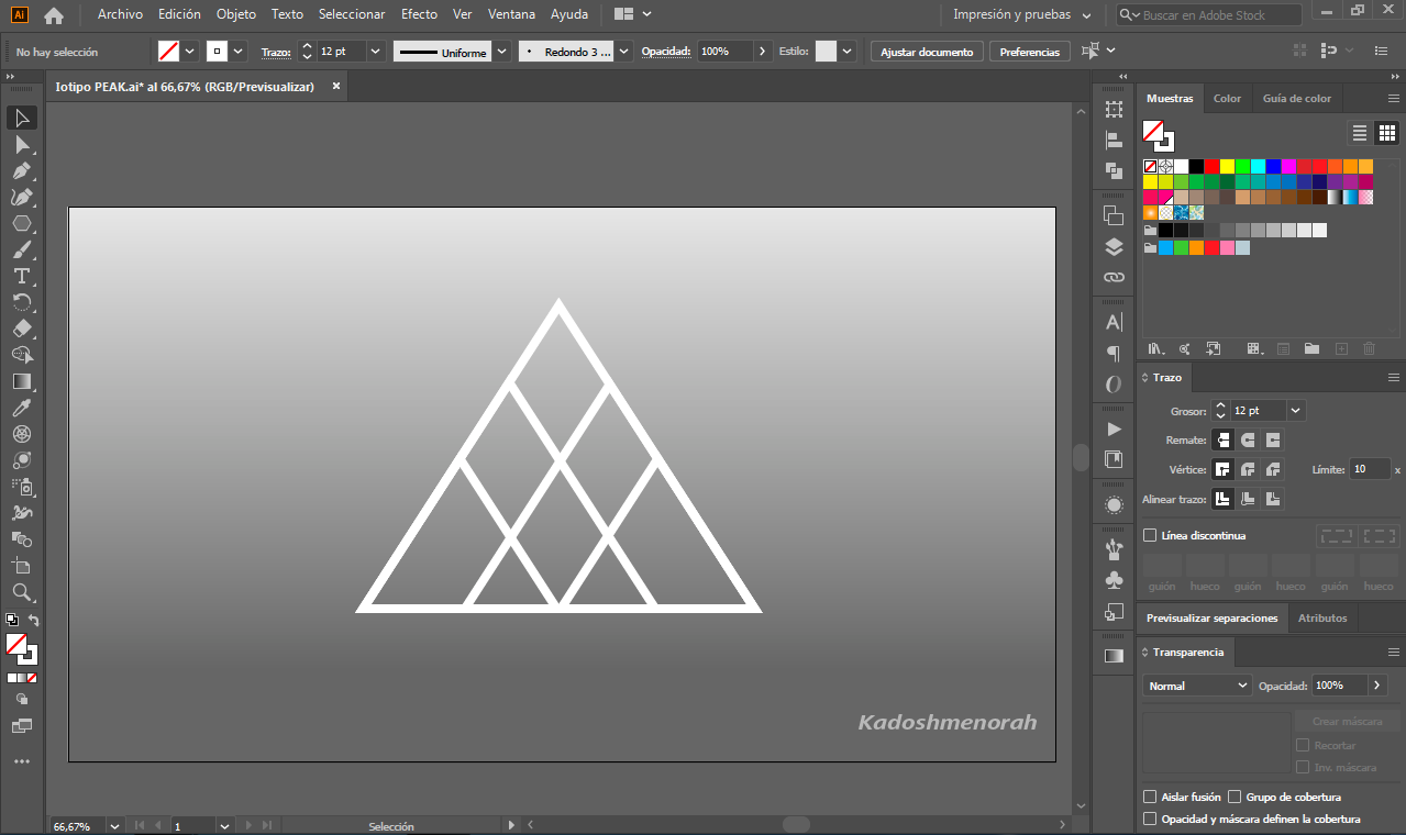
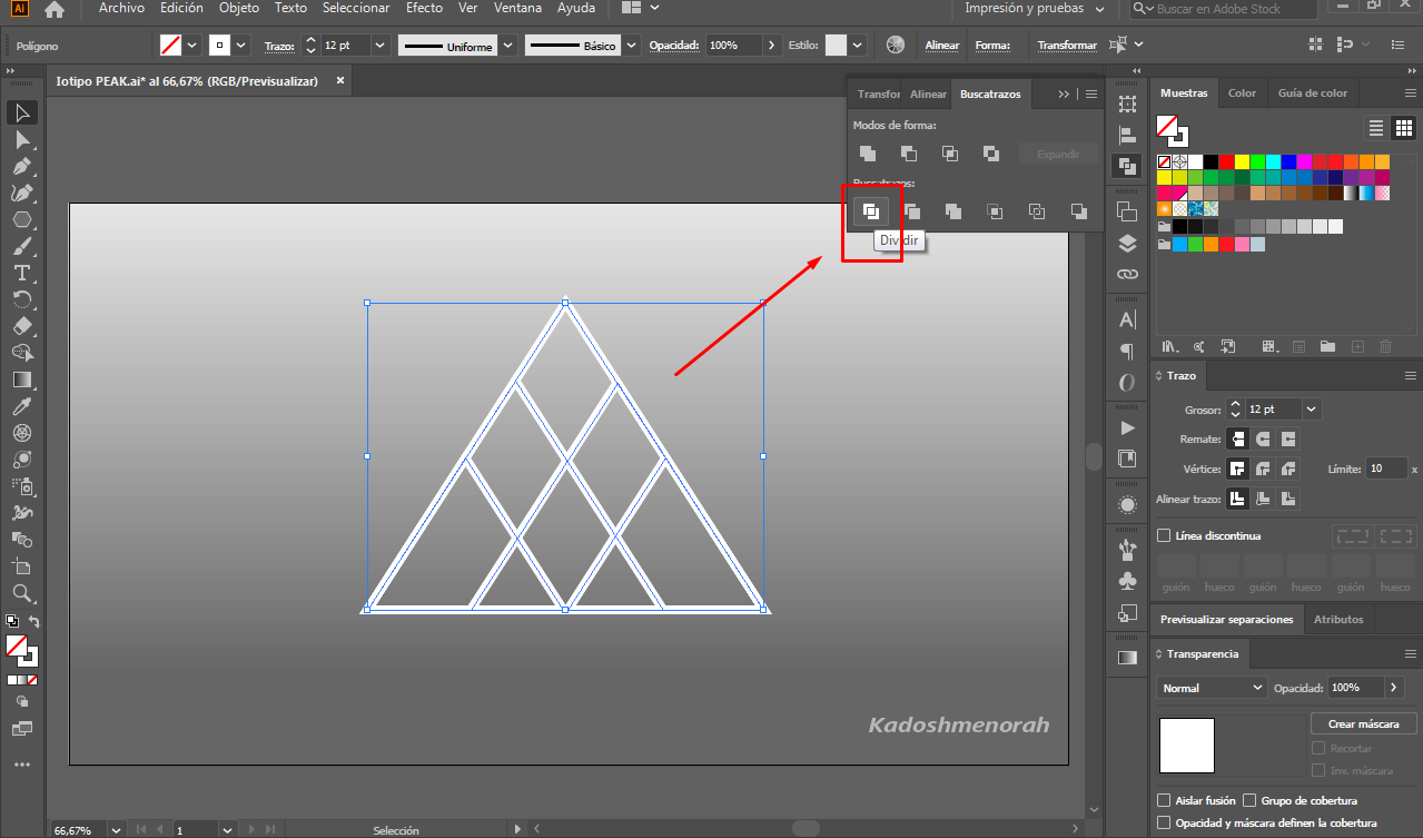
Creamos un fondo y dibujamos un triángulo sin fondo y con unos 12 px de trazo o borde al cual le damos un color blanco. Luego hacemos una copia de nuestro triangulo y lo hacemos más pequeño que el anterior y lo alineamos al lado izquierdo. Hacemos una copia de este y lo alineamos al lado derecho del triángulo más grande. Luego hacemos dos copias más pequeñas y hacemos lo mismo que hicimos con los triángulos medianos. Obteniendo así una estructura de varios triángulos agrupados formando la estructura base de nuestro logo de peakd.com.
STEP 1
We create a background and draw a triangle without a background and with about 12 px of line or edge to which we give a white color. Then we make a copy of our triangle and make it smaller than the previous one and line it up on the left side. We make a copy of it and line it up on the right side of the larger triangle. Then we make two smaller copies and do the same thing we did with the medium triangles. This way we get a structure of several triangles grouped together forming the base structure of our peakd.com logo.


PASO 2
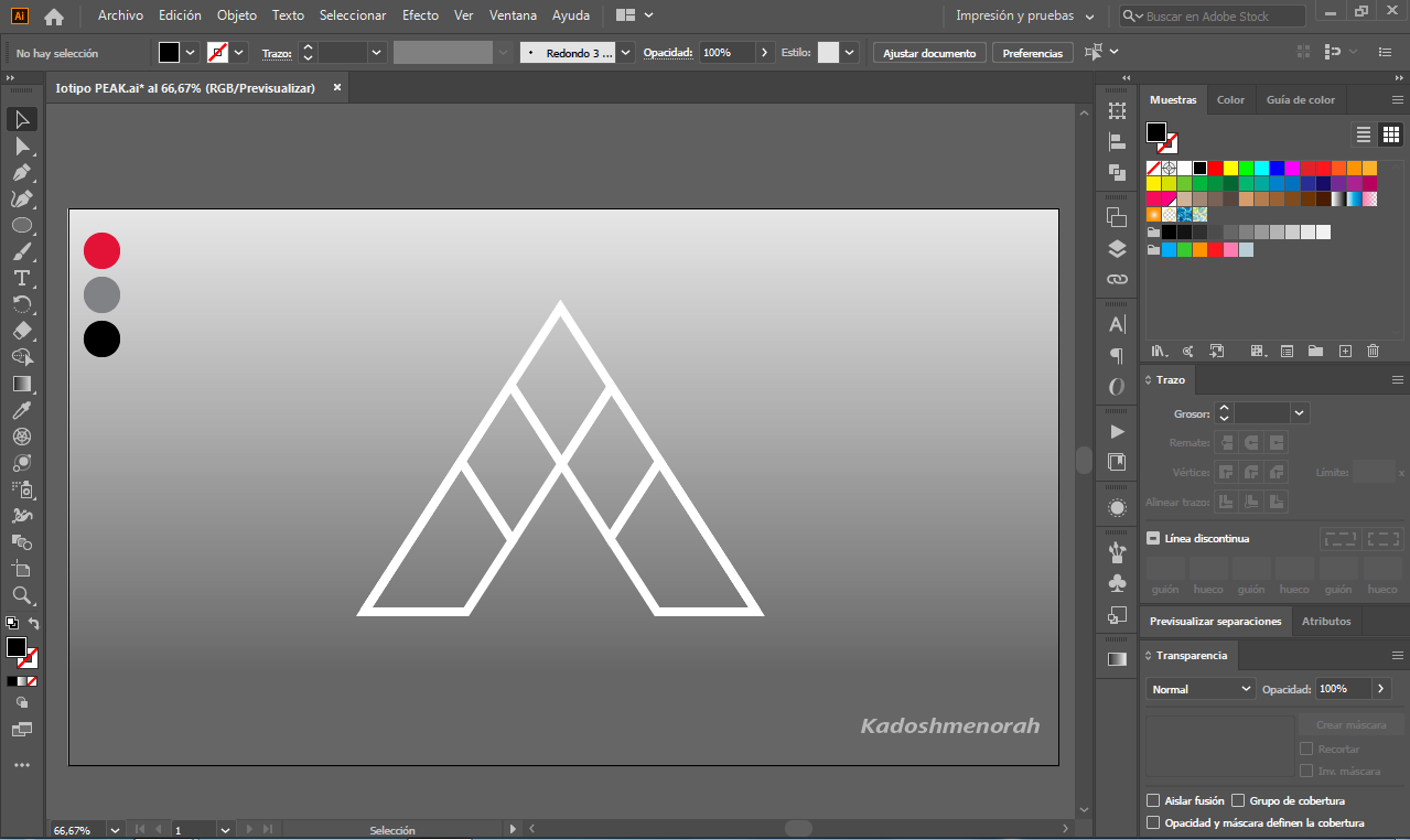
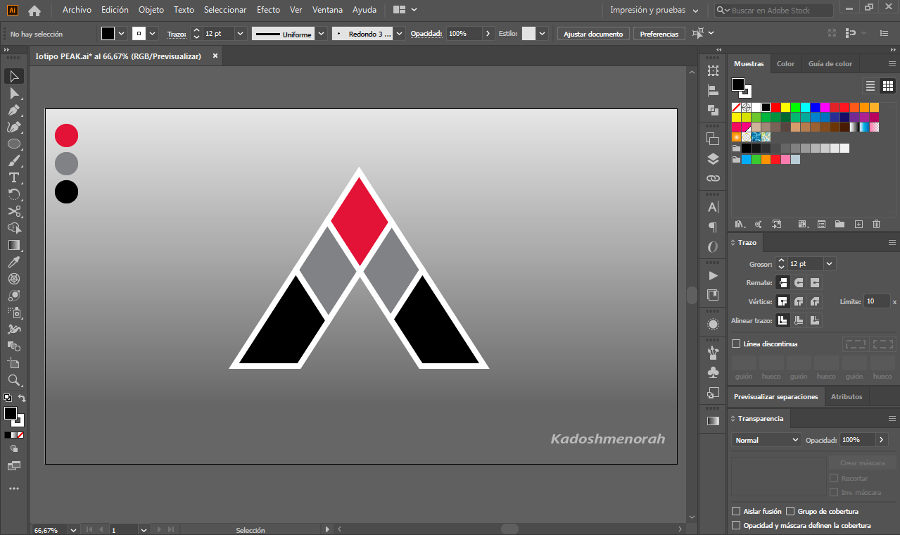
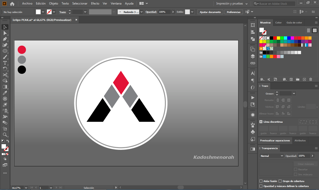
Seleccionamos todo y dividimos con la herramienta dividir del buscatrazos. Luego agregamos color a cada una de las partes. En mi caso y con fines de presentación agregare dos círculos los cuales no forman parte de la imagen de referencia.
STEP 2
We select everything and divide it with the divider tool of the scout. Then we add color to each of the parts. In my case and for presentation purposes I will add two circles which are not part of the reference image.
Soy kadoshmenorah y hasta una próxima oportunidad y no olvides dejar tus comentarios acá abajo.
pueden encontrar en las redes sociales:

Español
El día de hoy he querido dibujar el IMAGOTIPO de PEAKD.COM. Si te gusta crear logotipo y recién estas empezando en illustrator acá te comparto un pequeño tutorial de cómo hacerlo. Nuestro diseño de peakd.com se compone de un hexágono de tres lados mejor conocido como un triángulo dividido en varios segmentos, así que te invito con este diseño de hoy a cultivar tu mente creativa.
English
Today I wanted to draw the IMAGOTYPE of PEAKD.COM. If you like to create a logo and you are just starting in illustrator, here I share with you a little tutorial about how to do it. Our peakd.com design is composed of a three-sided hexagon better known as a triangle divided into several segments, so I invite you with this design today to cultivate your creative mind.
Programa usado: Adobe Illustrator 2020
Colores usados: Gris, negro y rojo
Tipografía: Calibri
Imagen de Referencia: https://peakd.com Fuente
About the design:
Program used: Adobe Illustrator 2020
Colours used: Orange, Grey
Typography: Calibri
Reference Image: https://peakd.com Fuente
PROCESO/ PROCESS
PASO 1
Creamos un fondo y dibujamos un triángulo sin fondo y con unos 12 px de trazo o borde al cual le damos un color blanco. Luego hacemos una copia de nuestro triangulo y lo hacemos más pequeño que el anterior y lo alineamos al lado izquierdo. Hacemos una copia de este y lo alineamos al lado derecho del triángulo más grande. Luego hacemos dos copias más pequeñas y hacemos lo mismo que hicimos con los triángulos medianos. Obteniendo así una estructura de varios triángulos agrupados formando la estructura base de nuestro logo de peakd.com.
STEP 1
We create a background and draw a triangle without a background and with about 12 px of line or edge to which we give a white color. Then we make a copy of our triangle and make it smaller than the previous one and line it up on the left side. We make a copy of it and line it up on the right side of the larger triangle. Then we make two smaller copies and do the same thing we did with the medium triangles. This way we get a structure of several triangles grouped together forming the base structure of our peakd.com logo.
PASO 2
Seleccionamos todo y dividimos con la herramienta dividir del buscatrazos. Luego agregamos color a cada una de las partes. En mi caso y con fines de presentación agregare dos círculos los cuales no forman parte de la imagen de referencia.
STEP 2
We select everything and divide it with the divider tool of the scout. Then we add color to each of the parts. In my case and for presentation purposes I will add two circles which are not part of the reference image.
Soy kadoshmenorah y hasta una próxima oportunidad y no olvides dejar tus comentarios acá abajo.
pueden encontrar en las redes sociales:
Español
English
Programa usado: Adobe Illustrator 2020
Colores usados: Gris, negro y rojo
Tipografía: Calibri
Imagen de Referencia: https://peakd.com Fuente
Program used: Adobe Illustrator 2020
Colours used: Orange, Grey
Typography: Calibri
Reference Image: https://peakd.com Fuente
Seleccionamos todo y dividimos con la herramienta dividir del buscatrazos. Luego agregamos color a cada una de las partes. En mi caso y con fines de presentación agregare dos círculos los cuales no forman parte de la imagen de referencia.
We select everything and divide it with the divider tool of the scout. Then we add color to each of the parts. In my case and for presentation purposes I will add two circles which are not part of the reference image.
Soy kadoshmenorah y hasta una próxima oportunidad y no olvides dejar tus comentarios acá abajo.
Congratulations @kadoshmenorah! You have completed the following achievement on the Hive blockchain and have been rewarded with new badge(s) :
You can view your badges on your board And compare to others on the Ranking
If you no longer want to receive notifications, reply to this comment with the word
STOPTo support your work, I also upvoted your post!
Do not miss the last post from @hivebuzz:
Support the HiveBuzz project. Vote for our proposal!
Excelente logo @kadoshmenorah, haces cosas increíbles con la gráfica.
Acabo de inscribir un artículo sobre GIMP y he creído obligatorio mencionarte.
Saludos.