

Hello Hive friends! I have returned with what I said I would bring before, the little tutorial on how to make retro chrome letters, I will also be telling certain anecdotes that have been happening, we are going to spice up this blog~.
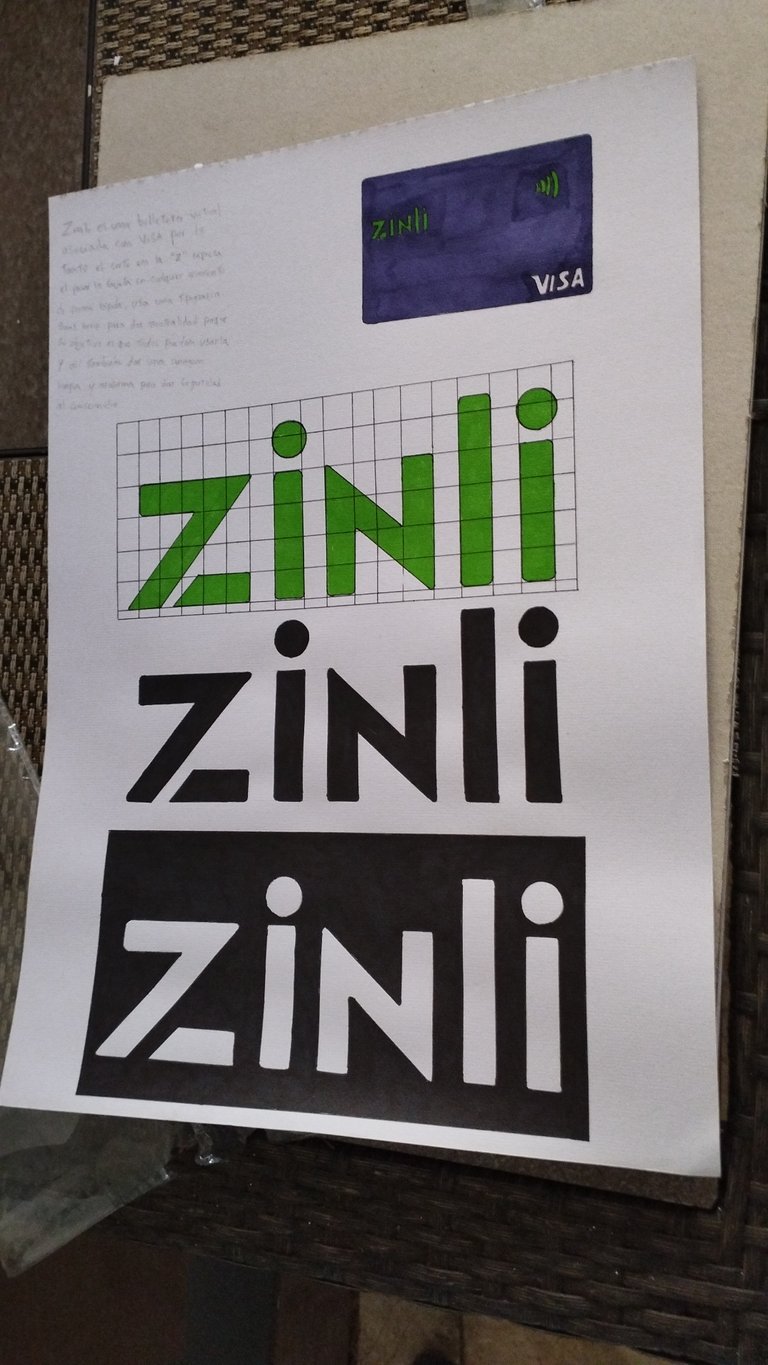
These days at the university, I have been somewhat moved, in the matter of Typography, recently I had to remake a logo that looks the same as the original, do it in negative, positive and grid, with a small drawing that serves as an example of what the company does, I think it was over at 3am last Saturday 😢.
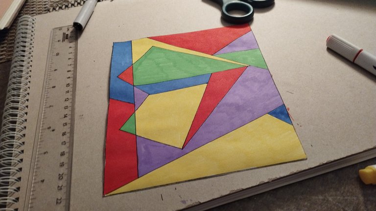
I also made this little cubism drawing for an example in history.
But hey, continuing with the little tutorial, here it starts!
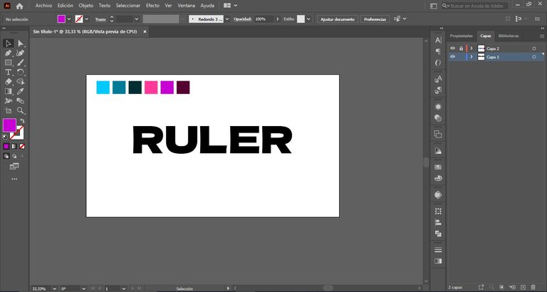
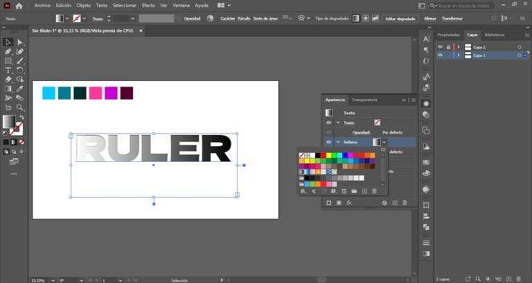
- The first step will be to choose a typeface that is quite solid, the colors that I chose, as you can see, contrast a lot, that will help create the chrome effect.
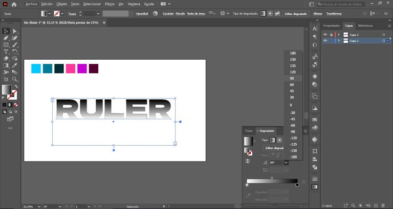
- The second step is to insert a gradient in the typography, in order to position the colors when we change the appearance of the typography.
- Now, we need to change the direction of the gradient by 90°.
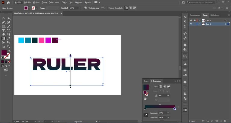
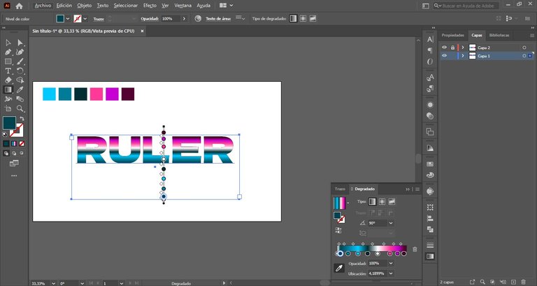
- After we have everything located, we start to change the colors using the eyedropper
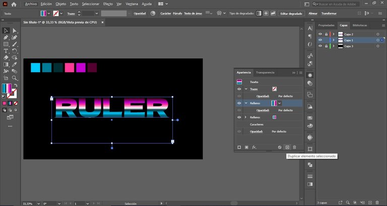
- Don't forget that the text we're doing is fully editable so don't really worry about it going wrong because it won't, I even made changes to what the tutorial did, now as the next step we go to the appearance panel, you have to duplicate the fill layer.
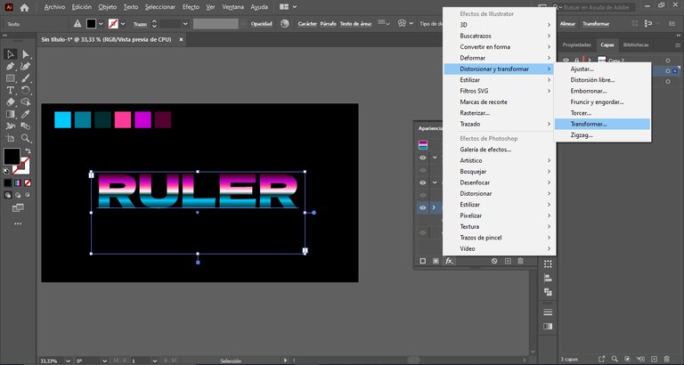
- Being in the duplicate layer, we go to FX, in distort and transform, then, in transform, we put where it says "move", horizontally, a value of 1.5 px, this will become a black fill that will be seen later to give depth effect.
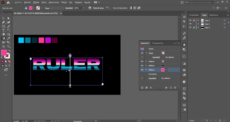
- So, we duplicate the fill again and change the color to a pink, this is to make a border and so the step we did before will be slightly noticeable.
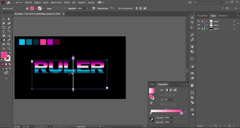
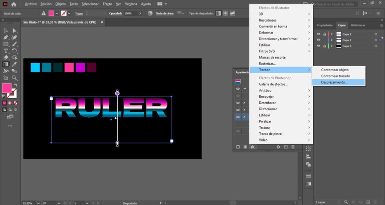
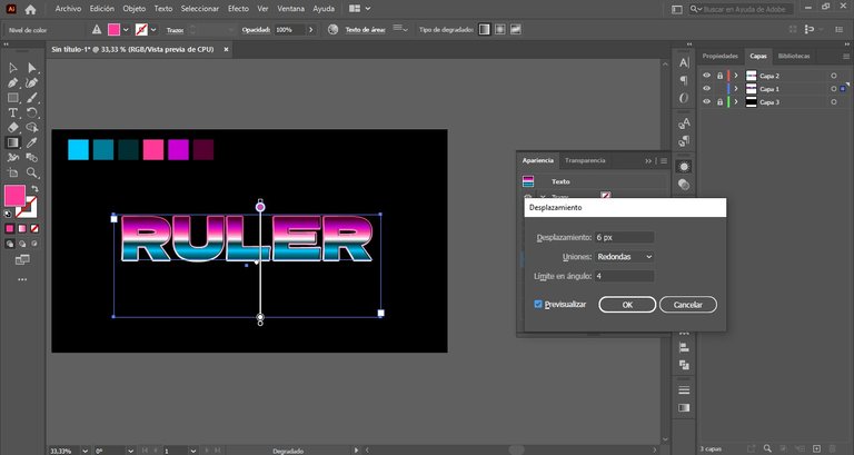
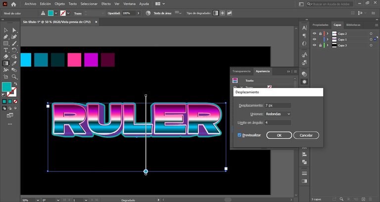
- Once that's done, we go to appearance again, effects, on path and click on displacement and put the next values.
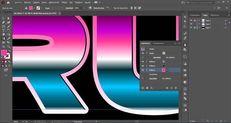
- If we zoom in, we can see the black border that we had created in the previous fill.
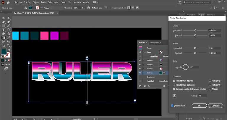
- Now that we're almost done, let's duplicate and transform again, using these values as we're going to create a fill behind the letters (I don't say much about the color since I was making several changes along the way).
- Finally, we go back to tracing and moving, to create a new border that will finish giving the retro chrome effect.
Now that the explanation is over, in the end I made changes and even, as it's editable, I was able to change the font easily, so if you don't like the font you used, you can change it without losing the work done.
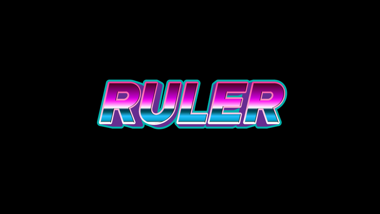
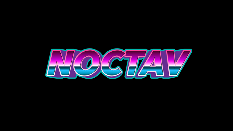
Here are some results I did:
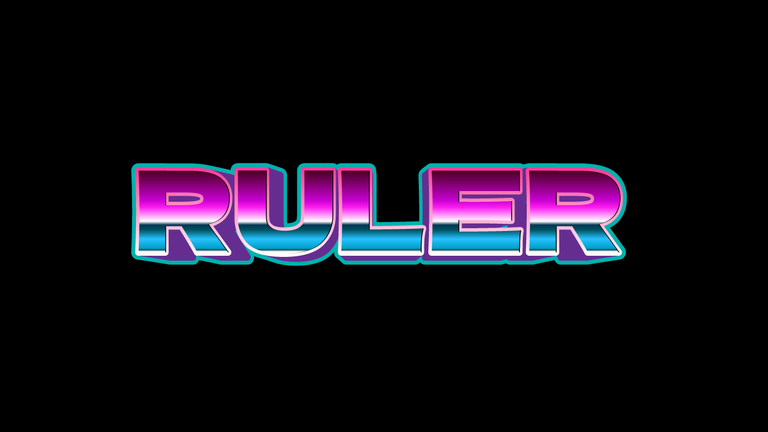
- First the result of the tutorial:
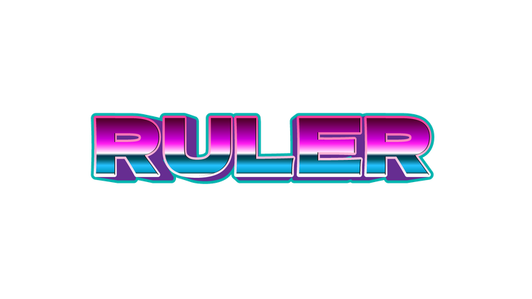
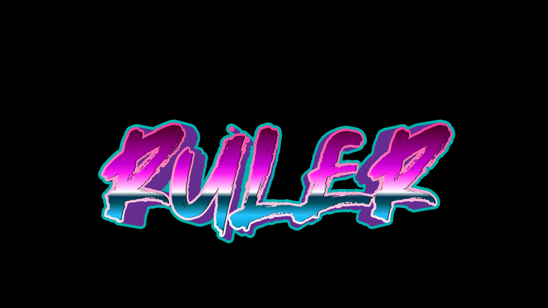
- Now the edits aside:
I never need to write my name hahaha 🤣.
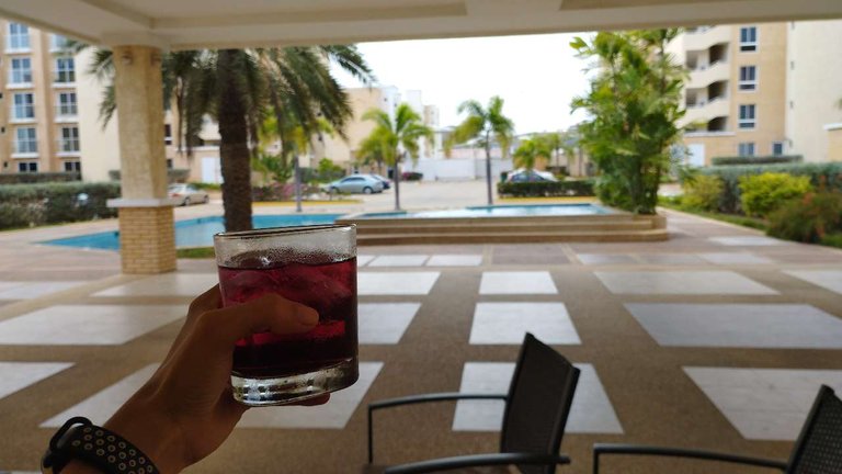
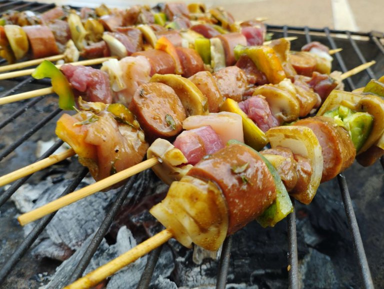
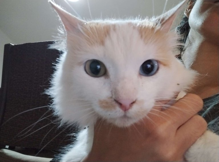
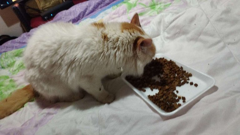
I hope this has been to your liking! by the way, these days have been interesting, I was with friends who made a grill in my house, they really are the best and make my days happy, I also got a kitten, which was lost, it was beautiful, it has heterochromia, reminds me of a friend from college, who also has heterochromia, I also wanted to show you some things I've done, like 3D origami, it was really a feat to get that homework done in one night hahaha 🤣.
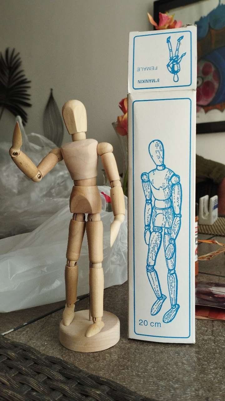
Now I also have something new to improve my art, a mannequin!
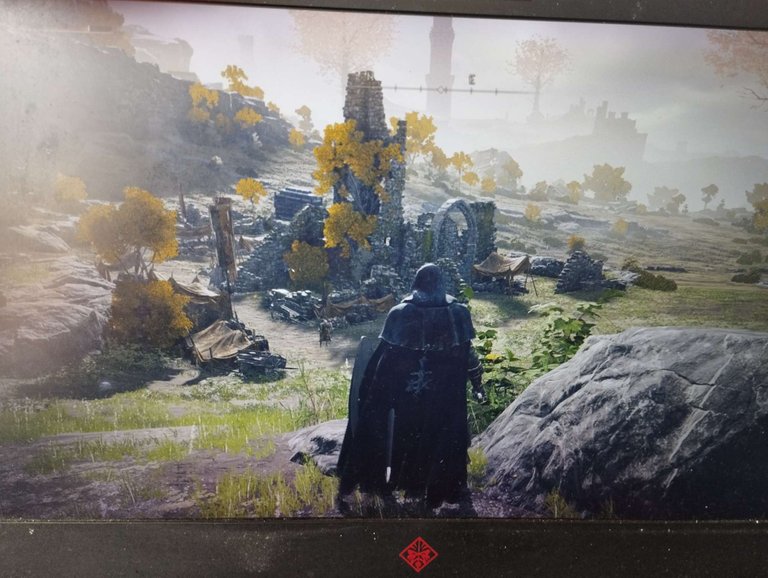
I went to visit my brother today as I was not feeling very well but he and his wife encouraged me too much, I also played "Elden Ring" so I felt quite happy but angry at the same time because I don't like losing 🤣.
And that was it for today's blog! Thank you very much for being here, you are great 💗.


¡Hola amigos de Hive! He regresado con lo que dije que traería antes, el pequeño tutorial de cómo hacer letras retro cromadas, también les estaré contando ciertas anécdotas que me han ido pasando, vamos a darle vida a este blog~.
Estos días en la universidad he estado algo movida, en el tema de la tipografía, hace poco tuve que rehacer un logo que se vea igual al original, hacerlo en negativo, positivo y cuadrícula, con un pequeño dibujo que sirva de un ejemplo de lo que hace la empresa, creo que terminé a las 3am del sábado pasado 😢.
También hice este dibujito cubista para un ejemplo en historia.
Pero bueno, continuando con el pequeño tutorial, ¡aquí empieza!
- El primer paso será elegir una tipografía que sea bastante sólida, los colores que elegí, como pueden ver, contrastan mucho, eso ayudará a crear el efecto cromado.
- El segundo paso es insertar un degradado en la tipografía, para poder posicionar los colores cuando cambiamos la apariencia de la tipografía.
- Ahora, necesitamos cambiar la dirección del gradiente en 90°.
- Luego de tener todo localizado, comenzamos a cambiar los colores usando el cuentagotas
- No olvides que el texto que estamos haciendo es totalmente editable, así que no te preocupes si sale mal porque no lo hará, incluso hice cambios en lo que hizo el tutorial, ahora como siguiente paso vamos al panel de apariencia, debe duplicar la capa de relleno.
- Estando en la capa duplicada, vamos a FX, en distorsionar y transformar, luego, en transformar, ponemos donde dice "mover", en horizontal, un valor de 1.5 px, esto se convertirá en un relleno negro que se verá más adelante para dar efecto de profundidad.
- Entonces, duplicamos el relleno nuevamente y cambiamos el color a rosa, esto es para hacer un borde y así se notará un poco el paso que hicimos antes.
- Una vez hecho esto, vamos a apariencia nuevamente, efectos, en ruta y hacemos clic en desplazamiento y ponemos los siguientes valores.
- Si hacemos zoom podemos ver el borde negro que habíamos creado en el relleno anterior.
- Ahora que ya casi terminamos, dupliquemos y transformemos nuevamente, usando estos valores ya que vamos a crear un relleno detrás de las letras (no digo mucho sobre el color ya que estaba haciendo varios cambios a lo largo del camino).
- Finalmente, volvemos a trazar y mover, para crear un nuevo borde que terminará de dar el efecto retro cromado.
Ahora que terminé la explicación, al final hice cambios e incluso, como es editable, pude cambiar la fuente fácilmente, así que si no les gusta la fuente que usaron, pueden cambiarla sin perder el trabajo hecho.
Aquí hay algunos resultados que hice:
- Primero el resultado del tutorial:
- Ahora las ediciones a un lado:
Nunca necesito escribir mi nombre ehh hahaha 🤣.
¡Espero que esto haya sido de tu agrado! por cierto, estos dias han sido interesantes, estuve con unos amigos que hicieron una parrilla en mi casa, realmente son los mejores y alegran mis días, también encontré un gatito, que parece que se perdió, era hermoso, tiene heterocromia, me recuerda a una amiga de la universidad, que también tiene heterocromía, también quería mostrarles algunas cosas que he hecho, como el origami en 3D, fue realmente una hazaña hacer esa tarea en una noche hahaha 🤣.
Ahora también tengo algo nuevo para mejorar mi arte, ¡un maniquí!
Fui a visitar a mi hermano hoy porque no me sentía muy bien pero él y su esposa me alentaron demasiado, también jugué "Elden Ring" así que me sentí bastante feliz pero enojada al mismo tiempo porque no me gusta perder 🤣.
¡Y eso fue todo por el blog de hoy! Muchas gracias por estar aquí, ustedes geniales 💗.
Nice post, interesting method. Maybe I have a slice of !PIZZA
Thank you so much! Oh yeah! Pizza time! 🍕 ❤️
PIZZA Holders sent $PIZZA tips in this post's comments:
@davidesimoncini(4/5) tipped @noctav (x1)
You can now send $PIZZA tips in Discord via tip.cc!
Yay! 🤗
Your content has been boosted with Ecency Points, by @noctav.
Use Ecency daily to boost your growth on platform!
Support Ecency
Vote for new Proposal
Delegate HP and earn more
Congratulations @noctav! You have completed the following achievement on the Hive blockchain and have been rewarded with new badge(s):
Your next target is to reach 4750 upvotes.
You can view your badges on your board and compare yourself to others in the Ranking
If you no longer want to receive notifications, reply to this comment with the word
STOPCheck out the last post from @hivebuzz: