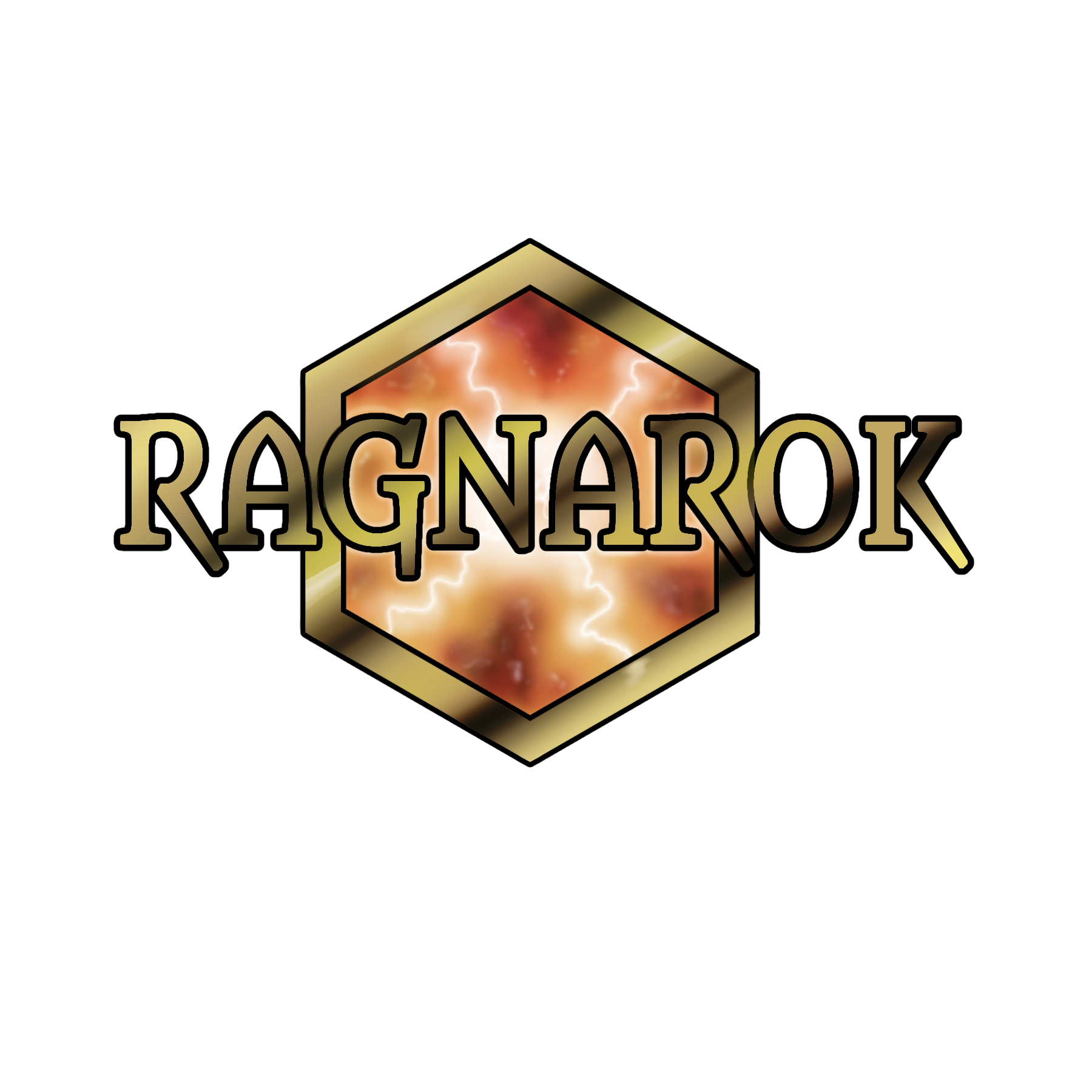
Here's my 2nd entry to the Ragnarok Logo Contest hosted by @ragnarok.game over here: https://hive.blog/ragnarok/@ragnarok.game/ragnarok-logo-contest
Thought I'd try this again with another design. I think my original looks too... fragile? Also, doesn't actually have the name of the game. Not sure if that's what they wanted.

Anyway, all for now. I really don't like drawing in geometric shapes.
The rewards earned on this comment will go directly to the person sharing the post on Twitter as long as they are registered with @poshtoken. Sign up at https://hiveposh.com.
Does it need to be geometric? They are a battle royal pixel game? Maybe draw like you usually do maybe use negative space to depict a battle scene you can always have the scene then "shape" the crest or whatever... Anyway, you are the artist just saying maybe drawing how you like would make you less frustrated with it?
Good point. I'm not sure exactly what they want. Maybe I'll play with another design later. Deadline's not until Feb 8 or 9...
This is a masterpiece
Awww. thanks.
!LUV
@sidekickmatt(1/1) gave you LUV. H-E tools | connect | <><