To be honest, my favorite colors are all over the place. I generally like Blue. But I mostly wear Black. And when I shop, my mind looks for black outfits almost on its own.
And then, when I design stuff, I've noticed I lean towards orange-ish colors quite a lot. This too is a subconscious bias.
Consciously, I love the colors you get from film cameras. Digital photos and videos are lifelike and absolutely detailed with nearly no noise, but film cameras have a certain charm to them, a color palette that is clearly recognizable and while it is possible to create a similar look via editing digital footage, experienced eyes can always tell the differences.
And man I love those blue-orange tilts captured in film cameras—both colors together or separately. Of course, these color tones are often used to convey feelings and emotions of the scenes, blue for misery, pain, and orange-yellowish for hope, good times. Even without considering what the filmmaker intended, some of these frames can be very tasteful. I often pause films just to look at the frames and all the colors lol!
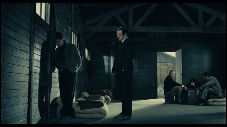
Army of Shadows (1969) / Jean-Pierre Melville
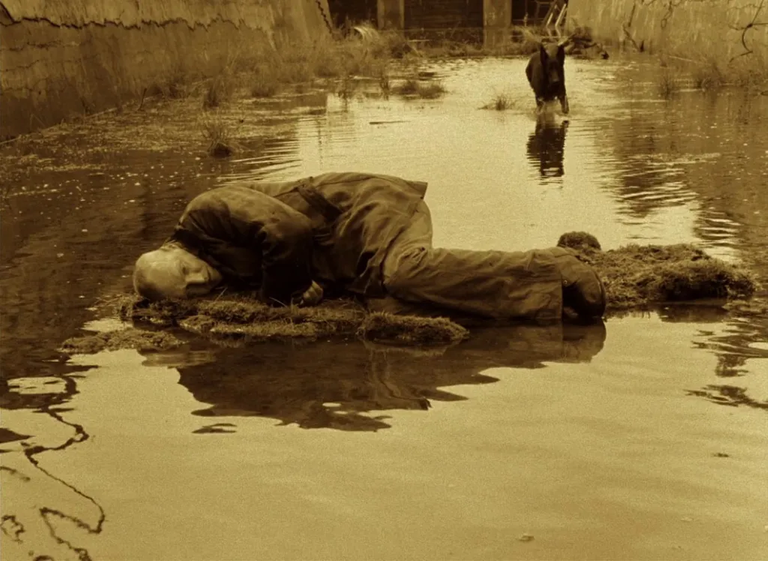
Stalker (1979) / Andrei Tarkovsky
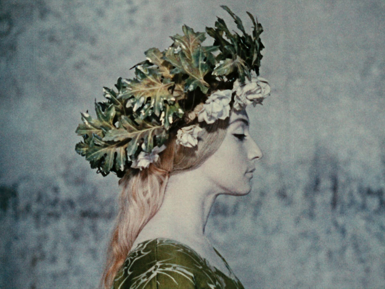
The Color of Pomegranates (1969) / Sergei Parajanov
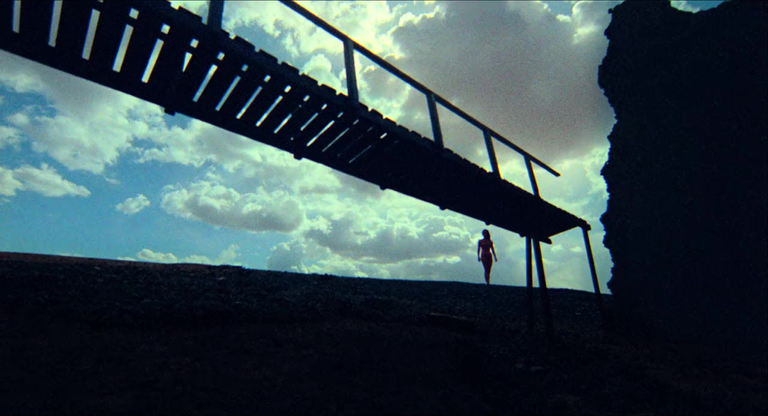
The Other Side of the Wind (1970-2018) / Orson Welles
Colour is an important aspect of life as humans are so visually-stimulated most often. I'm not surprised you see things a little differently, or more broadly I should say. I guess the most important thing is that were energised and uplifted by what we see right? Colours help do that.
I do agree. And it doesn't always have to be a pretty impression either. Drowsy sun's lovely orange becomes repulsive on a cockroach's back.
But that's how most things are as I'm sure you're well aware.