Recently I had to implement dark mode for a website I was building with GatsbyJS and styled components, and it turned out not to be as straight forward as I thought it would, at least to get the smooth results I wanted and some cool features.
Features for this DarkMode:
- Persist theme on localStorage so users always get to see their previously selected theme.
- Use the prefererd color theme from the user's operating system through the prefers-color-scheme CSS media feature.
- Don't show the wrong colors for an instant when loading the page (common issue with pre-generated HTML like gatsby, Next, etc).
- Use styled components.
Since the focus of this post is to explain the implementation of the features mentioned above, for this example I'll be building a simple website with just enough elements to showcase the functionality.
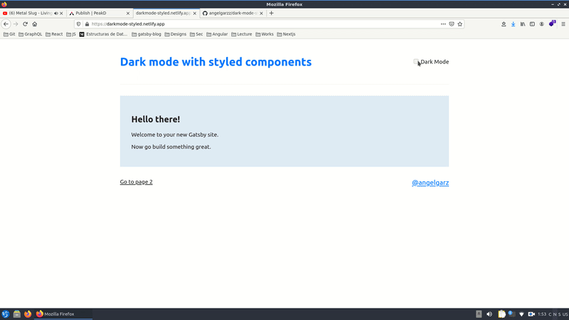
You can check the Live Demo Here and the complete source code on my github.
What we'll be using:
- React Context
- React Hooks (UseEffect, UseMemo, UseState, UseContext)
- CSS variables
- Some server side rendering APIs from Gatsby
- Some cool "tricks" for optimization
First lets create a gatsby project with gatsby-starter-default as boilerplate:
gatsby new dark-mode-styled https://github.com/gatsbyjs/gatsby-starter-default
Now install styled components and its plugin for gatsby:
npm install --save gatsby-plugin-styled-components styled-components babel-plugin-styled-components
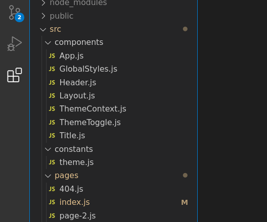
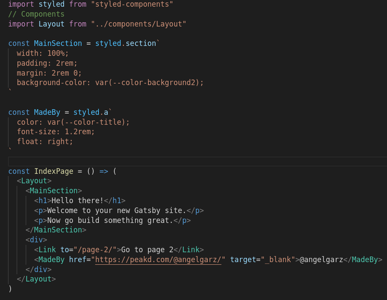
The structure for this project is really simple since it's just a few components. I just added the constants directory where we'll store the values for the theme, and some components in the components folder. Apart from that the structure is the same as the starter bolierplate.
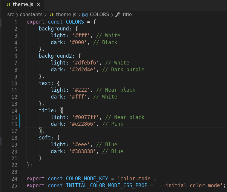
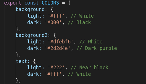
In the theme.js file we will be storing the color's values for the theme. This values will toggle the actual values of the css variables in our styles.
Let's start with the functionality
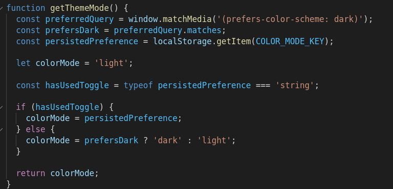
First we need a function to get the initial theme mode, it checks the preferred color scheme query and local storage to see if the user has used the toggle previsouly.
We'll make use of some state to store this value and React Context to manage it, so it's easily available in the other components.
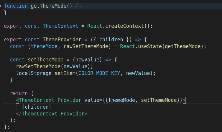
In the context provider whose value we'll be using later in the toggle component, the setThemeMode function receives a parameter (newValue) to save the theme mode in local storage. The state and setter are passed as a value in the Context Provider so we can use them later in the toggle component.
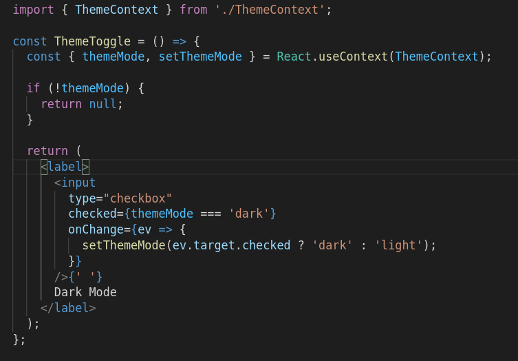
The Toggle component
Every component below a context provider has access to it's context value, so we just have to import it and we get access to themeMode and setThemeMode from ThemeContext.
This component is just a checkbox whose checked attribute is conditioned by the themeMode state, and it toggles that same state whent it's checked/unchecked.
So far so good, but there is a problem..
This function has to be run on the first render to determine (checking localstorage and the media query) what the initial theme values should be. But the thing is, THAT first render doesn't occur on the user's machine, it occurs on the server side or the develepment machine.
So that's one of the key differences to take into account between traditional client side rendering and server side rendering.
By using just the previous code the users would get to see somthing like this every time they refresh the page:
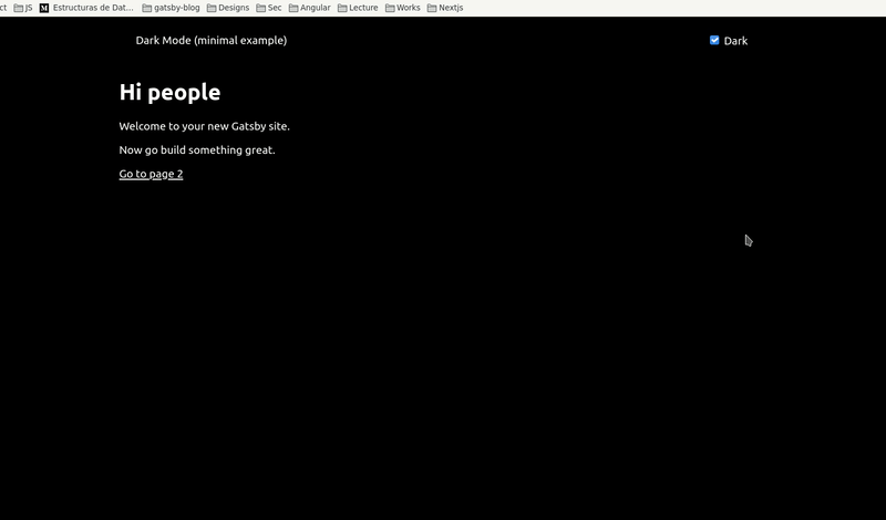
This is because the first render on the server delivers the exact same html for all the clients (with the default light mode), so if they have dark mode active they will get to see a flicker of the light mode.
How to solve this
Fortunately Gatsby has some server rendering APIs that allow us to make changes in different scenarions and during different stages of the server side rendering process. In this case we'll be using the gatsby-ssr.js API file.
The file gatsby-ssr.js lets you alter the content of static HTML files as they are being Server-Side Rendered (SSR) by Gatsby and Node.js.
For this approach we will use css variables and inject some javascript in the HTML before the rest of the content. This script will handle the initial theme mode, just as we were doing before, but this time it'll execute on the client side.
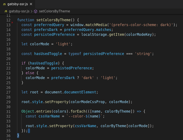
This function does the same than the previous one, but now it iterates through every color in the colors array, and with some nice dynamism, destructuring the objects in the array, it sets the css properties according to the selected mode.
Now we have to inject this function in the HTML, in the same file (gatsby-ssr) we turn the function into a string so we can inject it.
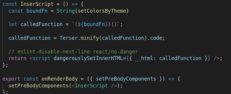
We are also making use of the onRenderBody API function to insert the script. This function allows us to insert components to the head and body of the html.js while the HTML is being built. It can take a lot of parameters to determine where and how to insert the code. In this case am passing just setPreBodyComponents, which I think is pretty much self descriptive.
You can check all the Gatsby ssr APIs in the official documentation.
What about the React context now?
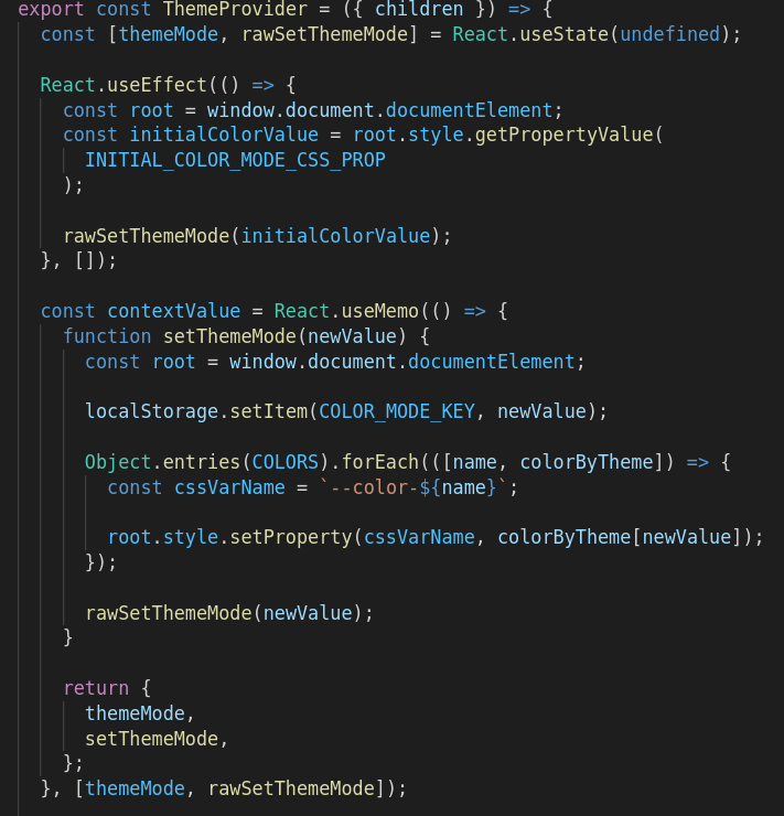
Just a couple of tweaks and we have something similar to the ssr function, but here we get to manage the state. This function (setThemeMode) together with the themeMode state, are passed as a value in the Context Provider so we can use them later in the toggle component.
As you can notice I wrap the function inside a useMemo hook, this is so the function doesnt executes every time the component re-renders, unless one of its dependencies have changed (if the themeMode state is changed in this case).
Last but not least.. The styles
Now that the css variables are being injected and available for our use, changing the theme values is just as matter of modifying the theme.js file.
The styled components with css variables
No much to say here 😅 Now we can pass the css variables directly to our styled components, without worrying about handling context values in each and every component of our app.
Something cool about CSS variables is that they are reactive, so every time their values change the HTML is updated.
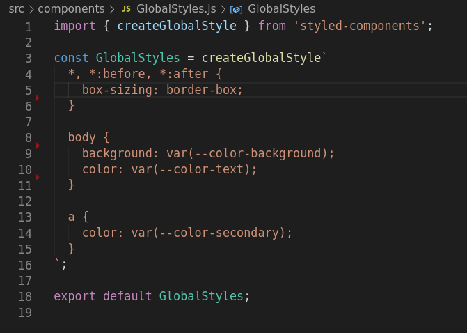
In this case for the global styles I use createGlobalStyle from styled components, but this approach works perfectly fine for regular css/scss too.
So that's it!
We have a nice looking dark mode that meets all the requirements. The users never get to see the wrong state, which is something pretty common I have seen in websites implementing dark mode.
There may be other simpler solutions, like gatsby-plugin-use-dark-mode and Theme-UI, but it all comes to the usecase you need. I like this approach because it doesn't compromise user experience while keeping the project lightweight and performant.
It also makes really easy to change the styles in components, and when adding new ones you dont need to worry about contexts or manipulating specific components, adding classes and so on. Just use the CSS variables you need and you are all set.
This is a work hard once / forget about it later approach 😄 so I think is really worth it.
Go check it out!
Demo: https://darkmode-styled.netlify.app/
Code: https://github.com/angelgarzz/dark-mode-styled-components
Thank you for this post. I am going to have to do this eventually for one of my react apps, and you've given me an idea on how to do it. It's not quite the same as your idea, but I think it might work.
Thanks for posting in the programming community!
I am glad you found it helpful in some way. Yeah, getting rid of the ssr part if it's pure React, but the css variables approach makes it really easy to mantain and make changes. Although I'm not sure I'll always go with this approach in a regular react app, instead of just passing the theme by context down the component tree.
Thanks to you for actually reading the thing! Is nice to get upvotes and tips(and appreaciated btw) but having someone to actually read and find some value in what you share is really cool.
Shared on Twitter #posh
Congratulations @angelgarz! You have completed the following achievement on the Hive blockchain and have been rewarded with new badge(s) :
You can view your badges on your board and compare yourself to others in the Ranking
If you no longer want to receive notifications, reply to this comment with the word
STOPDo not miss the last post from @hivebuzz: