This is not my first post doing little project based off online ideas, in fact it is my second, and I plan at some point joining all these ideas and do a website of my own where I'll showcase all that I've learned in a sort of interactive website as a CV, instead of the Finance way of just shoving a piece of paper up the ass of the potential employer.
I know, how cool of me to think like this, it's not like this idea is 20 years old and I'm late to the party. Well, I'm late to the developer party by like 25 years, but you gotta start somewhere, this is my somewhere.
In the meantime, I will leave you with two project Ideas based off on Brad Traversy's paid course on Udemy. Credit at the bottom and links btw.
Note: The code is based off someone else's ideas, all the comments and doc are mine as this is supposed to be a teaching kind of post, and even though the main concept is not mine, all the code has been tweaked and modified to align with my own ideas.
Out of the Blur
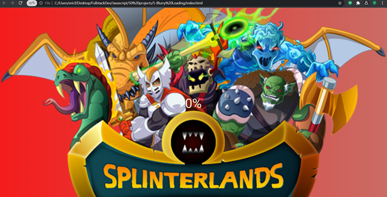
This is a pretty simple and straightforward project that will allow me to - once when I know how - give some time to the website to load while putting up a short loading legend with a percentage while the image in the background starts unblurring, giving the user something to watch while they wait.
HTML Code
  <body>
    <section class="bg"></section>
    <div class="loading-text">0%</div>

    <script src="script.js"></script>
  </body>
CSS Code
* {
  box-sizing: border-box;
}

body {
  background-image: linear-gradient(
    90deg,
    #f51c1c,
    #ca6c65
  ); /* The first color is the one we will begin with (on the right side), and the second the one we'll finish with (on the left). This if from left to right, that's why we add the 90 degress).*/
  font-family: "Roboto", sans-serif;
  display: flex; /* This centers everything on the project. Everything we write will be displayed horizontal with no "enter" between them unless we specify it.*/
  align-items: center; /* If your flex box is horizontal, it will align them to the center of the row. If its a row, it will align them to the center of the column.*/
  justify-content: center;
  height: 100vh; /* viewport height: Take the entire height of the browser.*/
  overflow: hidden; /* Hidden because we don't want scrollbars to be shown by default.*/
  margin: 0;
}

.bg {
  background: url(https://images.hive.blog/p/cyxkEVqiiLy5czPNg6acYWUoo1sAiV6GNzi6xcqDcyT6v4SjqykieMJYbVK2DhMY9ekcVxqMc5XgC8bo3K1FrEVDxeX9bEovQaywpgr5R1tcTJhTS4rAY89YT9mdy8uwsUr?format=match&mode=fit)
    no-repeat center center/cover;
  position: absolute;
  top: 0; /*This is what Initially we want, we will change it later*/
  left: 0;
  width: 100vw;
  height: 100vh; /* We want it to take the whole viewport */
  z-index: -1; /* We set this to -1 because we want it to be behind the 0% text */
  filter: blur(
    0px
  ); /* The higher the pixels, the more blurry it will be, we want it to finish at 0%*/
}

.loading-text {
  font-size: 50px;
  color: antiquewhite;
}
This is what we have as a result after the HTML and CSS Code, we now have what we want, but we need to make it do something with the JS code.
JavaScript Code
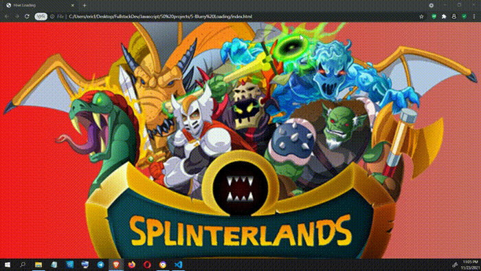
We want the loading percentage to go from 0 to 100% and while the loading goes on, the image becomes clearer and clearer until we hit 100% and the image looks perfectly.
const loadText = document.querySelector(".loading-text");
const bg = document.querySelector(".bg");

let load = 0; // This will go from zero to one hundred

let interval = setInterval(blurring, 30);
We want this function to run every 50 miliseconds, that's why we set the interval above.
function blurring() {
  load++;

  if (load > 99) {
    clearInterval(int);
  }
We just set the interval growth but we also want the "loading" text to grow at the same speed:
loadText.innerText = `${load}%`;
We want that, as the percentage grows, the numbers begin to blurry letting the attention focus in the image that will be slowly getting less blurry
loadText.style.opacity = scale(load, 0, 100, 1, 0);
We have to do the same for the blur
  bg.style.filter = `blur(${scale(load, 0, 100, 30, 0)}px)`;
}
The opacity goes from zero to one, and the load function will go from zero to une hundred, so that one is tricky, that's why I did it like that: Mapping a range of numbers to another range of numbers ( 0 - 100 to 1 - 0.)
const scale = (num, in_min, in_max, out_min, out_max) => {
  return ((num - in_min) * (out_max - out_min)) / (in_max - in_min) + out_min;
};
And voila, pretty simple but very handy to make websites look cool and give the perception that you are dealing with a cool as hell company.
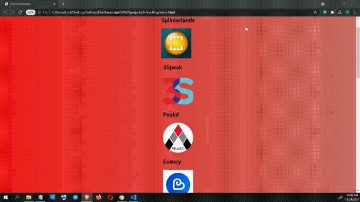
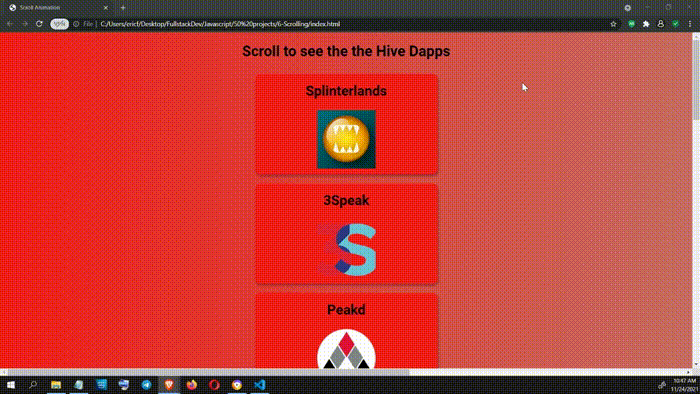
Scroll and Hive Dapps will appear!
HTML Code
  <body>
    <h1>Scroll to see the the Hive Dapps</h1>
    <div class="box">
      <h2>Splinterlands</h2>
      <img src="spl.png" />
    </div>
    <div class="box">
      <h2>3Speak</h2>
      <img src="3speak.png" />
    </div>
    <div class="box">
      <h2>Peakd</h2>
      <img src="peakd.png" />
    </div>
    <div class="box">
      <h2>Ecency</h2>
      <img src="ecency.png" />
    </div>
    <div class="box">
      <h2>Actifit</h2>
      <img src="actifit.png" />
    </div>
    <div class="box">
      <h2>Leo Finance</h2>
      <img src="leo.png" />
    </div>
    <div class="box">
      <h2>Hive.blog</h2>
      <img src="hive.png" />
    </div>
    <div class="box">
      <h2>CryptoBrewMaster</h2>
      <img src="brew.jpg" />
    </div>
    <div class="box">
      <h2>D.Buzz</h2>
      <img src="buzz.jpg" />
    </div>
    <div class="box">
      <h2>Pinmapple</h2>
      <img src="pin.png" />
    </div>
    <div class="box">
      <h2>Inji</h2>
      <img src="inji.png" />
    </div>
    <div class="box">
      <h2>Rabona</h2>
      <img src="rabona.png" />
    </div>

    <script src="script.js"></script>
  </body>
CSS Code
* {
  box-sizing: border-box;
}

body {
  background-image: linear-gradient(
    90deg,
    #f51c1c,
    #ca6c65
  ); /* The first color is the one we will begin with (on the right side), and the second the one we'll finish with (on the left). This if from left to right, that's why we add the 90 degress).*/
  font-family: "Roboto", sans-serif;
  display: flex; /* This centers everything on the project. Everything we write will be displayed horizontal with no "enter" between them unless we specify it.*/
  flex-direction: column;
  align-items: center; /* If your flex box is horizontal, it will align them to the center of the row. If its a row, it will align them to the center of the column.*/
  justify-content: center;
  margin: 0;
}

.h1 {
  margin: 10px;
}

.box {
  background-color: #f51c1c;
  color: rgb(7, 1, 8);
  display: flex; /* Because we want to align the H2 thats in inside both horizontally and vertically */
  align-items: center;
  justify-content: center;
  width: 400px;
  height: 220px;
  margin: 10px;
  padding-bottom: 20px;
  border-radius: 10px; /* This smooths the borders */
  box-shadow: 2px 4px 5px rgba(0, 0, 0, 0.3);
  transform: translateX(
    400%
  ); /* Because we want them to come from left to center. This moves the elements to an off-screen position */
  transition: transform 0.4s ease;
  overflow-x: hidden; /* We don't want a horizontal scroll bar */
  flex-direction: column;
  overflow-y: hidden;
}

.box:nth-of-type(even) {
  transform: translateX(-400%);
}

.box.show {
  transform: translateX(0); /* This brings the boxes to their normal position */
}

.box h2 {
  font-size: 30px;
}
JavaScript Code
const boxes = document.querySelectorAll(".box");

window.addEventListener("scroll", checkBoxes);

checkBoxes(); // This runs the function as the first thing

function checkBoxes() {
  const triggerBorrom = (window.innerHeight / 5) * 4; // We will use a slightly smaller number than the current innerHeight, we can't use a fixed number because this height can change depending on the browser, zoom of the user and much more.

  boxes.forEach((box) => {
    const boxTop = box.getBoundingClientRect().top; // Returns a DomRect object (an object rectangle) providing information about the size of an element and its position relative to the viewport - thanks MDN.

    if (boxTop < triggerBorrom) {
      box.classList.add("show");
    } else {
      box.classList.remove("show");
    }
  });
}
These projects are based on a CSS, HTML and JS paid course I got on Udemy by Brad Traversy. I made my own changes and tweaks but the template so to speak, is his idea and I do not claim them to be my own.
Nice going, jumping right in with the js mashup. That can give a person a headache or it might just be me that has a bit of an aversion to pure js frontends. I just don't understand them yet. I like how you made the typo then kept going with "borrom" haha, feels like pro work that. Honest. My only gripe would be to stick to semantic HTML, so where you have the logos, that is a list of items and I think it would be nicer if you did use a list for that instead of divs the way you do. Since you are targeting the class anyway it won't make a big diff js wise and another benefit would be to easily change the items from vertical to horizontal using inline.
Sure we will see some great hive related projects come from these steps, and hope you also have freecode academy a look at their course it is great for the foundational things. I should also continue there now that I mention it.
Thanks so much for the tips, I didn't think of putting them all in a list and manipulate them from there, but hey you learn something new every day, and that is exactly why I post on this community, hoping more adept devs give me some feedback, I'll try changing it and see if I can make it work out that way.
Lol yeah, since its just a variable name and VScode suggests every time you type I said well, now it's called trigerBorrom I guess :P
I am doing codewars, youtube vids, udemy lessons, stackoverflow for tips, and I heard of freecodecamp (I even did some challenges a few months ago) but never used it to actually learn from their course but I will definitely take a look.
Thanks for the feedback amigo!