Español
¡Saludos Hivers!
Espero que se encuentren bien.
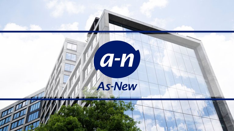
En este post quiero mostrarles un poco de lo que fue mi trabajo en la creación y desarrollo gráfico de la marca As-New. Les mostraré algunos de los resultados de mi análisis para crear la identidad visual de la empresa, así como también parte de mi proceso de bocetos.
English
Greetings Hivers!
I hope you are feeling well.
In this post I want to show you a little of what was my work in the creation and graphic development of the As-New brand. I will show you some of the results of my analysis to create the company's visual identity, as well as part of my sketching process.

CARACTERIZACIÓN DE LA EMPRESA.
As-New C.A es una empresa nacional dedicada a la producción, distribución y venta de productos para cuidado del hogar.
Sector en el que opera: Industria química.
Rango: Mediana Empresa a nivel Nacional de carácter privado.
CHARACTERIZATION OF THE COMPANY
As-New C.A. is a national company engaged with the production, distribution and sale of home care products.
Sector of operation: Chemical industry.
Rank: Medium-sized private company at national level.
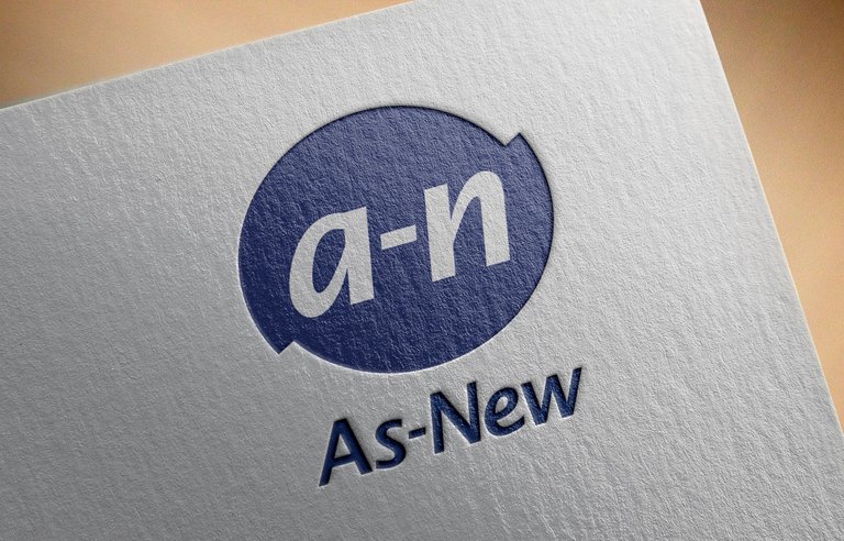
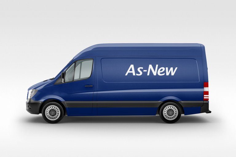
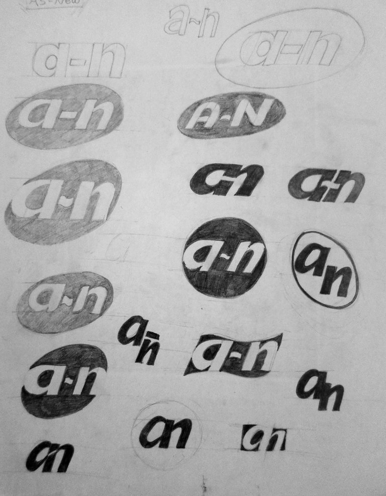
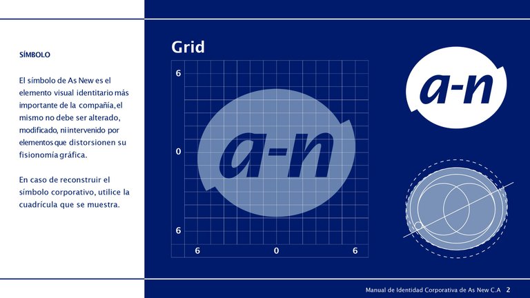 Imagen extraída del Manual de Directrices de la Marca/Image extracted from the Brand Guidelines Manual
ANÁLISIS MARCARIO.
Para la creación de la marca gráfica se analizó el sector en el que opera la compañía, así como también la competencia de ésta, llegando a la siguiente conclusión:
No se trata de crear una marca con poca originalidad, sino que es conveniente que tenga un estilo y grado de distinción medio-alto que se ajuste al sector en el que opera. Si bien es cierto que el nombre de la empresa ya la hace original, sobre todo por el guión en el centro, es un elemento tipográfico que la distingue del resto. La idea es crear una marca que, gracias a su fisonomía gráfica, el receptor pueda interpretarla y asociarla al sector.
BRAND ANALYSIS
In order to create the graphic brand, the company’s sector of operation was analyzed, as well as its competition, reaching the following conclusion:
It is not a matter of creating a brand with little originality, but it is recommendable that it has a medium-high style and degree of distinction that fits the sector of operation. It is true that the name of the company already makes it original, especially because of the script in the middle, which is a typographic element that distinguishes it from the others. Nonetheless, the idea is to create a brand that, thanks to its graphic appearance, can be interpreted by the receiver and associated with the sector.
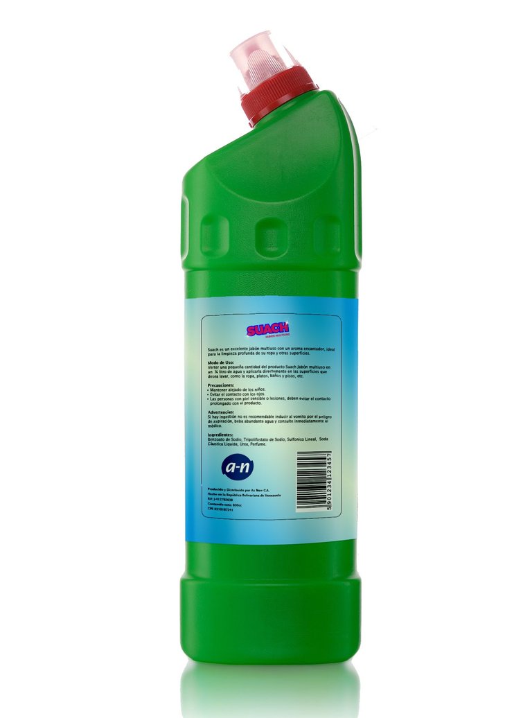
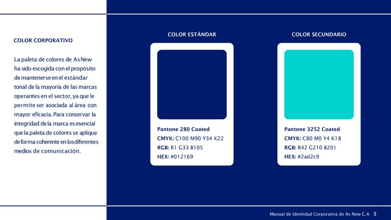 Imagen extraída del Manual de Directrices de la Marca/Image extracted from the Brand Guidelines Manual
RESULTADO OBTENIDO DEL ANÁLISIS - DESARROLLO DE MARCA.
Análisis marcario del sector:
• La mayoría de las marcas de dichas compañía están presentes en los productos, pero en menor tamaño.
• Su relevancia es menor que la marca del producto.
• Es más reconocido el identificador gráfico del producto, que la marca de la compañía.
Análisis gráfico de las competencias:
• La mayoría usan el tono azul en sus logotipos y símbolos.
• La tipografía de sus logotipos suelen presentar una breve inclinación.
• La mayoría usan las iniciales de su nombre comercial como símbolo.
RESULT OBTAINED FROM THE ANALYSIS - BRAND DEVELOPMENT
Trademark analysis of the sector:
• Most of such companies' brands are present on the products, but in a smaller size.
• They are less relevant than the product brand.
• The graphic identifier of the product is more recognizable than the company brand.
Graphic analysis of the competencies:
• Most of them use a blue tone in their logos and symbols.
• The typography of their logos usually has a short slant.
• Most of them use the initials of their trade name as a symbol.
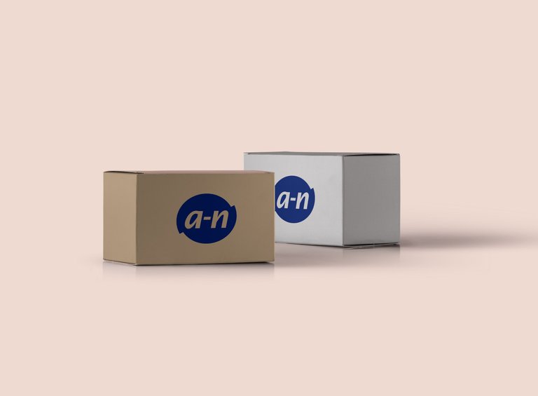
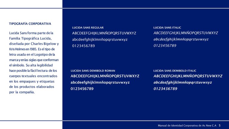 Imagen extraída del Manual de Directrices de la Marca/Image extracted from the Brand Guidelines Manual
También puedes conseguir este trabajo en:
behance.net/datavix
You can also get this job at:
behance.net/datavix

Congratulations @datavix! You received a personal badge!
You can view your badges on your board and compare yourself to others in the Ranking
Check out the last post from @hivebuzz:
Support the HiveBuzz project. Vote for our proposal!