A common that issue artists have, and have had for countless years, is the one of creating truly awe-inspiring artworks. They sometimes make one but don't know how to keep going.
I've tested the waters, and I've discovered that even simple drawings with stick-caricatures get more praise if they show landscape depth.
Contrast element for scale
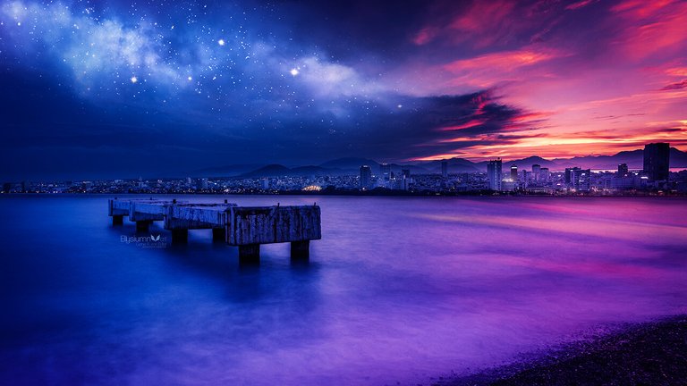
One frequent depth trick is displayed in this masterpiece by Artstation user Gene Raz von Edler. The primary method is putting one big element that is at the front of everything. This element doesn't have to be the main focus. In fact, as we can see in this painting, it's instead used as a tool to create size contrast. We have a bigger detailed object in focus. Therefore, all other tiny elements are not seen as something monotone and pointless, but small and distant.
Shadows and colors
If the color of a painting stays the same, it is fair to assume to the viewer's eye that all elements are in the same plane. To separate them, change the colors. The focus element should be the most saturated. The out-of-focus elements are often darkened, but this rule is also frequently broken by focusing on dark central objects in the picture.
Elements far away are also often mixed with blue, green and/or purple. This technique takes from a common visual effect: when you look far away, the air starts turning a bit blue. This is because city air is not 100% transparent (due to contamination, fog, rain, and other similar issues). In water, this effect is increased many times.
Progressively smaller elements will become less saturated, darker, and foggier. They will be less defined, blurrier, and the colors will be colder (instead of red/yellow, blue/green).
Angles and focus
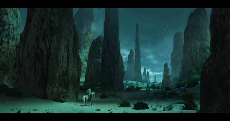
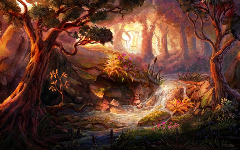
In the following picture, you will be able to see the previous steps applied: There are elements very close to the focal point to create an illusion of depth. The colors outside the focus are darker and colder. The most distant parts are foggy, less defined, and also have a higher density of cold colors. In the following painting by Johannes Roots, the main distance helper is light intensity. The river is brighter in contrast with the rocks further away. Among the rocky mound, there is also a contrast. Those nearer to the point of view are brighter and warmer, and those farther away are darker and colder.
Additionally, the trees become slanted toward the center in order to simulate a tunnel. When the eye sees a tunnel, it perceives the elements in the center as farther away. Try looking away from the picture and seeing it with the side of your eye, and you'll see what I mean.
Congratulations @reksnek! You have completed the following achievement on the Steem blockchain and have been rewarded with new badge(s) :
You can view your badges on your Steem Board and compare to others on the Steem Ranking
If you no longer want to receive notifications, reply to this comment with the word
STOPTo support your work, I also upvoted your post!
Do not miss the last post from @steemitboard:
Vote for @Steemitboard as a witness to get one more award and increased upvotes!
This post was shared in the Curation Collective Discord community for curators, and upvoted and resteemed by the @c-squared community account.
If you are a community leader and/or contest organizer, please join the Discord and let us know you if you would like to promote the posting of your community or contest.
@c-squared runs a community witness. Please consider using one of your witness votes on us here