To create collages, you often use parts of different photos that were taken at different times of the day, different seasons and in different lighting. Sometimes you may even use photos together with elements of paintings.
This inevitably means that all the image parts differ in color tones and brightness. Art, of course, doesn't have any problem with that. However, if you want to implement a certain degree of realism in your collage or if harmony of colors is part of your concept, you might be interested in changing this.
In this post, I would like to show how you can use GIMP to match the color tones of the different parts of your collage so that they look as if you had cut them all out of the same photo.
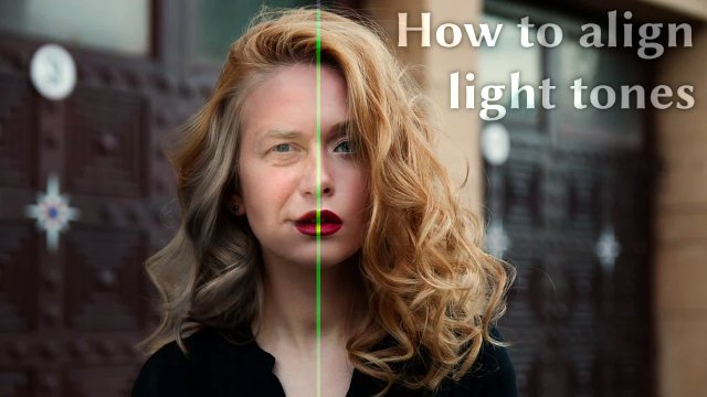
LMAC School - How to align light tones between picture elements
Requirements
You may need the GIMP software to understand this tutorial. GIMP is a free, open source tool for image processing of all kinds. Lots of people say GIMP is the open source Photoshop. I agree with this statement at least for the functionality I personally need.
You can download GIMP here: Click
I created this tutorial for GIMP version 2.10.20 (and higher).
1. Basics
Mostly photos differ in lighting, color temperature, shadows, highlights and midtones. Matching them is therefore sometimes a challenge that requires different tools, perceptiveness and good eyesight.
For good eyesight, folklore recommends carrots and hawkweed. In the following sections, I'll briefly explain the common tools you can use to adjust images before we move on to the practical part of the tutorial.
1.1 Color temperature
In the image menu through Tools → Color Tools → Color Temperature
GIMP has a nice function for adjusting the color temperature of the color of an image. The temperature must be set in kelvin in the respective dialog box. You can open this dialog box by clicking on the "Color Balance" menu item in the "Color" menu.
In example, a picture of a cold scene is often more bluish. If you want to add a penguin from an iceberg to a Hawaiian scene, you would propably need to correct the cold blue cast of the penguin cut to look a bit warmer.
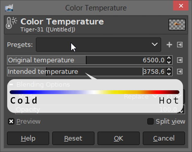
There are two adjustable values in the dialog box, "Original Temperature" and "Intended Temperature".
"Original Temperature" stands for the original color temperature you estimated the light source would have. Adjusting this can lead to more realistic results. However, in many cases it is sufficient to leave this slider untouched.
The value "Intended Temperature" stands for the color temperature you wish for the image.
GIMP gives you a number of presets for both values. You can select them by clicking on the triangular symbol to the right from either of the two values.
As already mentioned, the color temperature can be set using values in Kelvin. The range goes from 1,000K to 12,000K for both values.
1.2 Exposure
In the image menu through Tools → Color Tools → Exposure
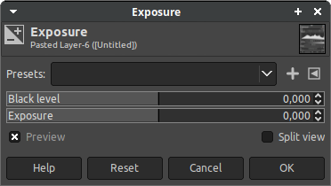
This function is very useful when you want to darken or brighten an overexposed or underexposed image. But you can also use it to match the black level and lighting of an image cutout to your collage. The benefit of this function is that the highlights of the image layer remain preserved, only the midtones and shadows are affected.
You can open the dialog window of this function by clicking on the menu item "Colors/Exposure...".
1.3 Color channels and curves
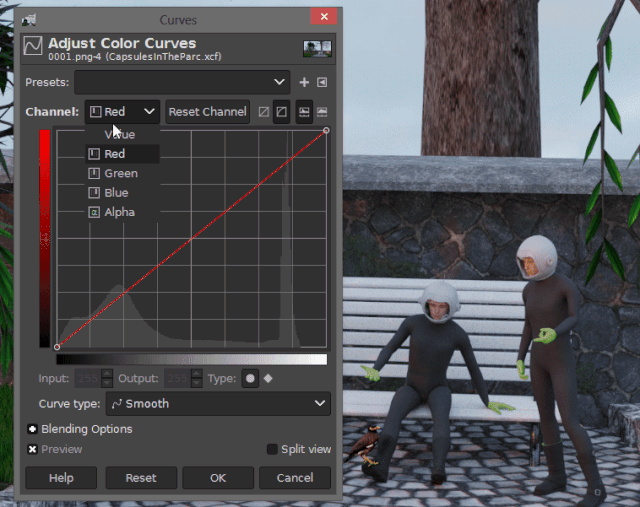
In the image menu through Tools → Color Tools → Curves or Colors → Curves
A digital image usually consists of 3 or 4 color channels. The most important 3 color channels are red, green and blue. Whenever the image also has transparencies, it has a fourth color channel, the transparency value.
In GIMP there is a tool called "Curves", which can be accessed through the menu item "Colors/Curves". With this tool you can adjust every single color channel via a grahpical curve. But in principle you can also manipulate brightness and contrast.
A digital image usually consists of 3 or 4 color channels. The most important 3 color channels are red, green and blue. Whenever the image also has transparencies, it has a fourth color channel, the transparency value.
In GIMP there is a tool called "Curves", which can be accessed via the menu item "Colors/Curves". With this tool you can adjust every single color channel of a layer via a mathmatical curve. But in principle you can also manipulate brightness and contrast.
In the "Curves" dialog window there is a drop-down menu in the upper right corner, where you can select the channel you want to manipulate.
- The channel "Value" stands for all color channels at the same time. With this you can manipulate the brightness of the layer.
- The channels "Red", "Green" and "Blue" stand for the individual color channels whose brightness you can change.
- Alpha" stands for the transparency channel. When this channel is selected, you can set how transparent the transparent areas of your image should be.
In the center of the "Curves" dialog box is a curve graphic. This graphic is interactive. You can drag the line in it with the mouse in any direction at any point of the line.
Depending on where you touch and move the Curve Handle, you can adjust the shadows, midtones, and light tones of a channel. By clicking on the curve at a specific point, the curve can be fixed at that there. The fixer can be moved at any time by dragging it using the mouse.
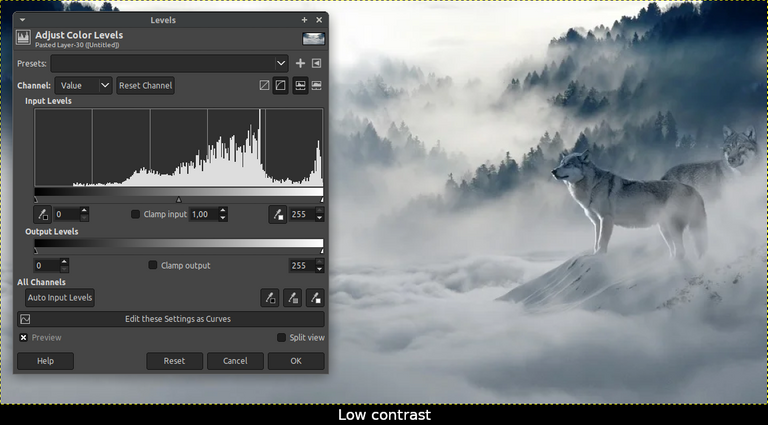
1.4 Levels (Histogram)
In the image menu through Tools → Color Tools → Levels
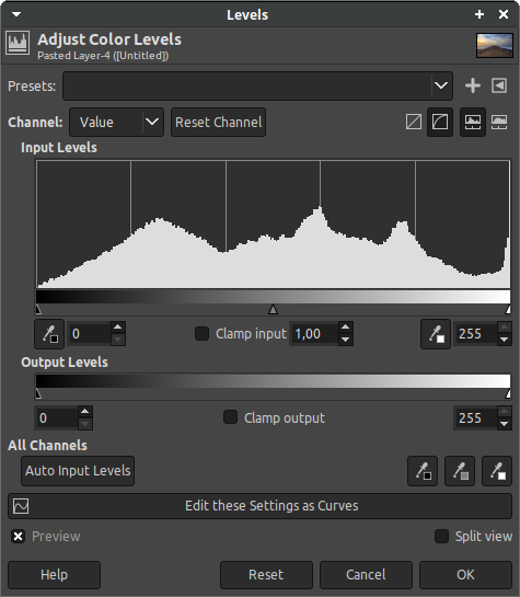
Histogram is a tool that every professional photographer should know. It is present in every good image editing software, so in GIMP.
The histogram provides the best way to check if the exposure is acceptable in an image. It is presented as a diagram (you can see an example below), which contains all the information about the light distribution on your photo.
It might look a bit difficult, but I promise it will be very easy to understand.
You should read the histogram "horizontally" from left to right. Dark colors are listed from the left to the right getting lighter. The vertical lines are used to define how many pixels are present in the image for a given color/lightness.
As with the Curve tool, this tool also provides you with a drop-down box for setting the color channel. The way it works is the same. Simply select "Value" whenever you want to manipulate or analyze the histogram of all color channels simultaneously or select a specific color channel.
1.4.1 Analyze the histogram
Below the histogram there are 3 small triangles. We will come to the functionality of these little sliders later. For an analysis of the histogram, these mark position of the shadows, the midtones and the highlights of the selected color channel.
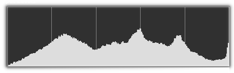
If the majority of the pixels in the histogram were more aligned to the left, this would mean that the image is dark, the darker the more the histogram is leaning to the left.
Conversely, if the histogram were to lean more to the right, this would indicate a very bright image.
If the shadows, the midtones and the highlight values are fairly evenly distributed from one end to the other, it means that the image has good contrast and medium detail.
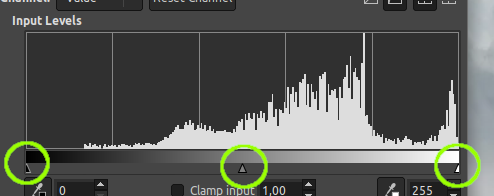
1.4.2 Manipulate the histogram
You see, the histogram can help us to align the color tones of separate image elements, as it tells us information about the distribution of colors. All you have to do is to try to match the histograms so that they become similar in all color channels by using the curve tool or the levels tool.
As mentioned above, there are 3 small triangles below the histogram. You can move these to the left and right by holding down the mouse button on them. These are called "Adjustment Sliders" and they are the main adjustment tools of the Levels dialog. It allows you to adjust the shadows, midtones or highlights to make them more or less dominant for the selected color channel.
For example, the left triangle, which is below the shadow side of the histogram, can be used to make the shadows of the selected color channel darker by dragging the triangle a certain portion to the right.
2. Examples
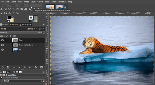
2.1. Let the tiger cool down - Color temperature
This short example shows the capabilities of the "Color Balance" tool. It's about cooling the colors of the tiger so that it fits better into the icy scene.
As you may notice, the blue component of the background image is very high compared to the tiger image. And the red component of the tiger image is very high compared to the background. So the tiger needs to get a little more blue and have to lose some red to match the icy background image.
So all I had to do was to adjust the "Intended Temperature" value in the "Color Balance" dialog box to a lower value until it more or less visually matched the hue of the light source in the background image.
2.1.1 Materials
If you'd like to try the following example for yourself, you can download the materials I used in the example.
https://pixabay.com/de/photos/tiger-raubkatze-raubtier-gro%C3%9Fkatze-685136/
https://pixabay.com/de/photos/antarktis-eisberg-eis-arktis-k%C3%A4lte-5163636/
2.1.2 Step-By-Step
- Arrange the scene by setting the tiger as layer above the background image, which should also be a layer.
- Open the "Color Balance" dialog box by clicking on the "Color Balance" menu item in the "Colors" menu.
- Adjust the "Intended Temperature" value to the left direction until it matches the color temperature of the background image well.
- Click the "Ok" button.
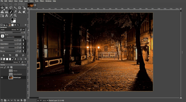
2.2. Day to night - Workflow
This example shows how you can change an image element that was photographed in bright daylight to match a night scene by simply manipulating the Color Levels, the Exposure and the Color Temperature.
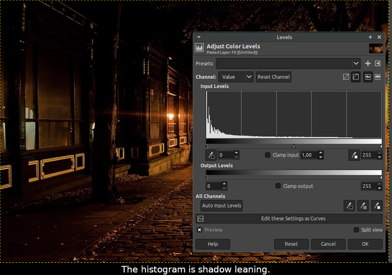
First of all, let's take look at the histogram of the night scene. To do this, activate the Night Scene layer and open the Levels tool.
The histogram of this layer indicates (see the sample GIF) it is very shadow leaning, as is to be expected for a night scene. The bright and middle tones are very low.
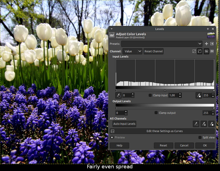
Now let's look at the histogram of the horse image. Activate its layer and open the Levels Tool again.
We can see in this histogram that all light tones are represented quite balanced.
To give the midtones and shadows a little more room, as they have in the night scene, move the middle (midtones) and right (shadows) Adjustment Sliders each to the right until the illumination of both images fit together well in the specific tones.
Since the horse photo was taken during the day, it still has much too high exposure values. Let's darken the horse photo a bit using the Expression Tool until it matches the night scene in terms of exposure value.
The light of the night scene is much warmer than the light of the horse photo. Let's make the color temperature of the horses a little warmer using the Color Temperature Tool.
Instead of using the Color Temperature tool, you can alternatively use the Curve tool by increasing the middle red tones a bit, as in the Curve Tool example GIF above.
Now both photos match very well in exposure and color tones. You can achieve even better results by manually correcting the details of the illumination using the Dodge / Burn Tool on the horses.
In "LMAC School - What are the principles of light and shadow in a picture?" you will find some tips & tricks about doing such kind of adjustments.
2.2.1 Materials
If you'd like to try the following example for yourself, you can download the materials I used in the example.
https://pixabay.com/de/photos/gasse-stra%c3%9fe-nacht-abend-stadt-89197/
https://pixabay.com/de/photos/pferde-stute-fohlen-isoliert-2180773/
What is LMAC?
LMAC is a great community for artists of all skill levels. The name of the community is an abbreviation and stands for "Let's make a collage".
Just take a look. Even if you think you are not an artist, LMAC will probably prove you wrong.
We have weekly collage contests there with great prizes.
Are you a good photographer and would like to contribute some nice good quality photos in exchange for good votes and tribute?
Since a while, we are very diligent building our own photo/image library that we can use as a image source for our collages, but also every Hiver beyond LMAC is very welcome to use the images we collected together.
Best regards
QuantumG
╭━━⋞ ☙ My NFT artworks ≻≺ ♖ My dCity ⋟━━╮
╰━━━━⋞ ♫ My Rising Star(s) ⋟━━━━╯
Really nice tutorial. Thanks for compiling it all sharing with the community.
Thanks for sharing this helpful guide and tutorial!
!1UP
Thank you. :-)
You have received a 1UP from @ivarbjorn!
@ccc-curator, @vyb-curator, @pob-curatorAnd they will bring !PIZZA 🍕
Learn more about our delegation service to earn daily rewards. Join the family on Discord.
beautiful job dear. very helpful article. thanks
Thank you very much! :-)
🤯This is really awesome and Helpful.
I'm glad Photoshop bears some similar features with GIMP, I'll apply appropriately.
Trying to learn GIMP side-by-side too🤘😁
Bless you Quantumg Sir💜
Thank you for dropping in. I'm very glad you find it helpful.
Yes, both have a lot in common. Like, both tools share a popular concept of image processing interface. It will be easy for you to use GIMP and PS samewise no matter which of the two programs you started learning with.
Bless you, too @queenstarr ❣️
!!!
¡Qué maravilla, @quantumg! ¡Hay tanto aquí que quería saber! Muchas gracias, realmente la comunidad tiene mucha suerte de tenerte.
Recibe un abrazo enorme.
Gracias @adncabrera. Me alegro de que te guste.
A wonderful tutorial. It is pinned so the next time I need this information I can come back and follow your instructions carefully. Some of these tools I have used, but not with any skill. This will be very helpful.
Thanks, teacher :)
Thanks for stopping by. I'm very glad you find it useful. :-)
This is a gem for all those who use Gimp, it is very similar to Photoshop, in fact, I use those tools a lot. Thanks, Quantumg for your dedication and for sharing your knowledge.👍
Thanks for looking in and thank you so much for the tip. So kind of you. :-)
I'm also very happy you find it useful.
In fact, this is very evident in your pictures!
PIZZA Holders sent $PIZZA tips in this post's comments:
@curation-cartel(10/20) tipped @quantumg (x1)
You can now send $PIZZA tips in Discord via tip.cc!
Your content has been voted as a part of Encouragement program. Keep up the good work!
Use Ecency daily to boost your growth on platform!
Support Ecency
Vote for new Proposal
Delegate HP and earn more
Congratulations @quantumg! You have completed the following achievement on the Hive blockchain and have been rewarded with new badge(s):
Your next target is to reach 8000 upvotes.
You can view your badges on your board and compare yourself to others in the Ranking
If you no longer want to receive notifications, reply to this comment with the word
STOPCheck out the last post from @hivebuzz:
Support the HiveBuzz project. Vote for our proposal!
Excellent, I am trying to learn Gimp.
Very good tutorial! I see it's been around for a while but I just discovered it today. I'm interested in working on these details when making a collage.
It is very well explained in a clear way.
Thank you very much for sharing it!