The Moving Averages Convergence Divergence also and common known as MACD is a trading indicator that uses the difference between two EMA's of an asset to show the traders and investors possible entry and exit points on the price chart of an asset.
The MACD value is usually displayed on a charted line on the price chart, but in order to use the MACD effectively one has to also consider three other components associated with the MACD on the chart.
On the price chart, for use to be able use MACD for readings the chart must have the following
- Signal line
- Zero line
- Histogram
- MACD line
Take a look at the image below
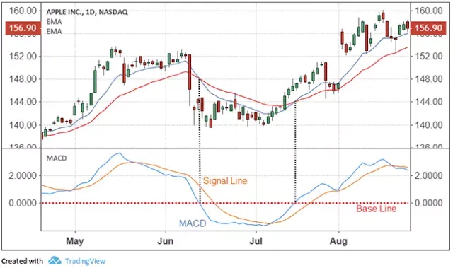
The red dotted line that cuts across the MACD and signal line is known as the zero line.
MACD line
The MACD line is gotten by subtracting the 26 period EMA from the 12 period EMA on a price chart.
Signal line
The signal line is the 9-period EMA of the asset at that point in time
Zero line
The zero line is the point where the MACD value and the Signal line value are the same.
Histogram
The histogram is used to show the difference between the MACD line and the Signal line.
How MACD indicator works
On the price chart, whenever the MACD line crosses above the signal line on the chart, this signifies a bullish trend and a possible spike in price. That should be the entry point for any trader.
When the MACD line crosses below the signal line it is an indicator of a bearish trend and a possible fall in the price of the asset. This should be the exit point for the trader.
When the MACD and signal line appears below the zero line, it signifies a bearish trend/down market
How to setup MACD indicator on TradingView
My charting tool of choice is always TradingView as with many other traders.
Using this BTC_USD chart as an example we are going to add MACD indicator.
On the chart click on the part that say Indicators in the top part of the page and type in MACD to add it to your chart
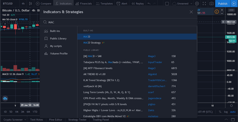
Once it has been added you will be able to find it on your chart below the price candlesticks
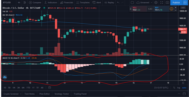
The area circled in red contains the MACD charting.
The thin blue line is the MACD line while the thin orange line is the signal line.
The bars appearing in green and red are the histogram and the line that runs between the histogram is the zero line.
To buttress the points that I made earlier we can see from the chart that Bitcoin is currently in a bear market, we can also see that whenever the blue line crosses the orange line upwards the price of Bitcoin goes up against USD and vice versa.