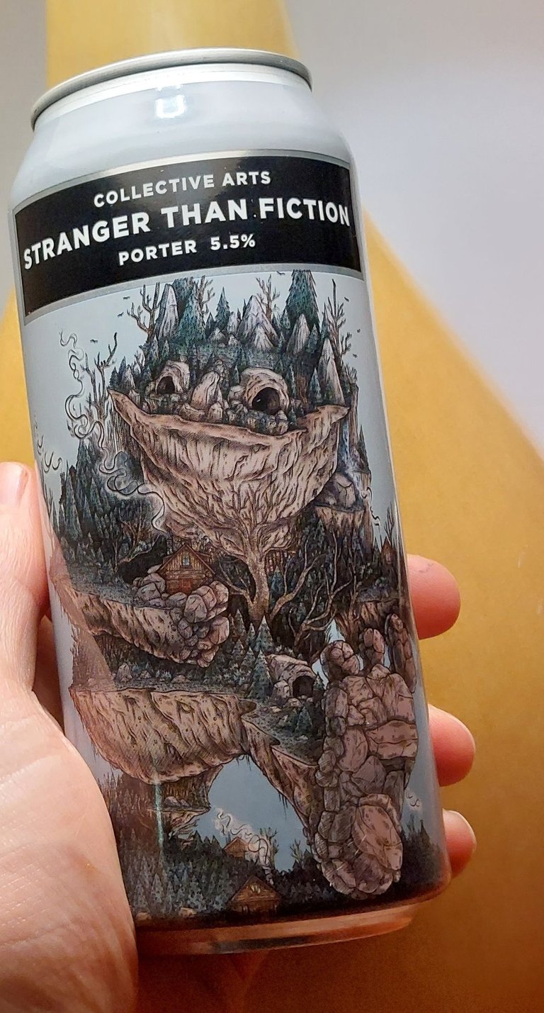
Well, I drank another beer recently so you know what that means, its time for a #Beersaturday post! For this review I really got caught up in the design of the can, so be prepared for me to talk way too much about that aspect of the beer. That being said, feel free to let me know in the comments what you think of this - "Stranger than Fiction" can.
Stranger than Fiction Porter
Brewery: Collective Arts Brewing Ltd
Origin: Hamilton, ON Canada
Style: Porter
Abv: 5.5%
Marketing: Nature woodland monster reminiscent of the children's book "Where the Wild Things are." Actually, it really reminds me of something that you would see as a Screensaver for Microsoft Vista. Do you remember those images? They were sort of a trendy, flash style of artwork.
The image is printed quite dark on the can, which makes it difficult to see and somewhat muddied looking, even up close.
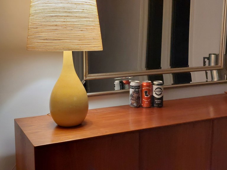
To show you what I mean I lined up three different cans from different breweries and from only 10 feet away you can barely tell what the Collective Arts image is supposed to be. I was even generous enough to show it in its best light by putting the can closest to the light source. I don't think that it made much of a difference. It was still quite hard to see the image and tell what it's supposed to be. It comes across as sort of a blob.
I personally do not care for the can design at all. This company's gimmick is to pair up with new and "up and coming" artists for their label designs. Anyone can submit their artwork for review and the instructions are printed on each beer can on how to do so. It's sort of a cool idea, but it makes for bad branding in my opinion. The brewery has no recognizable brand logo other than the black banner with the company name printed on it. You can see it at the top of every can but it really doesn't stand out anymore than the black banner seen on the Broadhead beer in the photo above. Going back to that photo, I can clearly recognize the Wellington boot logo from wellington brewery and I can even just make out the Broadhead writing on the beer beside it. On the other hand I can't read the "Stranger than Fiction" or the "Collective Arts" writing and I can't tell what the image is, and I'm only standing about 10 feet away.
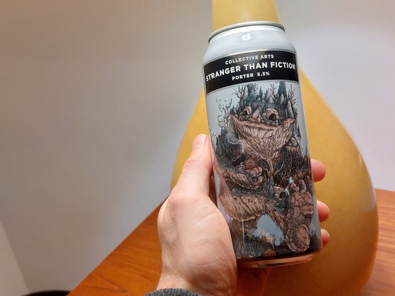
Of course, things change when you view the beer up close. There is a lot of detail and the image is a little more interesting than other more simple can designs. But the image still has nothing to do with the beer and nothing to do with the brand or marketing. All said, it really just seems like a random image that they chose. I personally don't like the design (if you haven't gathered that already), but I will admit that I spent more time looking at it than the other beers I've drank. So in a way, maybe it really is good marketing? Similarly the image they chose does fit with their Stranger than Fiction name.
My wife doesn't agree with me on the bad can design idea, she quite likes it and says that it's more fun and its more interesting than the others. So each to their own I guess.
The Beer has a hip and trendy sounding name that much like the image design has nothing to do with the beer itself. I guess it sort of implies that the beer will be unique in some way? Beer names never really have anything to do with the beer itself anyway.
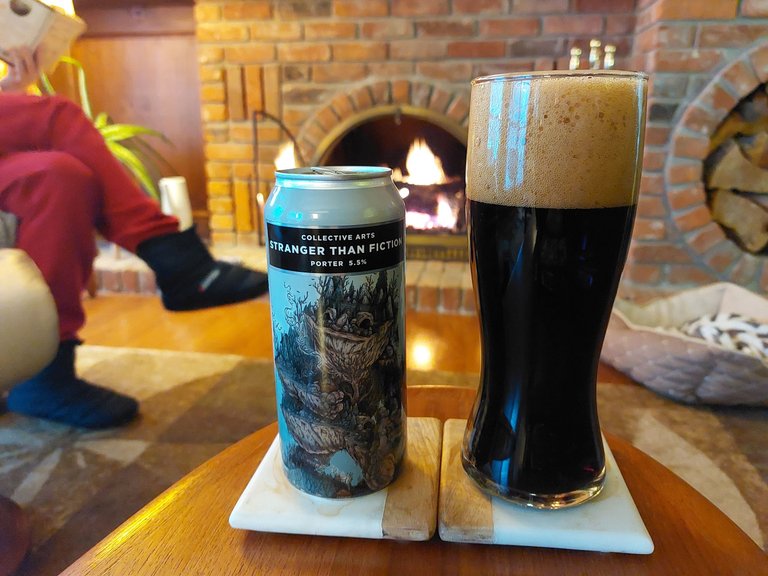
Wow, that was a lot of time spent talking about the outside of the beer. Let's crack the top and see how the inside fairs shall we?
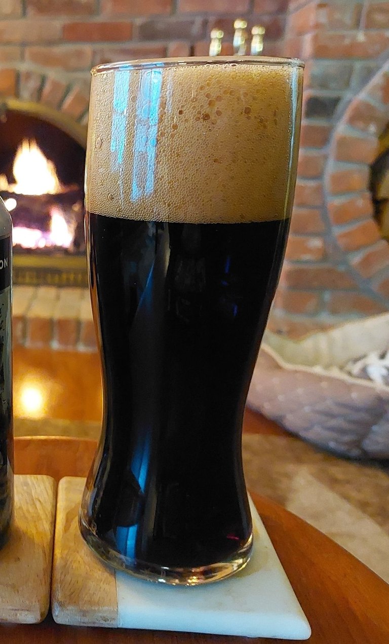
Color: Poured black with a tan head of foam that lasted a decent amount of time.
Nose: Roasted malt, cocoa, chocolate, very mild smoke aroma in the background.
Taste: Mildly sweet up front and finishing with a strong bitterness that coats the mouths. I noticed cocoa flavors coming through, coffee and a mild leathery smokey taste.
Texture: very nice mouthfeel overall. Nicely carbonated. Medium bodied.
Impression: This was actually a really great beer for me. It had a lot of flavor but was still very easy to drink. I personally didn't find this to be anything too different or more unique than other porters I've had but I quite liked it. Overall, it was a great beer, even despite the (in my opinion) horrible can.
What do you think about this cans image and design? Let me know in the
comments.
I’m with you on this. It’s an interesting piece of artwork but not bold enough for a can of beer. Where’s the colour?! Just seems a bit bland, which is a shame as the offer to submit your own artwork is quite a good idea imo and I imaging they had plenty of designs to choose from. Would definitely like to see more from their collection.
Yeah that's a good point about the color and you're right that they probably did have a lot of options to choose from. I think the idea of hiring up and coming artists is neat/interesting, but I wish that this company also had some sort of logo of its own to make its brand a little more recognizable on the shelf. I've seen worse cans in that regard that have a few images on them but no actual writing at all. I never buy those ones. I'm usually like "this looks like it could have been brewed in someone's garage and snuck onto the shelf as a prank. I'm going to skip this one..."
😂
Collective Arts isn't that bad of course but still, a small logo would go a long way for me in terms of recognizability.
You raise a good point and now you’ve mentioned it I can think of a few breweries that do the same. Maybe they think you’ll love the taste so much you’ll hunt them down 🤷♂️
Yeah that could be the case. ???
What I like more than the design is the name 😃
It's definitely a clever sort of name. Makes the beer sound mysterious or intriguing
I support you about the can design.
I don't see reason why your wife shouldn't agree with you concerning the branding..
The branding is poor compared to the taste you described..
I would love to have a beer with you one day.
Strange can but very good beer. I guess the latter is the important thing overall
Thank you!😊
It's fascinating how different perspectives can shape our opinions.
Personally, I'm fond of the design on the beer can.
Cheers 🥂
Yeah for sure. I think that more people will probably like the can than dislike it. I'm probably the odd one in this case. 😅
The image and name makes me want to have a drink, the picture of the beer in a glass cup is one i would like to take myself. Let me add it to my growing to-do list
Nothing more appetizing than a tall glass of beer! 😁
Indeed😎
Even the design on the beer alone will want you to have a taste.
Haha yeah I suppose so
You are right that companies can just review some designs or artistes and approve them but I think that’s a way to lure people to buy because people love wonderful designs
Seems to be working for them at the moment