Hello everybody,
These days on the web I came across some very particular illustrations. These are geometric and super colorful portraits, a real explosion of energy!
With some searches, I discovered that that style was called WPAP and I thought I'd try to make my self-portrait with this technique too!
Youtube and other social networks are full of tutorials about it, but here I want to propose the procedure that I used and which I consider very intuitive and easy to carry out. Maybe it's not the best method, but it was a lot of fun to try!
Introduction
First of all, the abbreviation WAPS stands for "Wedha Pop Art Portrait", by Wedha, an artist from Indonesia who created this technique in the early 1990s.
To proceed, it is necessary to have a photo of the subject to be portrayed, possibly well-lit and with the face highlighted, as this will be the centerpiece of our work.
In case it was in color, I recommend converting it to black and white, using any software such as, for example, Adobe Photoshop. I also recommend adjusting the exposure in order to highlight the shadow and light areas.
I decided to use this photo:

Guidelines
The software I used to make the self-portrait is Adobe Illustrator, for the simple fact that it is the only one I know very well. In any case, any software that allows you to work in vector is fine!
First, you need to:
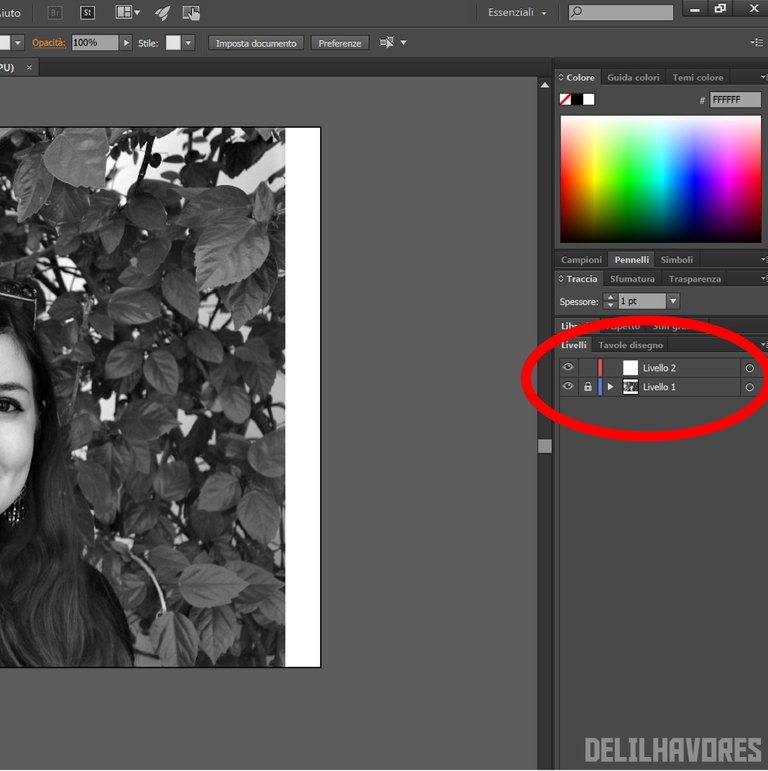
- Open a new document;
- Place the photo on level 1 and block the latter;
- Create a new work level 2.
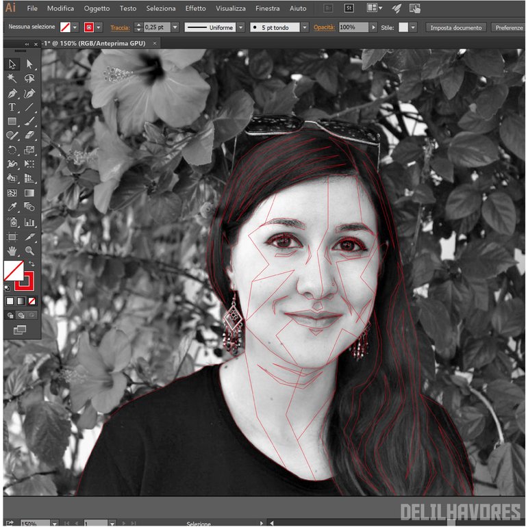
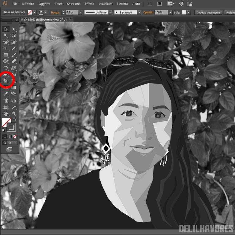
The next step is the creation of the guidelines, which we will subsequently fill in. Then, with the pen tool, you go to outline the contours of the face, the hair, some characteristic signs, …
To make a good segmentation it is important to rely on the areas of shadow and light. It can be very useful to use a thin (0.25 - 0.5) and colored trace.
This part is the most important (and perhaps the most boring!).
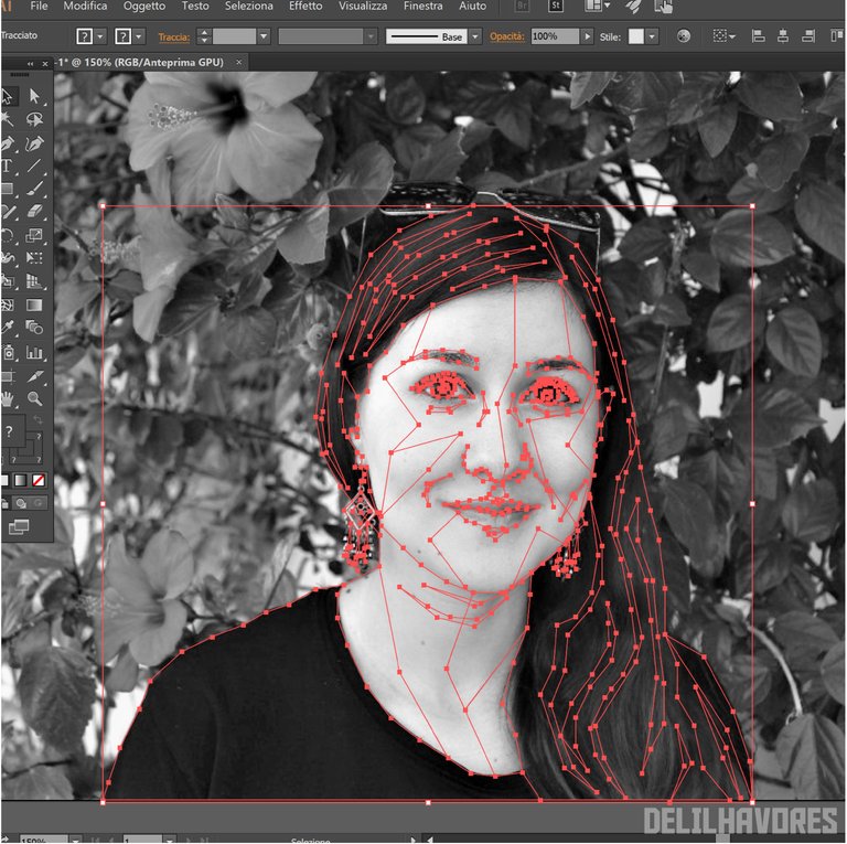
With a little patience, the result should look like this:
Black and white fill
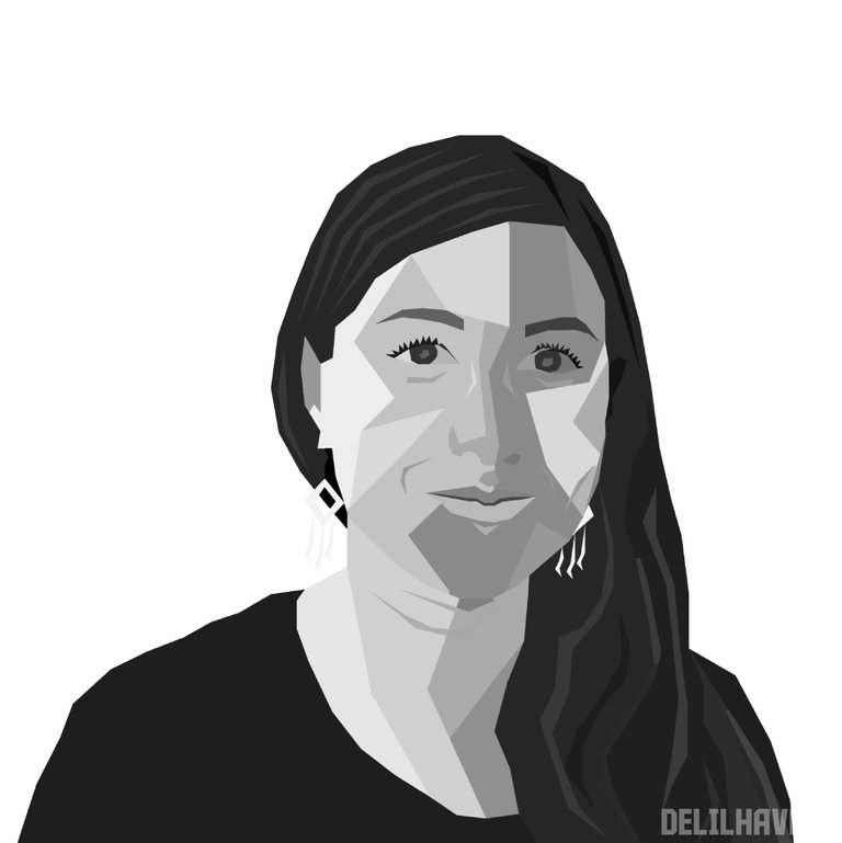
For coloring, I recommend creating a new level 3. Then, with the dynamic paint bucket tool we have to go to fill the various segments.
It is a very simple tool, just place the cursor on the color of interest in the photo and, holding "Alt", the color that we can use for filling will be captured.
At this point in the work we no longer need the background photo, so we can hide the layer that houses it.
Another fundamental step is the cancellation of the guidelines to obtain a more homogeneous result.
Here's what I got:
Color fill
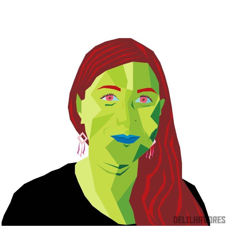
The last step is that of coloring. If we do not have clear ideas on which colors to use, we can search the web for examples of WAPS-style portraits and / or ad hoc palettes.
Personally, I don't like realistic effects and therefore I decided to throw myself on the chromatic fantasy!
Background
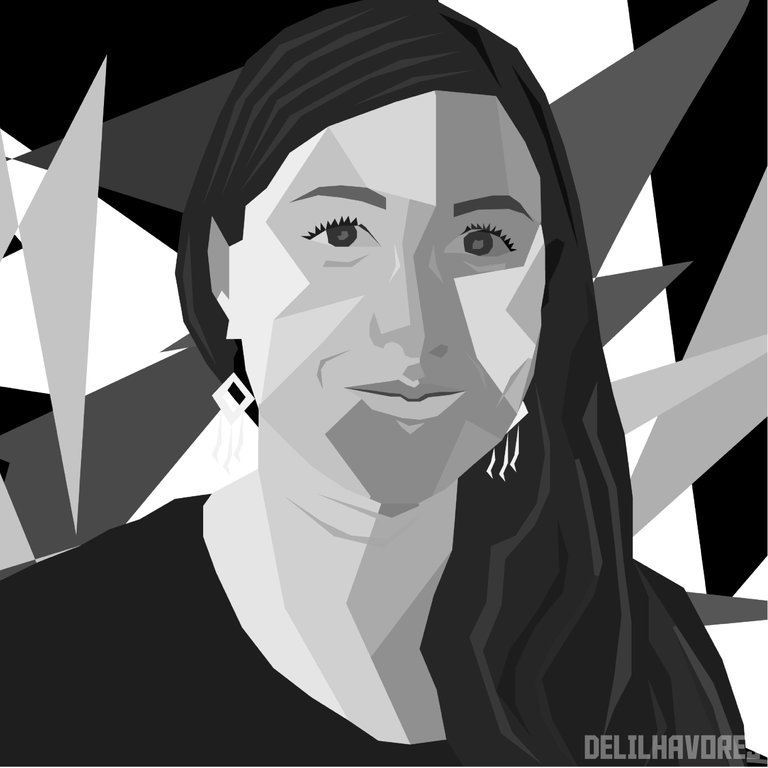
It can be interesting to complete everything with a beautiful background, also created thanks to geometric shapes!
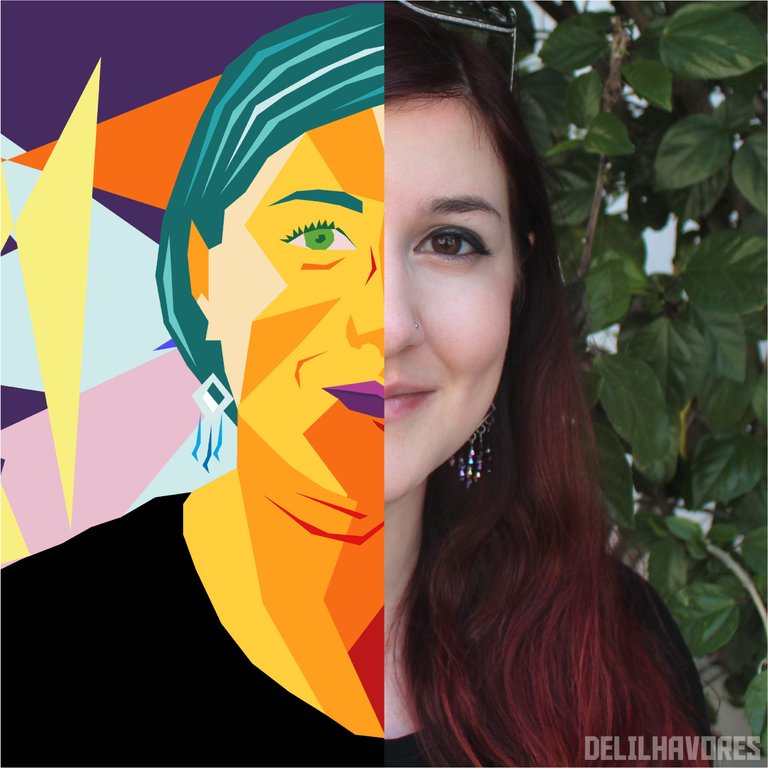
Here are my final results:

Overall, I think I still have a lot to improve, but I had a lot of fun making this self portrait! What do you think?
See you next time,
Delilha
ITA
Ciao a tutti,
In questi giorni sul web mi sono imbattuta in delle illustrazioni davvero particolari. Si tratta di ritratti squadrati e super colorati, una vera esplosione di energia!
Con un paio di ricerche, ho scoperto che quello stile si chiamava WPAP e ho pensato di provare anche io a fare il mio autoritratto con questa tecnica!
Youtube e altri social networks pullulano di tutorial a riguardo, ma qui voglio proporre il procedimento che ho utilizzato io e che ritengo molto intuitivo e facile da realizzare. Forse non è il metodo migliore, ma è stato molto divertente provarci!
Introduzione
Innanzitutto, la sigla WAPS sta per “Wedha Pop Art Portrait”, da Wedha, artista originario dell’Indonesia che creato questa tecnica all’inizio del 1990.
Per procedere, è necessario dotarsi di una foto del soggetto da ritrarre, possibilmente ben illuminata e con il volto in evidenza, in quanto sarà proprio quest’ultimo il fulcro del nostro lavoro.
Nel caso in cui fosse a colori, consiglio di convertire il tutto in bianco e nero, utilizzando un software qualsiasi come, ad esempio, Adobe Photoshop. Consiglio anche di regolare l’esposizione in modo da mettere in evidenza le zone di ombra e quelle di luce.
Io ho deciso di utilizzare questa foto:
Linee guida
Il software che ho utilizzato per realizzare l’autoritratto è Adobe Illustrator, per il semplice fatto che è l’unico che conosco molto bene. In ogni caso, qualsiasi software che permetta di lavorare in vettoriale va benissimo!
Come prima cosa, è necessario:
- Aprire un nuovo documento;
- Posizionare la foto al livello 1 e bloccare quest’ultimo;
- Creare un nuovo livello 2 di lavoro.
Lo step successivo è la creazione delle linee guida, che successivamente andremo a riempire. Quindi, con lo strumento penna, si vanno a delineare i contorni del viso, i capelli, alcuni segni caratteristici, …
Per fare una buona segmentazione è importante basarsi sulle zone di ombra e di luce. Può essere molto utilizzare una traccia di spessore sottile (0,25 – 0,5) e colorata.
Questa parte è la più importante (e la più noiosa forse!).
Con un po’ di pazienza, il risultato dovrebbe essere simile a questo:
Riempimento in bianco e nero
Per la colorazione, consiglio di creare un nuovo livello 3. Poi, con lo strumento secchiello pittura dinamica dobbiamo andare a riempire i vari segmenti.
È uno strumento molto semplice, basta collocarsi con il cursore sul colore di interesse nella foto e, tenendo premuto “Alt”, verrà catturato il colore che poi possiamo utilizzare per il riempimento.
A questo punto del lavoro non ci serve più la foto di sfondo, dunque possiamo nascondere il livello che la ospita.
Un altro step fondamentale è la cancellazione delle linee guida per ottenere un risultato più omogeneo.
Ecco cosa ho ottenuto:
Riempimento a colori
L’ultimo step è quello della colorazione. Se non abbiamo le idee chiare su quali colori utilizzare, possiamo cercare sul web degli esempi di ritratti in stile WAPS e/o delle palette ad hoc.
Personalmente, non amo gli effetti realistici e quindi ho deciso di buttarmi sulla fantasia cromatica!
Sfondo
Può essere interessante completare il tutto con uno sfondo grazioso, anch’esso creato grazie a forme geometriche!
Ecco i miei risultati finali:
Nel complesso, penso di avere molto ancora da migliorare, però mi sono divertita molto a realizzare questo autoritratto! Che ne pensate?
Alla prossima,
Delilha
Ti è uscita super bene!
Grazie mille, mi fa piacere che lo pensi! :) grazie per essere passato, una buona giornata!
This is beautiful. You did a great job on the image. I love it
Thank you! I really appreciate your support :)
It's my pleasure. Stay safe
Bel tutorial.. proverò anche io 😁
Ci conto eh! :)
Per un mondo più geometrico e colorato!
😂😂😂
Congratulations @delilhavores! You have completed the following achievement on the Hive blockchain and have been rewarded with new badge(s) :
You can view your badges on your board And compare to others on the Ranking
If you no longer want to receive notifications, reply to this comment with the word
STOPDo not miss the last post from @hivebuzz:
Support the HiveBuzz project. Vote for our proposal!