Creating a blog banner from start to finish: My process

Hello my Art friends.
I work with a group of awesome people in the Philippines for developing a microblogging platform for the hive blockchain. They asked me to do artwork and post-T-shirt designs in such each week.
Last night they asked me to do a banner for the release of their new witness server. I thought I would document my process to share it with you all.
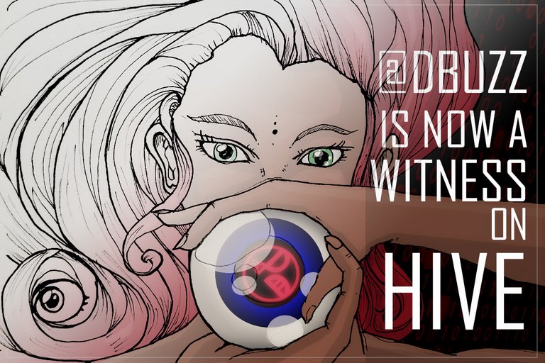
The title they wanted on the banner is :
@dbuzz is now a Witness on Hive
With that as a starting ground, my first step is usually to think on for a little bit what graphic might resonate with the words. For this one I connected with the word "witness".
witness means eyeballs because they're seeing something so a focus on eyes.
The pencil sketch
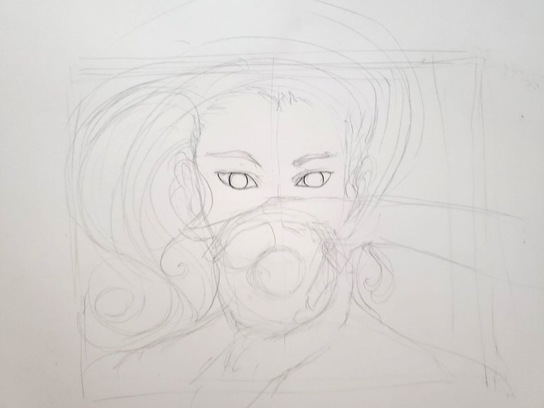
- I start by making a square roughly the size of the final image size that I want. The final image size is going to use is a standard 1200x800 at 72 DPI, so I make a bounding box that is slightly longer than it is tall, and I start to sketch out the drawing within it.
Inking the drawing
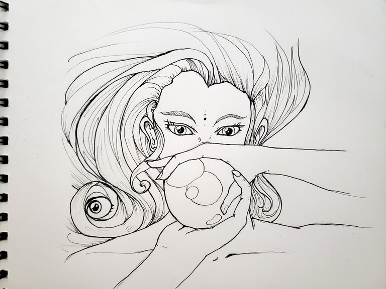
- This is the fun part to me. I start with the major lines and then work in smaller and smaller until I get something that feels about right. After this I erase all my pencil lines from the drawing and get ready to take a picture of it.
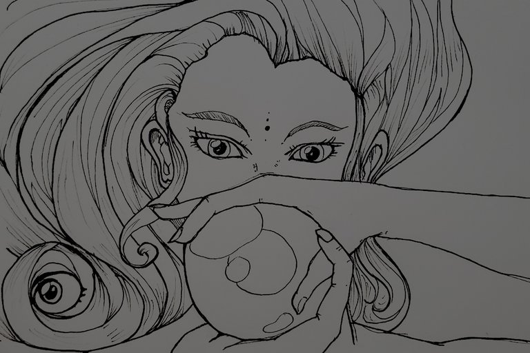
Into PhotoShop
I open up a new Photoshop document and send it to the required sizes that I want to have. In this case, 1200x800 pixels at 72 DPI.
I then set a neutral gray background, and drop my picture into it and scale it so it fills the image plane in a way I like.
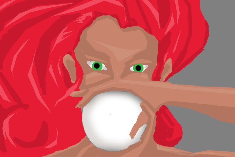
The photo I imported is in black and white so I set the layer to "multiply", and I get this image below.
Adding color
I go through and on layers below the artwork but above the gray, I start to paint first I do the hair followed by the skin and eventually the eyeball. If I remove all of the mind work this is what the color image looks like.
- I try to use three tones. I start with the middle tone and then add the shadow tone, and then the highlight tone.
- I decided to use the Circle tool in Photoshop to create a better round circle which then I painted a light gray shadow around create a bit of depth.
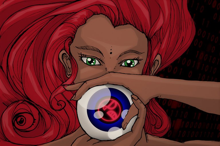
With the linework on top of it, and some background consideration for where the gray is left this is the image we have.

- I ended up using the Photoshop circle tool to make the eyeballs pop out a bit better with cleaner circles. I also added that digital code in the background that I got from a stock photo site for a bit of tech coolness / matrix like feeling.
Color correction
With the image kind of together to bring an overall harmony to the image I, grouped all my different Photoshop layers together into a folder ( select them all and hit control+g).
I duplicated this and then control+E to collapse them into one image while still keeping my original layers.
I opened up my levels tool and started to work with pushing and pulling the overall levels of the image to get a more dynamic feeling picture.
Here's the final results
- I find doing a final color correction pass harmonizes an image a little bit more and makes it feel harmonized.
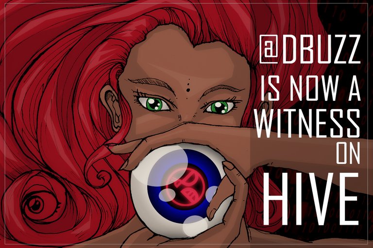
Text and a final product
The last step is to add the text to the image for the message.
In this case I use the agency font, and added a light gray square that I set to multiply, and the font in white on top of it.
I also made a black square on top of everything, that I sent to the mode "screen" so it disappears, scale that in just a little bit and put a white stroke on to create the white border around the outside edge.
Here's the final image that was delivered
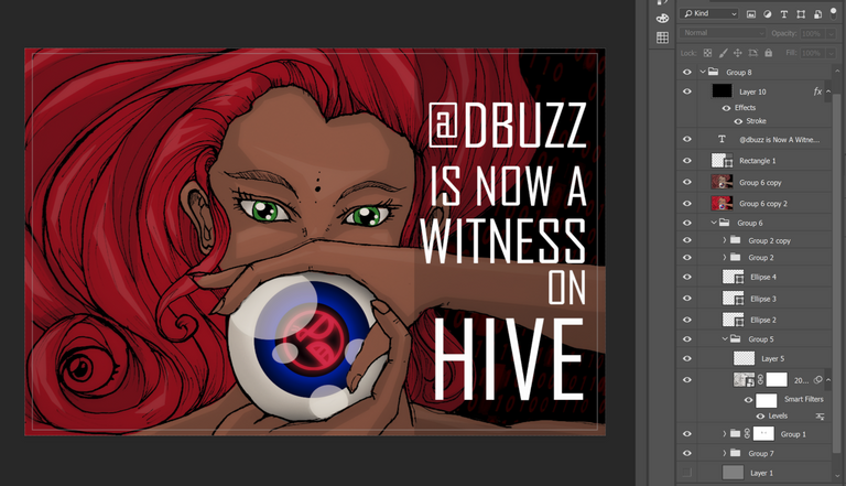
My Photoshop file how it looks
Summary
I was happy with the way this particular image turned out. However as one of my colleagues pointed out to me, the thumbs in the hands are backwards. Lol. Yes, this unfortunately was caught a bit too late.
Besides this however I think it was a good piece of work.
You can read the post that this is on as well as see the image online here :
https://peakd.com/hive-174578/@dbuzz/d-buzz-sets-up-a-witness-on-hive
- also I do recommend adding @dbuzz as a HIVE Witness. They really are a great group of people who are passionate about crypto currency and making this community grow!
Should you have any questions please post them below, I will do my best to address them.
Thank you for taking the time to read this post I hope you found some of it interest.
 |   Appcs : @RoamingSparrow Instagram : Instagram.com/roamingsparrow/ Smugmug : https://roamingsparrow.smugmug.com/ |
|---|
Any Support is Welcome!
Bitcoin (BTC) : 18zopjg9Y2VA1ouCqCZapN3UzdpK3UnMdm
Ethereum (ETH) : 0x849C33abCb753540fD0D6cDd25df05BC20a1254E
litecoin (LTC) : LdWUz5haDfkn4D1fxmte8nJePEGjJv6Lqh
Bitcoin Cash (BCH): 1DRRtY3j5xzx6Dn9ofQgoosXdqGVsYYNcU
NEED A LOGO - BUY ONE WITH CRYPTO!
You got curated good here @jacuzzi . . Great Job!
Thanks for the support @chrisrice ❤️❤️ You are one of the big reasons I am still on the block. :) !!
This is very cool! Hands! I have nightmares about drawing hands. You did a good job here with the hands. I remember few years back I tried to draw nothing but hands for a week....I'll never do that again. Reference, crisp lines, perspective, try my best is what I do now if I have to draw a hand. haha, This is great work my friend, and thank you for showing \ explaining the process I enjoy your work a lot. The style and coloring is awesome. Don't forget to join our new discord server and feel free to tell all your friends as well! 😀 https://discord.gg/zcr2Vns Much thanks! Looking forward to talking more. Keep up the great work!!
I wouldn't say that is a "handy" nightmare to have but might point to some issues... lol jk
thanks for the support @gre3n !❤️
You got it! Lol 😂😁👍🔥💯
😆