Sure I will do that right away so you can fit it in.
I thought as much that the words aren't not really visible again so I will do something about it.
Do you want me to drop it here?
And thank you for finding my entry fit.
Congratulations @dandays and @ubani1 we all did our best
See if this is a better fit concerning the words are much visible now
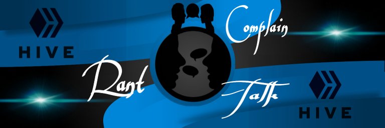
Very nice. I was considering touching up the profile pic a little bit, cutting out some gray specifically. But the blue in your background is nearly perfect and the gray border around the profile pic spaces perfectly. Very nice design @zanoz.
Love it when things work out the way they're supposed to
Biased? Sure, whatever, but I'm really proud of the Rant, Complain, Talk appearance.
Lol. Thank you but now I think we will need to bring back those gray as the Admin like it better😂😉
I kind of like the original silvery color of the words personally! Could we bring those back? :D I think squishing the Complain and Talk closer together will fit them on the banner, I think. How it shows up when I look at the community background is outside the circle is where it's getting cut off, so bringing them down a little bit further should do the trick!
And here is your silvery color and a squished writing :)
Fantastic, I think that should work out beautifully! I'll upload it now but it takes a few minutes to update on the community page.
!ENGAGE 25
I hope it does work out.
Thank you too
ENGAGEtokens.Hehe lol. Sure! Whatever the Admin likes :) give a few minutes then your design will be perfectly ready lol.
I hope the squishing won't pose a problem to the design because I thought it was better to space the words