![]()

Heute geht es um das Thema meiner Signaturen, das bereits in den letzten vorigen Beiträgen angeschnitten worden war (als erstes Bild meine aktuelle Signatur).
Soweit ich es bislang gesehen habe, benutzt der größte Teil der Künstler eine aus Initialen und/oder Namen(steilen) komponierte Signatur und ich bilde da keine Ausnahme.
Möglich, daß andere Künstler ihre Signatur von Anfang an für alle Zeiten definieren - bei mir hat sie eine lange Entwicklung durchgemacht:
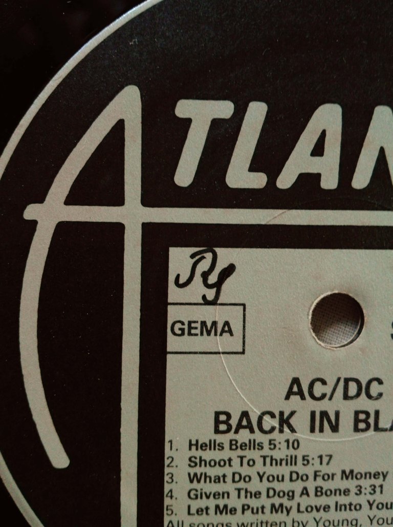
Als Jugendlicher habe ich meinem zweiten Namen (Michael) keine große Bedeutung beigemessen, sodaß meine erste Signatur nur aus den Initialen R (Rudolf) und S (Schmid) zusammengesetzt war. Wann sie entstanden ist, kann ich nur ganz grob schätzen, es könnte so um mein vierzehntes Lebensjahr gewesen sein. Zu jener Zeit war meine Familie frisch im eigenen Anwesen seßhaft geworden und jedes von uns drei Kindern bekam sein privates Zimmer. Meines wurde recht bald mit einer ziemlich schreienden, mehrfarbigen Malerei "verziert" und ich fing bald an, mich für Elektronik zu interessieren (=Fernseher zu zerlegen), was recht schnell dazu führte, daß ich ein paar alte Radios aus dem Sperrmüll zog. Eines kam von unseren Nachbarn und dieses benutzte ich irgendwann, um das Tonsignal aus einem selbstgebauten Plattenspieler (aus "Fischer-Technik") zu verstärken. Da es sich hierbei um die zweite Schallplatte handelte, die ich überhaupt besaß -gekauft auf einem in der Schule veranstalteten Flohmarkt- und diese, wie alle anderen Schallplatten meiner Sammlung, auf der inneren Hülle und auf der Scheibe, sprich: deren Etikett, selber signiert ist, schließe ich daraus, daß meine Signatur um diese Zeit entstanden sein muß. Es kann ein wenig später gewesen sein, denn ich könnte nicht verneinen, zu einem bestimmten Zeitpunkt die erste kleine Plattensammlung durchsigniert zu haben. Jedenfalls war dies die Signatur aus R und S.
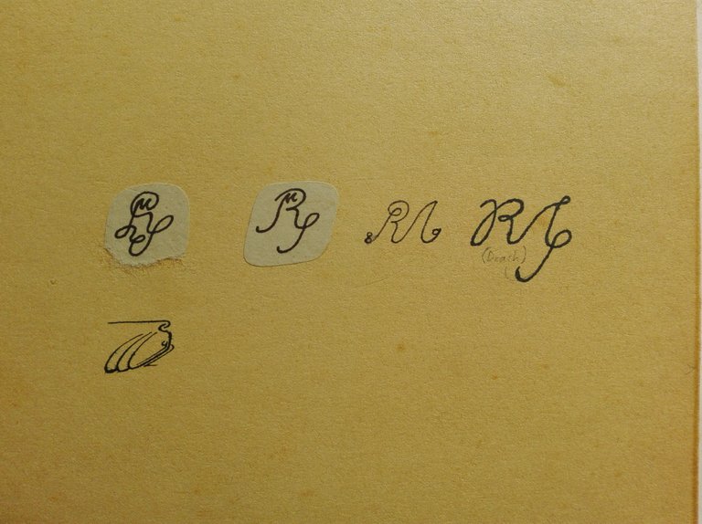
Die folgenden Signaturen habe ich irgendwann auf einer Mappe zusammengefaßt und es ist dieses Bild, woraus ich die Rückschlüsse über die weitere Evolution meiner Signatur ziehe.
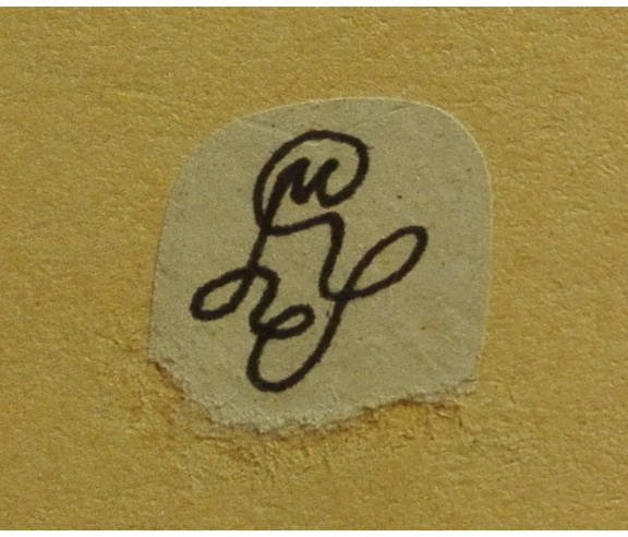
Da erscheint als erstes eine Signatur, die der ersten nicht unähnlich sieht, bereits das M beinhaltet und eine geschlossene Linie darstellt. Ich glaube, ich habe sie nicht oft benutzt ...
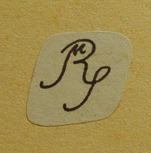
Als nächste ist eine Art "Rückbesinnung" zu sehen, klarere Linien, praktisch die erste Signatur mit dem Zusatz des kleinen M an der selben Stelle wie in der vorangegangenen. Diese Signatur dürfte ich einige Zeit verwendet haben.
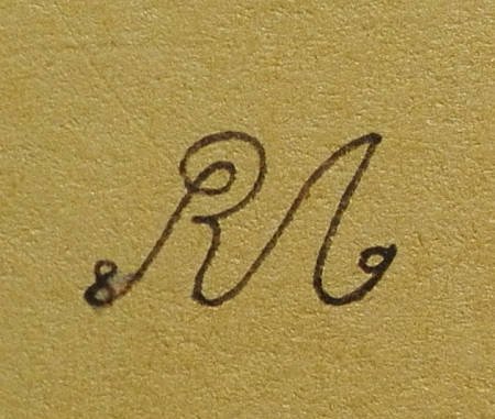
Dann kommt ein ziemlich radikaler Umbruch: das M übernimmt fast die gesamte Gestaltung der Signatur, wobei seine erste Hälfte aus S innerhalb des R besteht, dazu die letzten beiden Ziffern der Jahreszahl in An- und Ausschwung der handschriftlich gezogenen Linie. Diese Signatur ist hier mit dem Jahr 1989 eingebracht, woraus ich schließen würde, daß es sich um das Jahr der Entstehung dieser Signatur handelt. Diese Vermutung wird unterstützt von der Tatsache, daß die genannte Mappe die ersten Pausen aus meiner Lehrzeit enthält, die 1988 begann und: es ist die erste direkt auf den Karton geschriebene Signatur (die vorigen beiden sind aufgeklebte Ausschnitte von anderen Blättern), sehr wahrscheinlich zur Identifizierung der Mappe aufgebracht.
Anschließend erscheint diejenige Signatur, die meines Wissens nur ein einziges Mal verwendet wurde und zwar in einer mit Bleistift auf Glas dekorierten Fläche im Dreiecksschach "Drach" (dessen Geschichte ich mir jetzt verkneifen muß). Wieder etwas verschnörkelter, fast im Stil der 2. Signatur (1. auf der Mappe); dem M etwas Gewicht entzogen und dem S etwas mehr Bedeutung zugeordnet.
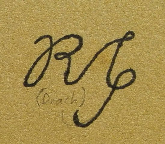
Zum Schluß: die Signatur, die ich heute noch verwende. Sie ist hier auf 1992 datiert und das kann leicht hinkommen. Mit den vorigen hat sie eigentlich nur die Initialen gemeinsam, vom Aufbau her ist sie ganz anders und wie man sieht, hat sie mich so überzeugt, daß ich sie seit nun 26 Jahren benutze.
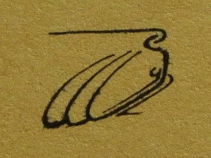
Dieses ist die "Linienversion"; auf manchen Werken erscheint eine vielleicht als "Kalligraphieversion" beschreibbare Ausführung, die der Vektorgraphik (erstes Bild im Post) nahe kommt - es ist anzunehmen, daß es sich um "Mutter und Kind" handelt. Mitunter zieht sie sich etwas in die Breite, das kommt am ehesten vor, wenn auf dem Werk viel Platz für die Signatur "übrig" ist ;-)


Today is about the topic of my signatures, which had already been mentioned in the last previous contributions (first picture: my current signature).
As far as I have seen it so far, most of the artists use a signature composed from initials and/or names (or parts of names) and I am no exception.
It is possible that other artists define their all-time-signature right from the beginning - with me it has undergone a long development:
As a teenager I did not give much importance to my second name (Michael), so that my first signature was only composed of the initials R (Rudolf) and S (Schmid). I can only roughly estimate when it came into being, it could have been about my fourteenth year of life. At that time my family had settled down in their own property and each of us three children got a private room. Mine was soon "decorated" with a rather screaming, multicolored painting and I soon began to be interested in electronics (= disassembling TVs), which quite quickly led me to pull a few old radios out of the bulky waste. One came from our neighbours and at some point I used it to amplify the sound signal from a self-made record player (using "Fischer-Technik"). The photo shows the signature on the first record I ever owned and since it is signed, like all other records in my collection, on the inner cover and on the disc itself, i.e. its label, I conclude from that the signature must have originated around this time. It may have been a little later, because I could not deny having signed through the first small record collection at a certain time. Anyway, this was the signature made of R and S and with a little imagination one can recognize these initials, in handwriting (in contrast to print), although it is written a little bit ugly here.
I have summarized the following signatures on a folder and it is this picture from which I draw the conclusions about the further evolution of my signature.
First a signature appears, which is not dissimilar to the first one, it already contains the M and represents a closed line. I don't think I've used it much...
Next is a kind of "comeback ", clearer lines, practically the first signature with the addition of the small M in the same place as in the previous one. I guess I used that signature for some time.
Then comes a rather radical change: the M takes over almost the entire design of the signature, whereby its first half consists of S within the R, in addition the last two digits of the year are placed in the up and down swing of the line drawn by hand. This signature was introduced here in 1989, from which I would conclude that it is the year in which it was created. This assumption is supported by the fact that this folder contains the first tracings from my apprenticeship, which began in 1988 and: it is the first signature written directly on the cardboard (the previous two are glued excerpts from other sheets), very probably applied to identify the folder.
Next: the signature that was only used onceas far as I know; it appears in a surface decorated with a pencil on glass in the triangular chess "Drach" (the story of which I now have to stifle). Again a little more ornate, almost in the style of the 2nd signature (first on the folder); some importance removed from the M and a little more importance given to the S.
And then, finally, the signature I still use today. It's dated here to 1992, which is quite likely to be its creation year. It has only the initials in common with the previous ones, but is completely different in its structure and as you can see, it has convinced me so much that I have been using it for 26 years now. The photograph shows is the "line version"; in some works a version that may be described as "calligraphy version" appears that comes close to the vector graphics (first image of the post) - it can be assumed to be "mother amd child". Sometimes it stretches in width, which is most likely when there is a lot of space left on the work for the signature ;-)

Hoy trataré el tema de mis firmas, que ya mencioné en las últimas contribuciones anteriores (como primera imagen: mi firma actual).
Por lo que he visto hasta ahora, la mayoría de los artistas usan una firma compuesta por iniciales y/o nombres (o partes de nombres) y no soy una excepción.
Es posible que otros artistas definan su firma desde el principio para siempre - conmigo ha experimentado un largo desarrollo:
En mi adolescencia no le di mucha importancia a mi segundo nombre (Michael), por lo que mi primera firma sólo estaba compuesta por las iniciales R (Rudolf) y S (Schmid). Sólo puedo estimar de manera aproximada cuándo nació, podría haber sido alrededor de mi decimocuarto año de vida. En ese momento mi familia se acababa de asentar en la casa se su propiedad y cada uno de los tres niños recibimos una habitación privada. La mía pronto fue "decorada" con una pintura multicolor bastante chillona y pronto empecé a interesarme por la electrónica (=desguazar televisiónes), lo que me llevó rápidamente a sacar unas cuantas radios viejas de la "basura voluminosa". Una vino de nuestros vecinos y en algún momento la usé para amplificar la señal de sonido de un tocadiscos de fabricación propia (usando "Fischer-Technik"). La foto muestra la firma en el primer disco que he tenido y, como todos los demás discos de mi colección, está firmado en el estuche interior y en el disco mismamente, es decir, en su etiqueta, concluyo que mi firma debe haberse originado en esa época. Puede que haya sido un poco más tarde, porque no podía negar haber firmado la primera pequeña colección de discos en un momento dado. De todos modos, esta fue la firma compuesta por R y S y con un poco de imaginación se pueden reconocer estas iniciales, en letra de escribir (en contraste con la letra impresa), aunque aquí esté un poco mal escrita.
He resumido las siguientes firmas en una carpeta y es esta imagen de la que saco las conclusiones sobre la evolución posterior de mi firma.
Primero aparece una firma que tiene cierto parecido con la primera, ya contiene la M y representa una línea cerrada. No creo que lo haya usado mucho...
A continuación una especie de "vuelta a los orígenes", líneas más claras, prácticamente la primera firma con la adición de la pequeña M en el mismo lugar que en la anterior. Creo haber usado esa firma durante algún tiempo.
Luego viene un cambio bastante radical: la M se hace con casi todo el diseño de la firma, por lo que su primera mitad consiste en S dentro de la R; se añaden los dos últimos dígitos del año en el inicio y el final del trazo. Esta firma se muestra aquí con el año señalado como 1989, concluiría que es el año en que se creó. Esta suposición es apoyada por el hecho de que esta carpeta contiene las primeras prácticas de mi formación profesional, que comenzó en 1988 y: es la primera firma escrita directamente en el cartón (las dos anteriores son recortes pegados de otras hojas), muy probablemente aplicada para identificar la carpeta.
Siguiente: la firma que, por lo que yo sepa, sólo se utilizó una vez; aparece en una superficie decorada con lápiz sobre vidrio en el ajedrez triangular "Drach" (otra historia, de la que ahora me tengo que aguantar las ganas de contar). De nuevo un poco más adornada, casi al estilo de la 2ª firma (primera en la portada); un poco de peso quitado de la M y un poco más de significado asignado a la S.
Finalmente: la firma que aún uso hoy. Está fechada aquí de 1992, y es fácil que esa el año en que se creó. Sólo tiene las iniciales en común con las anteriores, es completamente diferente en su estructura y como se puede ver, me ha convencido tanto que la llevo usando ya por 26 años. Esta es la "versión línea"; en algunas obras aparece una versión que puede describirse como "versión caligráfica", que se acerca a la versión en gráficos vectoriales (la primera imagen del post) - se puede suponer que se trate de "madre e hijo". A veces me sale un poco estirada de anchura, lo que es más probable cuando en la obra sobra mucho espacio para la firma.
Congratulations @rudomis! You have received a personal award!
Click on the badge to view your Board of Honor.