Pink Floyd’s Dark Side Of The Moon was originally released in 1973 as a gatefold LP sleeve designed by Hipgnosis and George Hardie. Hipgnosis had designed several of the band's previous albums, with controversial results; EMI had reacted with confusion when faced with the cover designs for Atom Heart Mother and Obscured By Clouds, as they had expected to see traditional designs which included lettering and words. Designers Storm Thorgerson and Aubrey Powell were able to ignore such criticism as they were employed by the band.
For The Dark Side of the Moon, keyboardist Richard Wright instructed them to come up with something "smarter, neater – more classy".
According to a September, 2011, interview with Thorgerson in “Rolling Stone Magazine,” the prism design was inspired by a photograph that Thorgerson had seen during a brainstorming session with Powell:
“It related mostly to a light show. They hadn’t really celebrated their light show. That was one thing. The other thing was the triangle. I think the triangle, which is a symbol of thought and ambition, was very much a subject of Roger’s lyrics. So the triangle was a very a useful – as we know, obviously – was a very useful icon to deploy and making it into the prism – you know, the prism belonged to the Floyd.”
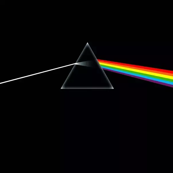
The artwork was created by their associate, George Hardie. Hipgnosis offered the band a choice of seven designs, but all four members agreed that the prism was by far the best. The final design depicts a glass prism dispersing light into color. The design’s sybolism represents three elements; the band's stage lighting, the album lyrics, and Wright's request for a "simple and bold" design.
The spectrum of light continues through to the gatefold – an idea that Waters came up with. Added shortly afterwards, the gatefold design’s interior also includes a visual representation of the heartbeat sound used throughout the album, and the back of the album cover contains Thorgerson's suggestion of another prism recombining the spectrum of light, facilitating interesting layouts of the sleeve in record shops
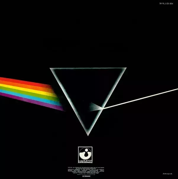
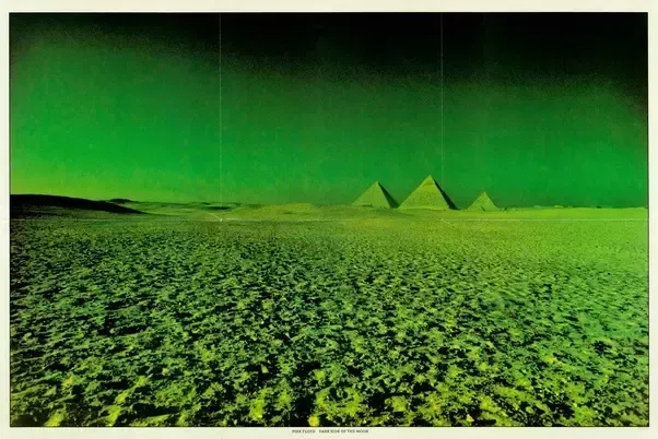
The light band emanating from the prism on the album cover has six colors, missing indigo compared to the traditional division of the spectrum into red, orange, yellow, green, blue, indigo and violet. Inside the sleeve were two posters and two pyramid-themed stickers. One poster bore pictures of the band in concert, overlaid with scattered letters to form PINK FLOYD, and the other an infrared photograph of the Great Pyramids at Giza, created by Powell and Thorgerson
The album has been the best selling in history and the art is now one of the most iconic ever created
Storm Thorgerson: How I Designed the Cover of 'Dark Side of the Moon'
I have a feeling I read this article somewhere else. Deja Vu.
Hi! I am a robot. I just upvoted you! I found similar content that readers might be interested in:
https://www.quora.com/What-is-the-symbolism-behind-the-cover-art-for-Pink-Floyds-%E2%80%9CDark-Side-of-the-Moon-album