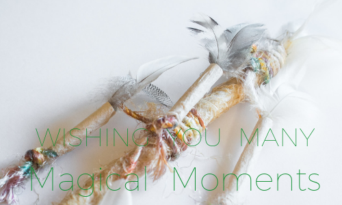
It makes me feel really happy that you enjoyed the colours @minismallholding. The blues would help to give a soothing effect while the oranges and tans add a touch of warmth.
I've always loved working with complementary colours in art ie colours opposite each other on the colour wheel, like blue and orange. Generally, you have to be very careful with the proportions of each because equal amounts of complementary colours will result in muddy tones. But just a little of one will darken the tone of the other and give you lovely subtleties. ♥︎♥︎⚖️♥︎♥︎

You've done it perfectly then. 😁 I've never been great at getting balances like that right. I'd have ended up with muddy. 😆
Posted using Partiko Android