Okay, let’s just admit it, I do have a bee in my bonnet. Well to be fair and honest, the bonnet’s so full of them It would be difficult to squeeze another one in. But, the one in question is that good old one about compositional rules in photography.
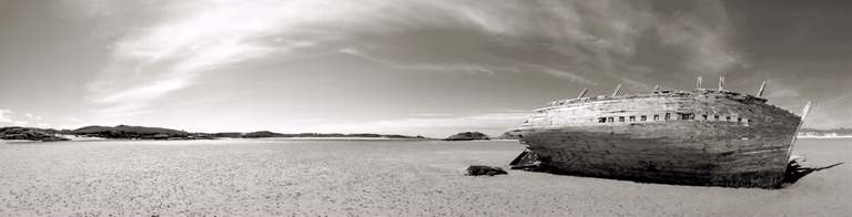
This shot shows little in the way of conventional rules. The main feature is the boat which leads out the shot in left to right following the arc of the clouds (a common side effect of extreme panoramas).
If ever I was going to write a big thick book about photography it would be about composition, and if I was going to write a really slim one it would be about composition. I think I first said that over thirty years ago when I was a very cocky 20 something and it was in a response to someone trying to explaining the thirds rule to an architect and the architect saying “don’t you really mean the 1.1618 golden ratio”. Now I think I have got it down to an essay…
The problem with compositional rules is that we can all meaningfully draw valid construction lines on any reasonably good picture, just as well as we can meaningfully draw similarly valid lines on some truly awful pictures. Indeed, the support for golden ratio of 1.1618 holds up about as much as the da Vinci Code – Its downfall is that we, as analytical entities, will see patterns and meanings in anything and everything. Furthermore, if we can find a magical number we will try to fit it to our analysis as a theory, for no other reason than is magic and it is so special it has to be true.

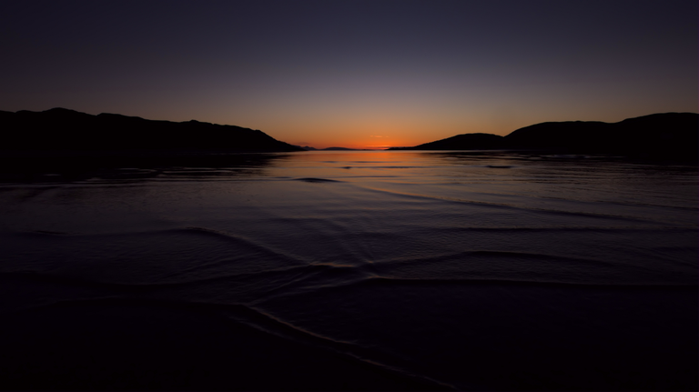
In this shot there is little use of thirds, its linear lines do not converge to any real point of interest. But, it has a narrative of two souls in the distance watching the twilight action of the waves rolling on the beach.
For now I have jumped ahead of myself, you see the nut of the problem is that we are not actually talking about rules, we are talking about aesthetics. Aesthetics are much less quantifiable than rules, this is because they are at the same time more complex, but as they assessed by our minds on auto-pilot, they appear so straight-forward and common-sensible that they are so simple that everyone should see my vision as I do.
In this our photographic aesthetics are like other cultural trends and fashion. In the pre-internet age when printed colour photographic magazines reigned supreme, the photographic aesthetic was driven by those chosen few, the editors. And we as readers had our aesthetic shaped by those magazines whose aesthetic we chose to follow to. Yes, editors and publishers were that powerful, to the point that brands, photographers and their agents, sought their attention eagerly as leverage to us all.
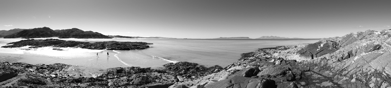
This shot has left to right balance without having true symmetry as such, as the islet of Sgeir Mhor and the mainland behind balance out the foreground rocks to the right. Tonally it is flawed as the sun’s highlight on the beach has been left bleached/clipped out, as it added to the visual dynamic of the shot.
By way of analogy it is practical to look at couple of other facets of human life that have a clearer view of aesthetics. Think of the food and music you most clearly associate with your own culture. In these you will have appreciations of elements that are distinct to your local cultural upbringing, nuances that are distinct and different to those from neighboring cultures. Now think of those elements of food and music that your culture pays tribute to by adoption or assimilation from another culture. As with anything there are what your will view as the good and the bad, and I know where I would put the Big Mac and musicals.
This conventional wide angle shot of is all about the symmetrical balance of the elements in the scene, demonstrating a Ying and Yang. As a narrative element, the symmetry is slightly offset to suggest that the viewer is walking on the symbolic road made up by the darker stone section of the shore that appears to lead towards the Isle of Rum in the distance
The thing is that the same factors apply to photography, and as to any other cultural element, be it literature, cinema, dance or sport.
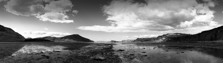
This panorama from the same viewpoint features all the same references, however in this the proportion the virtual horizon is relatively on a third. In comparison to the other shot the presence of a composition third make little or no difference to the aesthetics of the image.
Your cultural neighborhood can also be very flexible, and multi-faceted. You can be an aesthetic niche within your own culture, and that culture can be international – like the readers of this magazine, all with their own other aesthetic nuances that make up their individual composite aesthetic.
The other aspect is that aesthetics are cultural at a macro level; that is they apply to the particular niche society that you belong to, and were brought up in. As you grow you absorb shared aesthetic values, all of which enhance, amend and sometimes completely overwrite some deeply held aesthetic that previously held with pure conviction. Within all our life-times these cultural elements have become less pronounced as our world shrinks, and this is no bad thing (as this site amply shows), but they still evolve differently in different cultures (and that is not even considering the cultural exposure to technology).
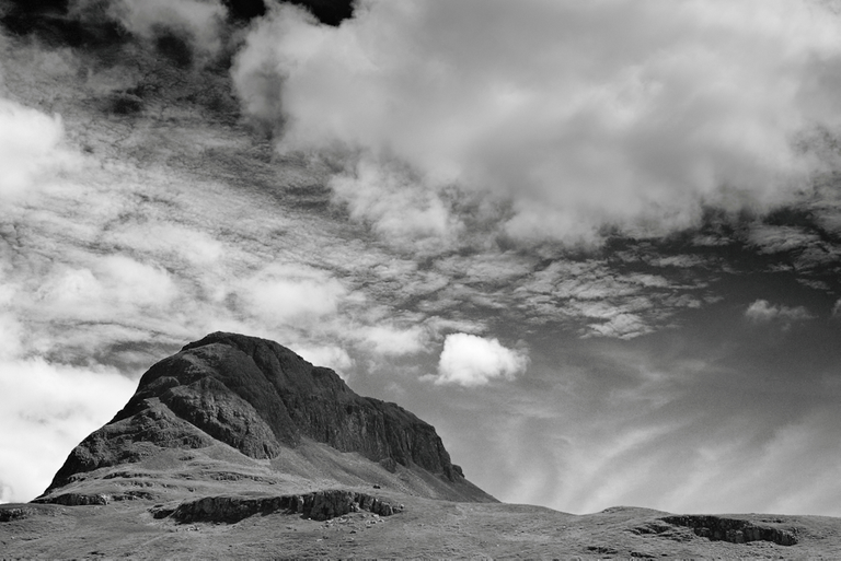
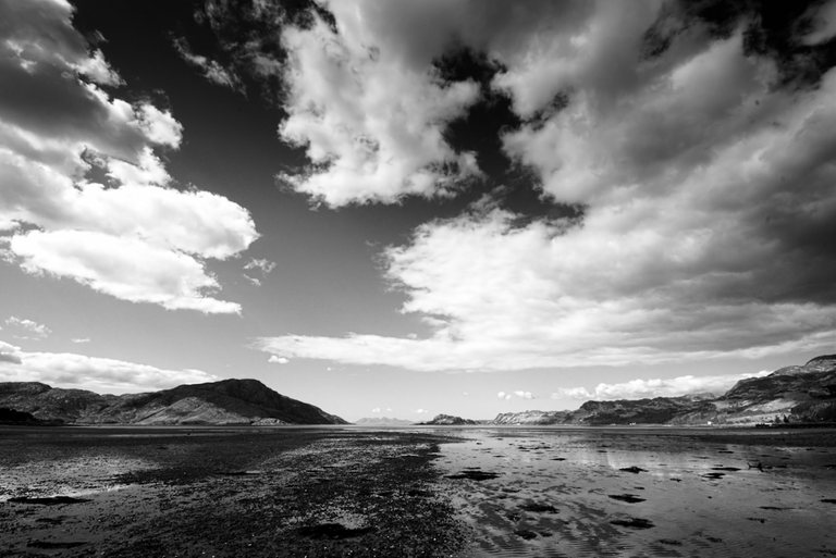
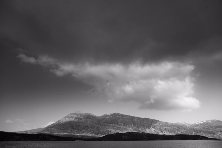
This shot show balance on a diagonal axis formed by the cloud type. If it weren't for the good fortune of having the delicate cloud balancing the mass of rock the scene just wouldn't have worked.
If you look back to the 1970s and 80s, when I was learning my trade, you could generally look at a photo and with a quick glance at the picture have a fair chance of saying it was German, French, American, or Japanese. Since then the world has become marginally less distinct on two grounds. Firstly, the geographic locality of film stock has virtually disappeared being displaced by globally leveled image processor and .raw interpretations. Secondly, due the likes of 500px, Flickr, Instagram and indeed Steemit, has given us exposure to a rolling 24 hour aesthetic melting pot. That is not to say that national and supra-national differences are still not there, it is just that they have become subtler, or nuanced, so that easy sweeping generalizations can no longer be satisfactorily applied.
So how has this melting pot all evolved? To answer that lets just look at the term used for out-of-focus background; Bokeh. The way it is commonly explained, it would be fair to think that this never existed until in the auto-focus camera age it was invented in Japan. This is nonsense, isn’t it. To be fair though, until lenses became faster and more complex the quality of out of focus areas was not an issue, basically because all relatively symmetrical lenses with the iris placed at the sweet-spot, will give well-blended out of focus imagery. But, when lenses are expected to zoom more, resolve more, give greater contrast, be unbelievably fast and be so light that auto-focus does not eat up batteries; then the quality of the image either side of the focus was a casualty of the other corrections, oh and production budgets. And so as prime adopters of technology, the first place to pick up on this as an issue in image quality, ah now that was Japan.
Although there the presence of a thirdish horizon line, this shot is all about the story of the geometry of the ripples that emerge out of the dark water, all the other elements of the shot serve to support the unusual interference patterns within their wake.
This adoption has come to us courtesy of the peak distribution period of the color magazine age in the 1990s. Firstly this became part of the Japanese photographic aesthetic due to magazine distribution in its native speaking area, before it then jumped to the US to be subsumed into the mainstream US aesthetic, and then as they say it jumped to the rest of the world via easily consumable English. Even the work Bokeh is a simplified Americanization of the Japanese for blur quality (ah, like Gaelic place names the cold translation is usually less romantic than the sound of it on our ears).
But in this adoption only the appreciation of the effect of out-of-focus has crossed the aesthetic bridge, this did not bring over any of the other cultural factors in Japanese photographic appreciation, or the greater Zen aesthetic at large that affects the larger Japanese cultural appreciation.
I could easily digress further in to the Zen aesthetic, and how its principles are a very useful way to apply to your thinking when creating a photograph, as they are in effect a very common-sense approach. But, I’m trying to be as cynically un-mystical and non-airy-fairie as possible.
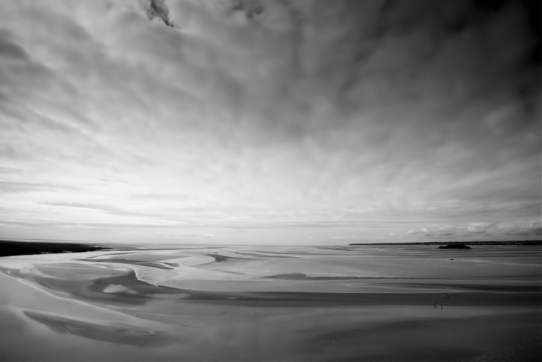
There is a nice thirdish line on the horizon, but the interest and story in this picture is in the swirls in the sand and the scale of the tiny ant like people making their way across the estuary’s sand to the islet.
But what are the other aesthetic elements that tend not to get carried over? Well, for example, those of us with a western upbringing have been cultivated to looking from the left to the right, due to the medium of our languages. Those from a language background that makes use of Arabic script have been cultivated to look from the right to the left. East Asian script languages can be multi-directional, reading horizontally and vertically, leaving them in an arguably more open in terms of directional visual appreciation.
It can also be argued that there is also a similar divergent visual reading characteristic that evolves with car drivers in relation to which side of the road you dive on, and this is simply based on where you look first for safety when pulling out at a T junction or approaching a roundabout.
So in our aesthetic we can see that the way we read a picture is shaped by the experiences that are the formation of our aesthetic. These are not hard rules, just local guidance.
Looking back at my old chestnut, the proportionality that underlies the rule of thirds and the golden rule likewise is also a culturally affected aesthetic. Just as the rule of thirds is an approximation of the golden rule, the golden rule is really just a mean of range of parameters that underlie the physical properties of our known universe. It is just that this mean roughly also coincides with a very special number, the ratio 1.1618.
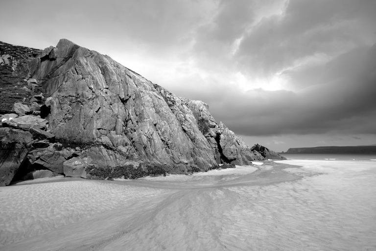
This shot is from my favourite place, and bares little reference to the formal rule book. It does however convey the path that the little burn takes to get around the huge mass of ancient rock to reach the sea, where it can carry on into the endless ocean. Tonally it is imperfect, as the bright patch in the sky has been allowed to burn out so that it implausibly gives the idea that it is illuminating the scene and is reflecting in the rocks. Implausibly, as this is due north, and thus a bit of a subtle fake that would have taken a darkroom ninja to produce in the good old days.
1.1618 is special in many ways, if you add 1 to it you get its square, if you subtract 1 you get its square route. If you draw a rectangle whose length-to-breadth is in the 1.1618 and cut out the largest square you can from it, you are left with another rectangle whose length-to-breadth ratio is 1.1618. And like π the full golden ratio is also difficult to pin down (1.1618 like 3.14 is simplified), it was calculated down to an accuracy of two trillion (2×1012 = 2,000,000,000,000) digits with no repetition – more than has been done for π.
But for all this number magic, it is not some universal key to nature itself, it just matches some of the averages, just like the much simpler and less dynamic rule of thirds. This because some of these essential matches to the averages are based on how they match up to the ideal human frame and proportions, and this had differential averages across the globe. Thus at the end of the day, although both these approximations are useful but not absolute; and a better philosophy may be to think of a rule of somewhere-about-a-third-ish. And at that, think of it as a fat fuzzy out of focus blur, rather than a hard line.
And, one last nail in magic numbers; these are only magic because we use a decimal numbering system, if we humans had settled on any of the other numbering systems that evolved during our development, we would have completely different magic numbers.
There are two elements I believe that are common to all aesthetics; Symmetry (or balance as I would prefer) and odd numbers, which are in a way opposing concepts.
We as humans are evolutionary hard-wired to equate symmetry as healthiness in attraction for a mate, and we as photographers should be aware that the model industry’s panacea is the symmetrical face – one of mankind’s true rarities.
Why do I equate this with balance? Well hard symmetry is at the end of the day rather boring. If you view this more of a complimentary balance, we are weighing one side of our symmetrical divide against another; a ton of feathers could balance a ton of bricks, or more photographically a bright yellow flower could balance a large grey cloud in terms of visual intensity. So, this is more of Ying and Yang than a glass mirror.
Conversely the odd number count makes things more interesting, because there is no simple symmetry in an odd number. In the disharmony the brain interprets, it will seek to make sense in its own way of the group, creating a hierarchy, shape or a line out of the entities. So, if we make use of our main or contributory subject(s) in 1s, 3s, 5s etc., then the compositional effects will have more potential. It is often stated that the effect works for 1 and 3, but not larger odd numbers, but this is not quite true. If in a group of say 7 objects, 4 of the objects are similar enough then the brain will tend to group these off as harmonious pairs, and the visual dis-harmony will focus on the remaining 3.
The big problem I have in tracing some aesthetic route is in appreciation of color, contract and the merits of breadth of tone in black and white. And, it is the one that over the course of my involvement with photography has taken the most to resolve in my mind, as on a personal aesthetic level it has a primary conflict.

Nothing centered, nothing on a third, innumerable elements to count and hardly a pure white or black — but a beautiful image that should appeal to the eye.
As this article has evolved I have related everything to a larger aesthetic, however to you dear reader it now really boils down to a personal basis. As I summarized above the loss of film from general use has left us in the hands of the camera’s digital processing engine; either to produce a .raw output, or an interpreted .jpg. This has at one fail swoop flattened the playing field, and broadened it out so that those with a modicum of IT user skills can manipulate an image to a level that would have seen them revered as a darkroom god back in the day. My own wet darkroom skills hover around the adequate level, but I knew some folk who could do things with a latent image that would leave me aghast and humble, and at that particularly the guys who worked unsung in a darkened corner of the newspaper press room. Now in this IT age, I can do more with some freeware than these heroes of mine could dream of, in less time it took them to dev and fix a final print from a perfect neg.
This leveling has come however, as a challenge to the individual aesthetic. Again, back in the day, I possessed an aesthetic style whose main contributing factor was Agfa’s pro films. This simply evolved due to a genius at Agfa flavoring the lick-strip on 120 film with aniseed, and as this tasted so much better than Kodak, I learned how to get the best from it. Nowadays is this route to “a look” achievable, not even close, as the parameters are so much bigger and complicated.
So where does all that relate to the composition rules that people appear to crave in our photographic world? Well, what it gives us is some clarity to that compositional rule-book, and drawing from aesthetics we can say that the following could be counted as aesthetic components (or rules if you really have to have them):
Story: Well a picture is pointless if it is not telling you something. This does not have to be a full-blown narrative tale or a documentary in an instant, it just should be the message you want to convey to your audience, the viewer. This can be as simple as; look here at this pretty flower isn’t it pretty, or it can try to tell the history of man’s impact on the landscape in the form of a portrait, but it still must tell you something.
Depth: If a photo looks flat, and does not convey some indication of depth to it, it is not going to have many admirers. If you think flat is cool, 14% grey tone cards can easily be run off the printer.
Proportion to content: Forget all rules of proportion for this one, it just has to look pleasing for its use. This will be different if the picture is to hang on a wall, or to be overwritten by typography in a photo layout, or indeed to compliment other pictures hug in a series such as a triptych. The golden prime is bunkum, as is the rule of thirds derived from it, if you must use a proportional rule may I suggest the rule of “thirdish or there abouts”. Better simply to give the image a flow or visual balance within the crop; allowing that is for its intended use.
Relative tonality: Don't get hung up on being Ansel Adams. Creating a histogram more beautiful than your picture is certainly a downfall. There are many perfectly exposed and developed pictures that are exquisitely presented, and still fail to capture the essence of the pictures story; always remember photography is more art than technique, and in that a full range of tones has a place in landscape photography, but that is not in everyplace.
Numerical harmony/disharmony: There is some truth in even number for harmony, odd for interest or tension. But the eye of your viewer will group and subgroup elements in your picture as suits them not you. So, if is fair to say this rule get interpreted as intended for simple subjects less than three.
Oh and one last one…
Technological novelty: A new technique or effect may well look astounding and be well received when it is new, but as time goes on subtlety usually wins out. As always there are exceptions that become part of the general aesthetic, but these are rare. If you want your image to date quickly, be at that cutting edge of gadgetry.
All the tone you could wish for, and a number of proportionality rules fulfilled — yes I can freely contradict myself.
So in summary, this should be all photographers libertarian mantra; I reserve the right to blissfully ignore composition rules completely, and relax into my own cultural aesthetic knowing that I’ll always be right with myself (at least at that moment).
Congratulations @scotgillespie! You have completed the following achievement on the Steem blockchain and have been rewarded with new badge(s) :
You can view your badges on your Steem Board and compare to others on the Steem Ranking
If you no longer want to receive notifications, reply to this comment with the word
STOPTo support your work, I also upvoted your post!
Vote for @Steemitboard as a witness to get one more award and increased upvotes!
Very well written and with stunning photo examples!
Manually curated by PhotoStreem: The Photography Tribe
Join Photostreem DISCORD
Follow the Trail
Congratulations @axeman, you are successfuly trended the post that shared by @scotgillespie!
@scotgillespie got 6 TRDO & @axeman got 4 TRDO!
"Call TRDO, Your Comment Worth Something!"
To view or trade TRDO go to steem-engine.com
Join TRDO Discord Channel or Join TRDO Web Site
Thank you very much
Hello @scotgillespie, thank you for sharing this creative work! We just stopped by to say that you've been upvoted by the @creativecrypto magazine. The Creative Crypto is all about art on the blockchain and learning from creatives like you. Looking forward to crossing paths again soon. Steem on!
Thank you very much, and great to learn from yourselves as well.
That was an opus!
Yip, a former magazine article (which I have one or two) just looking for a new home ;-)
If this was the appetizer, maybe you should!
Very interesting topic. Composition has always been a nightmare for me, since I don't think of myself as a very "creative" person, and I tend to look for rules to apply mechanically. I've known amateurs who knew next to nothing about photography but managed to take amazing shots just because they didn't have to think about it, they just felt them. I guess I have to take the long road - and this kind of "essay" is extremely helpful.
Thank you very much. I do have another article/essay on Japanese Aesthetics which I will probably put up next week, which may be of interest.
👍
~Smartsteem Curation Team
Many thanks