• Sign in
  • Sign up 
  • Welcome
  • FAQ
  • Block Explorer 
  • Night Mode
  • Stolen Accounts Recovery 
  • Change Account Password 
  • Vote for Witnesses 
  • Hive Proposals 
  • OpenHive Chat 
  • Developer Portal 
  • Hive Whitepaper 
  • Privacy Policy
  • Terms of Service
logo
  • Posts
  • Proposals
  • Witnesses
  • Our dApps
LoginSign up

This Is What A World Map Looks Like When Scaled According To Population Size

crypt0mine (51)in #stats • 9 years ago

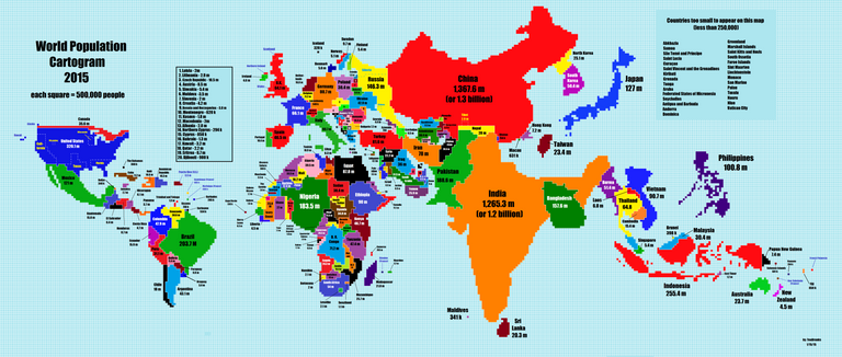
This map changes your perspective on the world we are living on... interesting how small Canada, New Zealand and Australia are. I found this and thought this is definitely worth sharing.

See the full size image here

@crypt0mine

#story #life #population
9 years ago in #stats by crypt0mine (51)
$0.00
    7 votes
    • crypt0mine
    • edgarsart
    • wuyueling
    • darkminded153
    • dreagonhaise
    • rusla
    • hanamana
    Reply 1
    Sort:  
  • Trending
    • Trending
    • Votes
    • Age
  • [-]
    hanamana (60)
     9 years ago  

    interesting.

    $0.00
      Reply