RE: $250,000 set aside to fund a STEEM upgrade to EOS architecture has just been been given to the STEEMJET community for their dedication to promiting steem global adoption
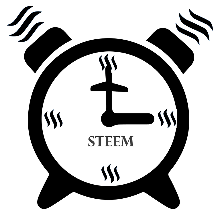
I love the immediacy and power. The steem logos sideways = soundwaves emitted from the bells is true genius. Not only motion, but motion and sound .
The perfection of minimal/balance is nearly complete.
Remove the hands and center dial of the clock entirely and just leave the black and white jet pointing up but not touching the steem logo at noon. Everything else is perfect except the logo at 3 oclock needs to straighten up and move left just a touch. @jogreh taught me that if you nail enough basic elements of the clock, then you can completely eliminate others and still feel the full effect, in fact, you multiply the effect the more you can remove. It is usually too dificult to remove elements, but because you made an ALARM clock by adding the legs, bells (with soundwaves), then your reward for adding such clear elements to the outside of the image is that you now get to remove elements on the inside (in this case the hands). And since you wrote in letters only "STEEM" all you need to do now is EXPOSE CLEARLY the jet (try to make the jet wings connect to the body of the plane at the same location, the symmetry is a little off which will be more noticeable as the image becomes clearer).
Maybe if you just put the jet in the center where the right wing is pointing to the 3 and left is pointing to 9 and nose to noon, it will be spectacular because the wings will be taking the place of the clock hands.
Overall, everything on the outside of the circle and 4 steem logos at 3,6,9,12 is beyond perfect, it's magic. I love how you have made steem waves into soundwaves, and then time numbers simultaneously. It makes the viewer subliminally question what is steem, and since we choose steem as our money, we now have the viewer subconsciously questioning "what is money/currency/value"
Profoundly simple and beautiful and most of all truly truly effective. Because after all, these contests are only a means to an end where we can teach our 4 basic concepts (that get progressively more difficult to comprehend). We are going to have the first crypto market course on fundamental analysis (everyone else only does technical analysis which is only what you should do AFTER you choose to buy an asset for a fundamental reason). We are explaining the fundamental reasons why the crypto market is coming into focus as it is. And your image is coming into focus absolutely perfectly. I have no doubt that you are only a couple tweaks away from mvp of next week honors. Bravo, thank you maestro.
Your ability to bring in so many intangible elements with just black and white is on par with your previous design which frankly I can't believe how consistently your talent shines.
Brilliant work again my friend!
Everyone knows that you first put a puzzle together boarder first, then work your way methodically inwards. This puzzle is nearly complete, all you need to do is re-arrange a few pieces in the middle and this image will explode.
Good enough, the asymetry of the tail is growing on me. You are a master magician my friend!
97/2203
Just a couple white pixels taking out the inside black circle at 3 oclock, but other than that, this masterwork is going straight into the showcase!
I hate to critique such a master, but if you make the jet's tail on the right, into the same shape as it is on the left (looks more animalistic, I like it) , and fix the circle at 3 o'clock, then I will promise never to self-vote until I have maxed out your comments (all 100% upvotes) until my debt to you is paid in full.
Seriously, it's perfect, please check out the other contests, I will be bringing them all into focus as time allows. Your work cuts straight to the soul of what I am trying to accomplish. You are a pro at capturing the essence of what someone else is looking for. Twice now, you did exactly what I asked. I would love to see some of your original work.
I hope you stick around because the kids book idea is going to be a lot of work (several pages of illustrations). And your images are going to be planted throughout.
I went back and looked at the original logo and I can't get over the fact that I am loving the assymetry
Especially on the wings, how they don't connect in the same part of the middle of the plane, because the illusion of the circle (and angled plane) conceals it brilliantly. And the tail being assymetrical reinforces the fact that the jet in this image is a living being like the ships in Battle Star Galactica. The only reason it looked weird on the clock image is because the plane was pointed straight up and was not going through any shapes to meld the image. We are not perfect, people are not perfect, nature is not always symmetrical, and what I truly believe is that these are 2 tools are perfect for what we are going to use them for:
The pleasure remains mine, and like i’ll always say, i’m obligated to serve. Time and chance might not allow me do that perfectly, but any little opportunity I get to work for this course, I do it with all deligence. Thank you for letting me serve, i’m truly glad. @dimimp
70/2230
I love the immediacy and power. The steem logos sideways = soundwaves emitted from the bells is true genius. Not only motion, but motion and sound .
The perfection of minimal/balance is nearly complete.
Remove the hands and center dial of the clock entirely and just leave the black and white jet pointing up but not touching the steem logo at noon. Everything else is perfect except the logo at 3 oclock needs to straighten up and move left just a touch. @jogreh taught me that if you nail enough basic elements of the clock, then you can completely eliminate others and still feel the full effect, in fact, you multiply the effect the more you can remove. It is usually too dificult to remove elements, but because you made an ALARM clock by adding the legs, bells (with soundwaves), then your reward for adding such clear elements to the outside of the image is that you now get to remove elements on the inside (in this case the hands). And since you wrote in letters only "STEEM" all you need to do now is EXPOSE CLEARLY the jet (try to make the jet wings connect to the body of the plane at the same location, the symmetry is a little off which will be more noticeable as the image becomes clearer).
Maybe if you just put the jet in the center where the right wing is pointing to the 3 and left is pointing to 9 and nose to noon, it will be spectacular because the wings will be taking the place of the clock hands.
Overall, everything on the outside of the circle and 4 steem logos at 3,6,9,12 is beyond perfect, it's magic. I love how you have made steem waves into soundwaves, and then time numbers simultaneously. It makes the viewer subliminally question what is steem, and since we choose steem as our money, we now have the viewer subconsciously questioning "what is money/currency/value"
Profoundly simple and beautiful and most of all truly truly effective. Because after all, these contests are only a means to an end where we can teach our 4 basic concepts (that get progressively more difficult to comprehend). We are going to have the first crypto market course on fundamental analysis (everyone else only does technical analysis which is only what you should do AFTER you choose to buy an asset for a fundamental reason). We are explaining the fundamental reasons why the crypto market is coming into focus as it is. And your image is coming into focus absolutely perfectly. I have no doubt that you are only a couple tweaks away from mvp of next week honors. Bravo, thank you maestro.
Your ability to bring in so many intangible elements with just black and white is on par with your previous design which frankly I can't believe how consistently your talent shines.
Brilliant work again my friend!
Everyone knows that you first put a puzzle together boarder first, then work your way methodically inwards. This puzzle is nearly complete, all you need to do is re-arrange a few pieces in the middle and this image will explode.
Modifications to my design as requested
Also a new art work I hope y’all wouldn’t like
https://steemit.com/steemjet/@shartzy/shartzy-s-timeless-timepeice
Ta-Daaa!
Good enough, the asymetry of the tail is growing on me. You are a master magician my friend!
97/2203
Just a couple white pixels taking out the inside black circle at 3 oclock, but other than that, this masterwork is going straight into the showcase!
I hate to critique such a master, but if you make the jet's tail on the right, into the same shape as it is on the left (looks more animalistic, I like it) , and fix the circle at 3 o'clock, then I will promise never to self-vote until I have maxed out your comments (all 100% upvotes) until my debt to you is paid in full.
Feel free to make more corrections sir, I hope I got it right this time tho.
Payday for shartzy! You are an idea machine!
145/2155
Seriously, it's perfect, please check out the other contests, I will be bringing them all into focus as time allows. Your work cuts straight to the soul of what I am trying to accomplish. You are a pro at capturing the essence of what someone else is looking for. Twice now, you did exactly what I asked. I would love to see some of your original work.
I hope you stick around because the kids book idea is going to be a lot of work (several pages of illustrations). And your images are going to be planted throughout.
I went back and looked at the original logo and I can't get over the fact that I am loving the assymetry
Especially on the wings, how they don't connect in the same part of the middle of the plane, because the illusion of the circle (and angled plane) conceals it brilliantly. And the tail being assymetrical reinforces the fact that the jet in this image is a living being like the ships in Battle Star Galactica. The only reason it looked weird on the clock image is because the plane was pointed straight up and was not going through any shapes to meld the image. We are not perfect, people are not perfect, nature is not always symmetrical, and what I truly believe is that these are 2 tools are perfect for what we are going to use them for:
Thank you so much your majesty!
The pleasure remains mine, and like i’ll always say, i’m obligated to serve. Time and chance might not allow me do that perfectly, but any little opportunity I get to work for this course, I do it with all deligence. Thank you for letting me serve, i’m truly glad. @dimimp
That was a great work bro, just checking oit those fine details the boss mentioned.
I created an instagram account for steemjet
Okay sir, notes and would be corrected soon.
I am with you @dimimp
Great explain about This steemjet LOGO.
I am ready to fly with this steemjet ha ha ha
Thank you once again.. i’m Committed to serve