
I can't believe people fall into the Technical Analysis pseudo-science-ish analysis of the markets. It's like forecasting from chicken bones or tarot cards. It's non scientific and it's just a way to keep people away from profits. It's basically a scam, whoever invented it. It's like substituting science for mysticism.
So let's use science instead of mysticism, I will analyze the BTC_USD market scientifically in this article, with real scientific tools, and not quackery.
QUANTITATIVE ANALYSIS OF THE BTC/USD MARKET
First of all we determine what the market is, statistically. The BTC_USD market is a heteroskedastic joint probability distribution, where the current price is the random variable that is confined to this statistical distribution. The market is also a continuous time series, since it's a function of time as well.
Now let's analyze the properties of it. I have gathered daily price data from Blockchain.info, from the first datapoints available up to Dec 4th. In total we have a sample of 2302 points, and we will analyze this data.

Since it's heteroskedastic, we can't estimate the true characteristics because it is changing, however we calculate the aggregate properties of this sample.
| Sample Property (T=2302) | Value |
|---|---|
| Mean | 239.40 |
| Median | 143.56 |
| Minimum | 0.060900 |
| Maximum | 1151.0 |
| Standard Deviation | 251.40 |
| Coefficient of Variation | 1.0501 |
| Skewness | 0.75597 |
| Ex. Kurtosis | -0.53753 |
| 5% Percentile | 0.28030 |
| 95% Percentile | 697.55 |
| Interquartile Range | 420.94 |
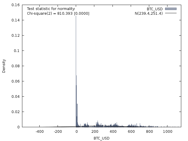
So far so good, we see that it's not a normal distribution. It has a positive skew meaning that higher prices happened less times, and the bulk of the price was at lower or closer to the mean. It has negative excess kurtosis or it's Platykurtic, meaning that it has thin tails, the price stayed less time around higher levels. 95% of the price was below 697.55$ price level.
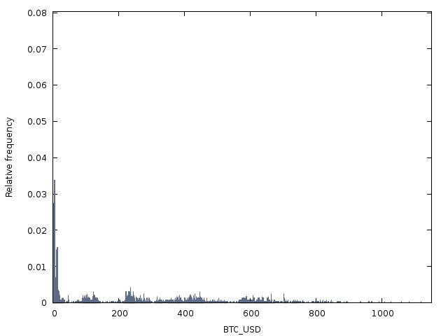
Let's plot a frequency chart (with 2301 bins) to estimate and view the sample distribution:
Obviously not a normal distribution, let's compare it to a normal distribution bell curve:
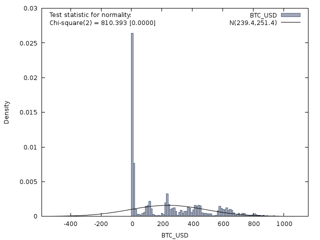
It's barely visible, that central spike is too big, so here it is with less bins:
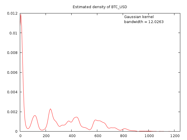
Perhaps a density plot shows the distribution better:
Normality Tests:
Doornik-Hansen test = 810.393, with p-value 1.06027e-176
Shapiro-Wilk W = 0.856609, with p-value 1.37073e-41
Lilliefors test = 0.197649, with p-value ~= 0
Jarque-Bera test = 246.977, with p-value 2.34266e-54
All of them reject the null hypothesis, for normality, the heteroskedasticity is confirmed.
Spectrum Analysis
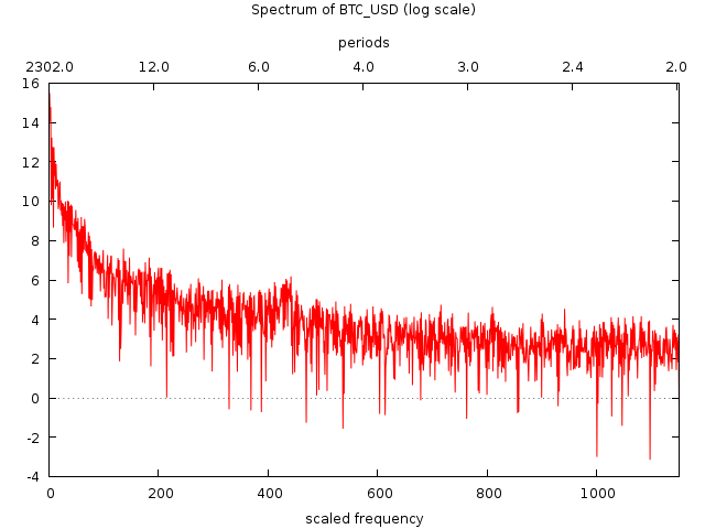
A spectral density graph reveals a lot about the concentration of signal into different frequencies or periods. Here is a top 10 breakdown of them, good to set moving averages around those numbers for example.
| Ω | scaled frequency | period | log spectral density |
|---|---|---|---|
| 0.00273 | 1 | 2302 | 15.459 |
| 0.00819 | 3 | 767.33 | 14.772 |
| 0.00546 | 2 | 1151 | 14.04 |
| 0.01365 | 5 | 460.4 | 13.218 |
| 0.02457 | 9 | 255.78 | 12.742 |
| 0.01911 | 7 | 328.86 | 12.734 |
| 0.03002 | 11 | 209.27 | 11.983 |
| 0.03548 | 13 | 177.08 | 11.893 |
| 0.02729 | 10 | 230.2 | 11.277 |
Auto-Correlation
For Autocorrelation tests we perform an ACF and PACF test.

The test shows us that the strongest correlation is at lag 1 level. Which means that the price is mostly defined by it's previous value, rather than older ones.
The Box-Jenkins method also tells us that:
Decay, starting after a few lags = Mixed autoregressive and moving average (ARMA) model.
It is minimum an ARMA(1,1) model with p=1, q=1. Since the first lag levels are the strongest.
I did a KPSS test for BTC_USD (including trend and seasonals):
| Variable | Value |
|---|---|
| T | 2302 |
| LAG | 502 |
| AIC | 30017.7 |
| Test | 0.0670265 |
| P-value > .10 (null hypothesis rejected) |
ADF test with constant and trend plus seasonal dummies:
- asymptotic p-value 0.1802 (null hypothesis rejected)
So d=1, and we also have seasonality. It's technically a SARIMA(1,1,1) model , a Seasonal ARIMA and it can be further estimated with "secret regressors", but I am not going deep into this, read my other analysis here, if you are interested in forecasting/modeling with regressors:
Volatility / Local Variance
The volatility of the price can be easily seen if we calculate the natural logarithmic difference:
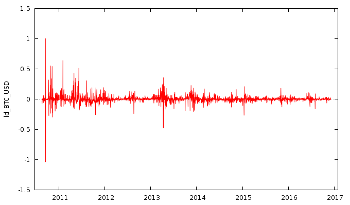
As you can see, the volatility is going down as Bitcoin gets more mature and liquidity increases. The volume at LocalBitcoins is astonishing, so it probability has to do with it.
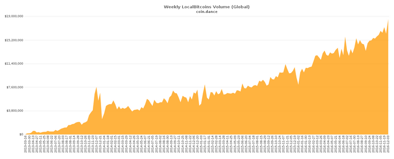
https://coin.dance/volume
The logarithmic difference function has the following properties:
| Sample Property (T=2301) | Value |
|---|---|
| Mean | 0.0040004 |
| Median | 0.0000 |
| Minimum | -1.0393 |
| Maximum | 1.0043 |
| Standard Deviation | 0.066946 |
| Coefficient of Variation | 16.735 |
| Skewness | 1.0119 |
| Ex. Kurtosis | 60.941 |
| 5% Percentile | -0.066603 |
| 95% Percentile | 0.090217 |
| Interquartile Range | 0.029708 |
| Missing Values | 1 |
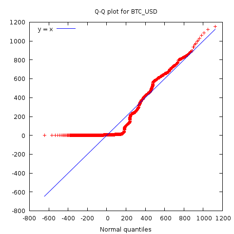
QQ Plot
Here is a QQ plot of the BTC_USD against it's sample mean:
Gini coefficient
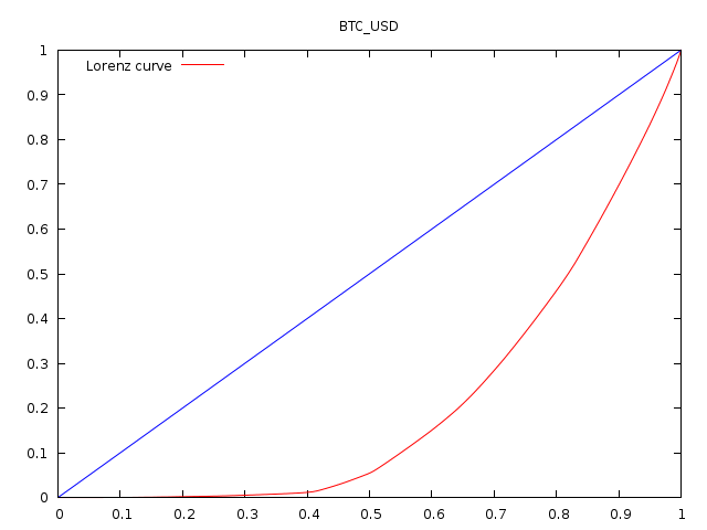
The Gini coefficient is used to measure statistical dispersion. It is widely used in economics to measure income inequality, but here it measures the inequality of the price distribution, or the smoothness.
Sample Gini coefficient = 0.572432
Estimate of population value = 0.572681
Range Mean Statistics
Since BTC_USD is heteroskedastic, it means that it's made up of different probability distributions joined together. We estimate the boundaries between the local distributions:

We determined that the price is best segmented in 49 segments, of the size of 47 observations, or days.
| date | range | mean |
|---|---|---|
| 2010-08-17 - 2010-10-02 | 0.1141 | 0.066584 |
| 2010-10-03 - 2010-11-18 | 0.438599 | 0.184284 |
| 2010-11-19 - 2011-01-04 | 0.097 | 0.264088 |
| 2011-01-05 - 2011-02-20 | 0.801002 | 0.642306 |
| 2011-02-21 - 2011-04-08 | 0.29 | 0.873304 |
| 2011-04-09 - 2011-05-25 | 8.1411 | 3.91267 |
| 2011-05-26 - 2011-07-11 | 26.5008 | 17.3969 |
| 2011-07-12 - 2011-08-27 | 6.0099 | 12.4839 |
| 2011-08-28 - 2011-10-13 | 5.34109 | 6.2073 |
| 2011-10-14 - 2011-11-29 | 1.82455 | 3.00614 |
| 2011-11-30 - 2012-01-15 | 4.29 | 4.52837 |
| 2012-01-16 - 2012-03-02 | 2.85555 | 5.63988 |
| 2012-03-03 - 2012-04-18 | 0.76706 | 4.9961 |
| 2012-04-19 - 2012-06-04 | 0.48112 | 5.15025 |
| 2012-06-05 - 2012-07-21 | 4.23 | 6.87492 |
| 2012-07-22 - 2012-09-06 | 6.63002 | 10.8339 |
| 2012-09-07 - 2012-10-23 | 1.9629 | 12.1282 |
| 2012-10-24 - 2012-12-09 | 3.08783 | 11.8449 |
| 2012-12-10 - 2013-01-25 | 5.79109 | 14.3668 |
| 2013-01-26 - 2013-03-13 | 30.1204 | 29.6119 |
| 2013-03-14 - 2013-04-29 | 190.88 | 107.013 |
| 2013-04-30 - 2013-06-15 | 45.959 | 118.065 |
| 2013-06-16 - 2013-08-01 | 44.1116 | 94.7816 |
| 2013-08-02 - 2013-09-17 | 34.47 | 114.173 |
| 2013-09-18 - 2013-11-03 | 102.38 | 148.598 |
| 2013-11-04 - 2013-12-20 | 925.9 | 691.525 |
| 2013-12-21 - 2014-02-05 | 321.71 | 788.192 |
| 2014-02-06 - 2014-03-24 | 250 | 626.464 |
| 2014-03-25 - 2014-05-10 | 184.7 | 465.133 |
| 2014-05-11 - 2014-06-26 | 239.98 | 567.415 |
| 2014-06-27 - 2014-08-12 | 84.91 | 609.379 |
| 2014-08-13 - 2014-09-28 | 170.14 | 472.612 |
| 2014-09-29 - 2014-11-14 | 136.4 | 362.776 |
| 2014-11-15 - 2014-12-31 | 70.91 | 353.331 |
| 2015-01-01 - 2015-02-16 | 139.65 | 241.836 |
| 2015-02-17 - 2015-04-04 | 62.52 | 260.029 |
| 2015-04-05 - 2015-05-21 | 41.03 | 234.565 |
| 2015-05-22 - 2015-07-07 | 50.97 | 240.798 |
| 2015-07-08 - 2015-08-23 | 83.26 | 273.705 |
| 2015-08-24 - 2015-10-09 | 33.43 | 234.084 |
| 2015-10-10 - 2015-11-25 | 191.26 | 313.518 |
| 2015-11-26 - 2016-01-11 | 113.16 | 419.466 |
| 2016-01-12 - 2016-02-27 | 78.28 | 398.062 |
| 2016-02-28 - 2016-04-14 | 35.18 | 417.9 |
| 2016-04-15 - 2016-05-31 | 105.44 | 455.634 |
| 2016-06-01 - 2016-07-17 | 222.96 | 648.909 |
| 2016-07-18 - 2016-09-02 | 158.144 | 602.686 |
| 2016-09-03 - 2016-10-19 | 44.0025 | 615.703 |
| 2016-10-20 - 2016-12-04 | 142.21 | 713.458 |
The range is just like the variance measurement except it's not squared, it's just the absolute value the price moved in that segment.
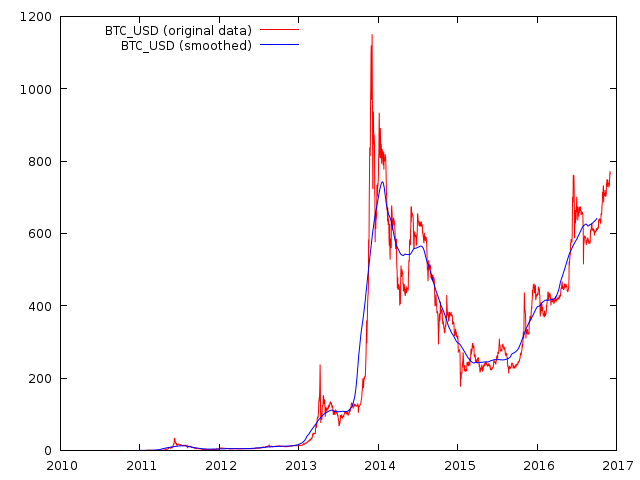
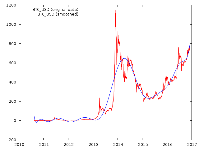
Filters
Finally, we will plot a few filters to see the smooth price.
Simple Moving Average 126 (because I found autocorrelation + high spectral density in this zone):
A 15th order polynomial trend:
And more advanced filter like a HP Filter with 8000 order of smoothness:

It can be used to play around with it, measure seasonality, cycles and whatnot.
THE END
Thanks for reading through, this has to be my longest article. Now you can see how to actually analyze the price with real statistical tools not with mysticism and quackery.
Upvote, ReSteem & 

but...but...what does it all MEAN?
It's just a complete analysis of the BTC/USD market.
A lot of information can be gained by doing this. This is more done to learn about the market from it's past behaviour, but this is not forecasting.
For forecasting I wrote another article:
https://steemit.com/bitcoin/@profitgenerator/the-profit-generator-ii-scientific-btc-usd-forecasting-model
It doesn't mean a thing because it has all changed in the time since it was posted!
Not entirely, this analysis is very useful, it's just not that obvious for people who are not quants.
For example my analysis shows that the best model that fits this is a SARIMA(1,1,1), which then can be used for forecasting.
Sorry to offend...it was a joke!
It can also be used for risk analysis for longer term investors, where they can measure the volatility and the trend of the future volatility.
And many more practical use cases, it's just that they are not that obvious at first look. A lot of information can be revealed from past data.
I studied statistical analysis in college and was particularly impressed in homoskedasticity (probably spelled wrong, it's been 25 years)in social sciences.
@richq11 Definitely working with homoskedastic models is very easy, but unfortunately all financial markets are hetero.
Exactly, a bit too complicated for me as well. I was hoping for a "To da moon!" tldr at the bottom ...
Well it certainly looks that way though based on my other research, but I didnt want to complicate this article with forecasts.
This article is just for examining and analyzing the market as it is.
All markets are just human behavior. One only needs to understand human behavior in order to understand market behavior.
Or vice versa, you can also learn human behaviour from empirical data.
Touché.
I share your skepticism...
Great article . Upvoted
But where are the intersecting lines? And the random joining of bar top/bottoms?
It's random, but not entirely, since it has somewhat a predictability, therefore it's seasonal.
There are no intersecting lines, it is just joined together smoothly. It's like if you put oil on top of water, they don't mix together, but you can also hardly see the boundary. The more you "zoom in" the more clear it gets, but the less accurate.
The best estimation here is that the local probability distribution changes every 49 days or observations.
Lol, this is splendid. I really do take my hat off to you. If this was a fairground I would have crossed your palm with silver!
Real cool article, you have my vote and followed also.
Tchnical analysis is "playing the market"; fundamental analysis is investing
Yes fundamental analysis is good for figuring out the way the market is headed, but the timing is what counts and for that you need this.
You dont want to invest early, because that exposes you to unecessary risk, and certainly not invest too late.
I was thinking more in terms of choosing stock in specific companies.
I have been out of the market for a long time now, but I did use both strategies in turn.
One of my better long term picks was Ruger (great fundamentals, carried a dividend, and I could play with options)
Upvoted because of all the work but I do quite well using Technical Analysis.
Your profits probably come from some other technique, there is no way TA can work. Maybe you do additional analysis or have other information about investing.
Nah bro, its all technical analysis and only technical analysis. My strategy has been backtested for years and I use risk management and I am very disciplined. I use harmonics and its worked consistently for me for years.
Is is falsifiable?
Is it repeatable?
Can it be peer reviewed?
How do we establish that it is working based on the scientific method?
https://en.wikipedia.org/wiki/Scientific_method
This post has been ranked within the top 80 most undervalued posts in the second half of Dec 05. We estimate that this post is undervalued by $6.03 as compared to a scenario in which every voter had an equal say.
See the full rankings and details in The Daily Tribune: Dec 05 - Part II. You can also read about some of our methodology, data analysis and technical details in our initial post.
If you are the author and would prefer not to receive these comments, simply reply "Stop" to this comment.