The candlestick techniques originated from Japanese for over 100 years. Homma, a Japanese trader in the futures market discovered the candlestick pattern In the early 1700s.
The markets were strongly influenced by the emotions of traders. He understood that when emotions played into the equation, a vast difference between the value and the price of occurred.
Homma's principles established the basis for the candlestick chart analysis, which is used to measure market emotions surrounding a stock.
The technique has become very popular among traders. Candlestick charting is a very complex and sometimes difficult system to understand.
Let's look at what a candlestick pattern is and what it can tell you about the market action.
Candlestick patterns are an excellent way to gauge market sentiment, but they shouldn't be the only tool in a trader's toolbox. but you need to harness yourself as a trader with other forms of technical analysis which i will share on upcoming post.
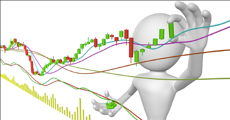
Candlestick Components
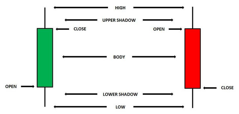
Figure 1: A candlestick
Above and below the real body are the "shadows". Some analyst have always thought of these as the wicks of the candle, and it is the shadows that show the high and low prices of that day's trading. If the upper shadow on the filled-in body is short, it indicates that the open that day was closer to the high of the day. A short upper shadow on a white or unfilled body dictates that the close was near the high. The relationship between the day's open, high, low and close determines the look of the daily candlestick. Real bodies can be either long or short and either black or white. Shadows can also be either long or short.
Basic Candlestick Patterns
In the chart below of Bitshares/USD trade, you see the "long green body" or "long red line". The long red line represents a bearish period in the marketplace. During the trading session, the price of bitshares was up and down in a wide range and it opened near the high and closed near the low of the day.
By representing a bullish period, the "long green body," or "long green line" is the exact opposite of the long red line. Prices were all over the map during the day, but BTS opened near the low of the day and closed near the high.
Spinning tops are very small bodies and can be either red or green. This pattern shows a very tight trading range between the open and the close, and it is considered somewhat neutral.
Doji lines illustrate periods in which the opening and closing prices for the period are very close or exactly the same. You will also notice that, when you start to look deep into candlestick patterns, the length of the shadows can vary.
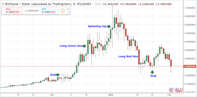
Figure 2: Daily chart of BTS/USD showing Doji lines and spinning tops
Source: Tradingview
Summary
The candlestick charting pattern is one that any experienced trader must know. As the Japanese traders discovered centuries ago, investors' emotions surrounding the trading of an asset have a major impact on that asset's movement. Candlesticks help traders to read the emotions surrounding a price action, and thus make better predictions about where that price might be going.
Your Comments and questions are highly welcomed.
If this blog post has entertained or helped you to profit,
please UPVOTE, FOLLOW, RESTEEM and/or consider giving some donations:
BTS Wallet - trizle1
BTC Wallet - 1AxEcPUi6nNQDaaT8CKTohmBKeYFhUJyFE
ETH Wallet - 0xDFf7E134291E1C82F98E3976be47BC3484F595B9
LTC Wallet - LbpwNMUYPj2uPMXh6RiDwvzap7UBtQGiAS
that is very helpful especially for newbies who just started trading ...lets work together ...
More topics will be released soon
Education is big think Good work! I love this colorful representation candles provide to price analysis. Inventing new ways of reasoning about price movements is also nice stuff and I produce some of it. Check it out here @, @@.
thanks for the comment
no pro mate!!