Hey @richardbmx ,
Thank you for the contribution. I liked your idea and concept.
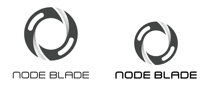
I think typeface looks weak when compare with the logo-mark. So, it can be better if you made the typeface more thicker on the logo-type version. Also, logo-mark should be smaller.
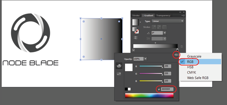
You can clearly specify the colors of gradient.
Your contribution has been evaluated according to Utopian policies and guidelines, as well as a predefined set of questions pertaining to the category.
To view those questions and the relevant answers related to your post, click here.
Need help? Write a ticket on https://support.utopian.io/.
Chat with us on Discord.
[utopian-moderator]
@baranpirincal Many thanks for your valuation I will get in touch with the project owner to make the changes greetings.
Thank you for your review, @baranpirincal! Keep up the good work!