Following up on my last post, where I showed off some of my illustrated contributions to the recent Tommy “Hitman” Hearns NFT Collection, here’s an extra look at some “behind the scenes” material as well.
My artwork creation process has been quite disorganized this year. In fact, it hasn’t really been much of a process at all, more a series of experiments... and thus the disorganization!
When confronted with an unfamiliar challenge and hitting a brick wall, I can always fall back on my comic book roots and that happened in the case of these illustrations.
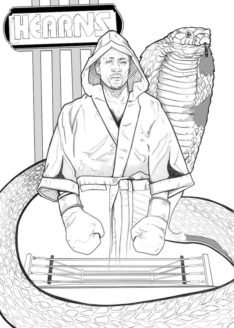
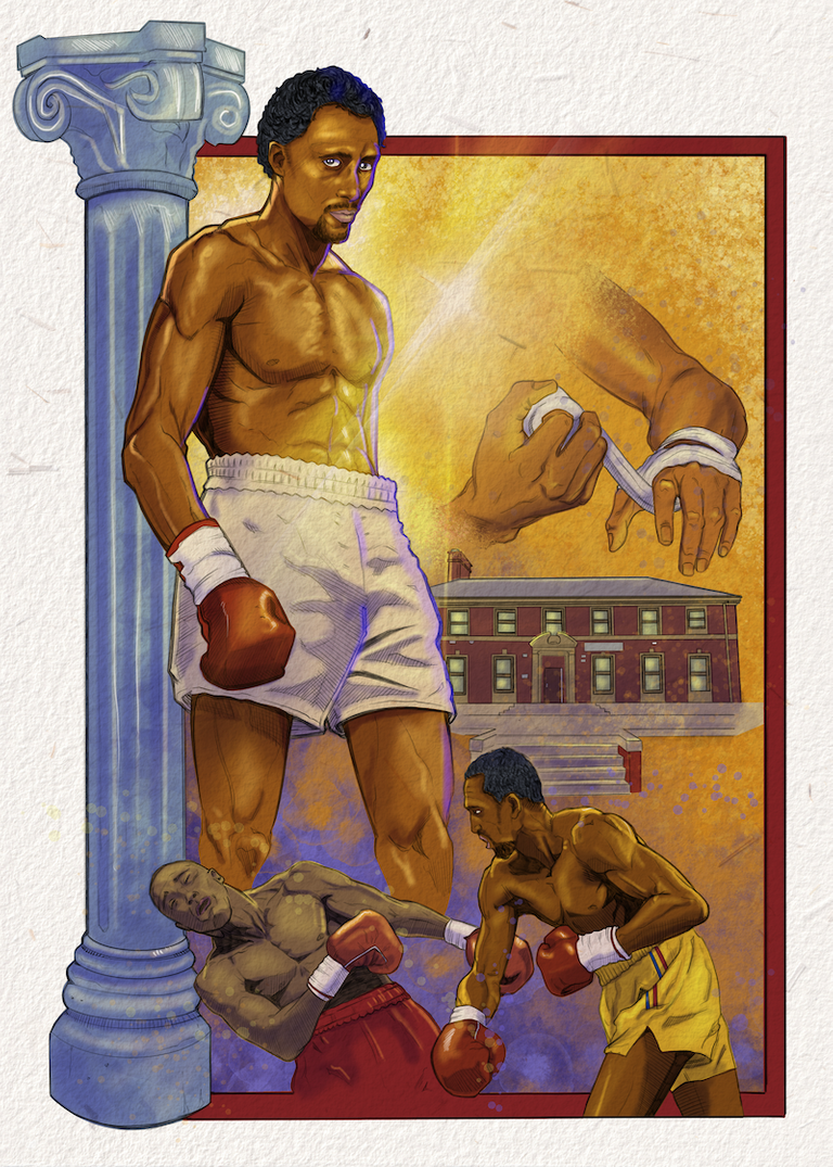
It all starts with the pencils. (Well, technically rough layouts come first… but you get the idea!) This is very familiar to me from comic artwork and the stage of production I’m most comfortable with. Tommy Hearns is known as the “Hitman,” but he also has another nickname; the “Motor City Cobra.” C’mon… with a nickname like that you just have to seize the opportunity to draw a badass snake right? So I did. In some areas these pencils actually aren’t incredibly tight and detailed. This particular image was the fourth that I worked on and by then I’d gotten a feel for what areas I was probably going to detail out entirely during the coloring stage and thus didn’t waste as much time on them during penciling.
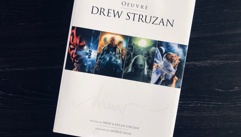
Unlike many comics which then move to an inking stage, I decided to render the pencil work more detailed than usual and go straight to color. The initial request had asked for images that were in the spirit of artist Drew Struzan. Even if you don’t recognize Struzan’s name, you’d almost certainly recognize his work. He’s responsible for a myriad of movie posters over a number of decades all done in his beautiful illustrative style. His work is synonymous with massive franchises like Star Wars and Indiana Jones. I was passingly familiar with Struzan’s work and looked up a bunch online, but being a lover of art books I also used the assignment as an excuse to pick up yet another and do some studying!
I decided to forego inking after looking more at Struzan’s work as his pieces are very textural and the pencil lines emulated that feeling better than my inking would.
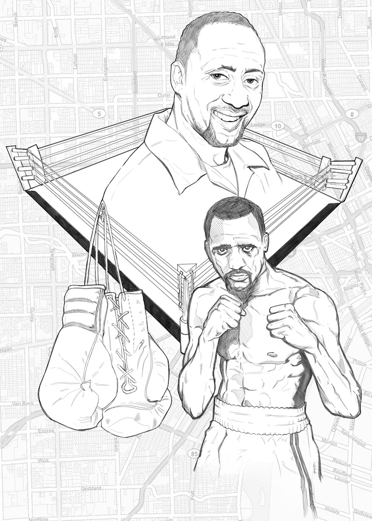
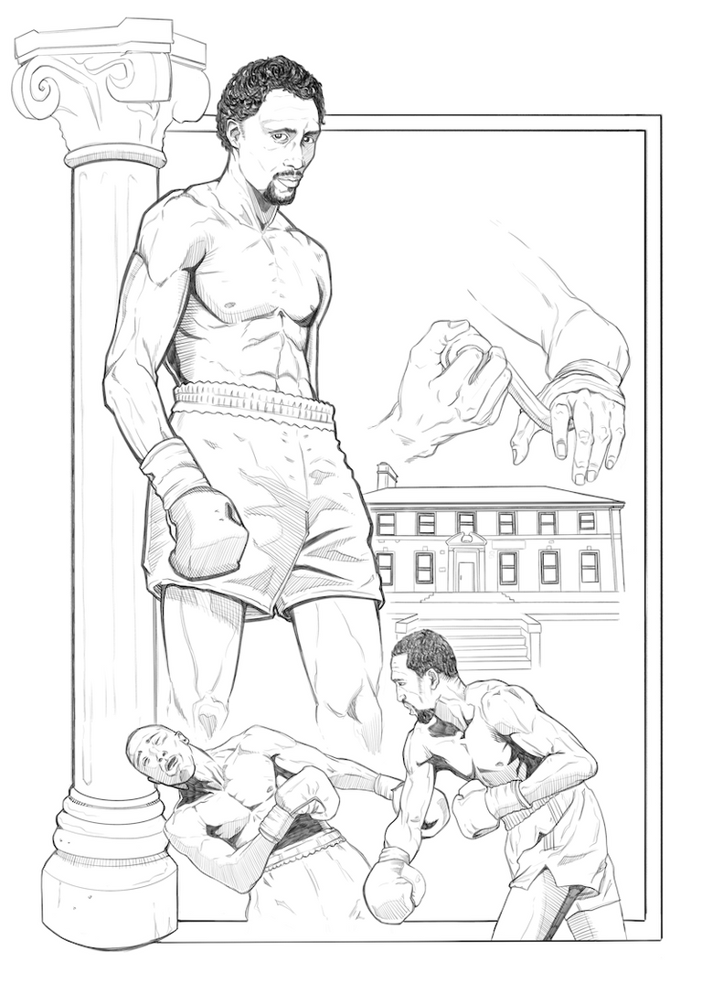
Below are a couple more examples of the pencilled work prior to color. The top one is probably the biggest direct nod toward one of Struzan’s montage style layouts as I was inspired by the poster for the movie “Angels in the Outfield,” of course substituting in a boxing ring for a baseball diamond!
When it came time to color, I first approached it in a very painterly fashion, again trying to emulate some of Struzan’s technique. However, my skill is not on that level and painting is a weaker area for me.
My first attempts were okay, but appeared rather washed out and muddy as I just wasn’t used to building up the values, colors and detail in a more traditional (albeit still digital) way.
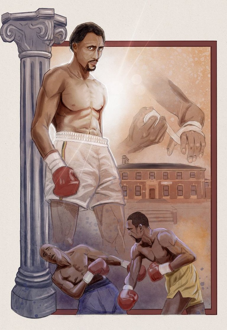
As I moved on to the second and third pieces I altered my coloring technique back to a comic book style workflow in which the entire piece is first filled with flat color and from there extra layers of both shadow and highlights are added. I’m much more used to working this way and it gave me a wider range of values and more saturated look that I liked better. While I wasn’t exactly using painterly techniques, I did my best to find and utilize brushes and textures that helped to mimic that effect with at least some success. Since the first piece now stood out from the grouping and looked very different, I circled back to it toward the end and re-rendered it into a style that was more cohesive with the rest of the set.
To top off the disarray of my learning and experimenting, in the midst of this project I also received a new piece of equipment in my studio, a brand new Cintiq drawing monitor, and I was eager to put it to use! Afterwards my workflow was split between the Cintiq at my desktop computer (all the while fiddling with new settings, configuration, and hotkeys), while also heading back to my iPad for color work as I already had a better handle on creating those more textural effects when using the Procreate application which is only available on iOS. But I digress! I think those details and discussion are best left for another post or two! (Hopefully sooner than later as my intent to share this “behind the scenes” look a couple days after my first post turned into 17 days! 17 can still be considered a couple, right?)
While you’re breathlessly awaiting my next post, you can always check out the Tommy Hearns Collection for yourself! Packs are still available for purchase!
See you soon, I gotta go do some more drawing experimenting!
-Bryan "the Imp" Imhoff
Follow me for more behind the scenes looks at the creation of "I Thought It Would Be Zombies..." Your votes help support its production! Also look for limited edition digital artwork for sale on NFTShowroom.com
Really cool! For some reason your posts don't come up in my friends feed. I wish they did. I'm pretty naive to the process, but when color is applied, about what % is manual and what % is auto-filled when you apply, if any?
There's often an initial stage known as "flatting" where flat colors are applied, not necessarily to even serve as the final base colors but just to separate out all the individual elements on the page so they can be easily selected and worked on in isolation later. That process largely involves tracing around the outlines and then just clicking to fill the area with a solid block of color. Beyond that it's rather manual, very much like traditional materials, especially now that pressure and tilt sensitive stylus technology is readily available. The big benefit is of course being able to undo, make color corrections, etc. but the actual brush strokes and application of color is quite akin to regular old painting!
Wow this is amazing stuff! I love the pictures you provided of the process, it blew my mind when I saw the colored version. I could only dream of having that type of skill.
Cintiq's are some insane pieces of work, if I was to buy a drawing tablet, it would be from that line.
Thanks so much! I had a Cintiq before that lasted about 7 years and broke down around the time I got my first iPad Pro. I've gotta admit the iPad Pro drawing experience beats out the Cintiq in almost every respect except for screen size! I'm sure I'll be moving back and forth between the two, but for certain things I work on that extra screen real estate on the Cintiq is very helpful. I pray someday Apple will make an iPad Pro Max or some such, with a massive screen!
I love the detail you put into these. I expect it all took a long time and that there were lots of sketches to play with ideas. The results are excellent.
!PIZZA !LUV
Thanks @steevc! Interestingly enough there was less sketching of ideas than normal. Since it was five pieces all in a bit of a montage style I did rough sketch each individual element, but then I simply started putting them together like collages! I cut & pasted, resized etc. until I had pleasing compositions but pretty much every initial element I had drawn found its way into one of the pieces with very little redrawing, just extra detailing. That’s a big benefit of the digital work vs. doing multiple compositional sketches for each illustration!
Digital tools must help a lot, but then it's something different to paper. It definitely seems to work for you.
It's always so interesting to read and see the process another artists uses. I'm far from a comic book artist, but my own things I also go through many processes from sketch (on paper or digital) of multiple layouts, to playing with colours and technique.
I'm determined to do nft this coming month so I really need to get my feet wet a bit more in that realm.
I love how the final piece, (last one shown) is also a study in primary colours, it really glows within the definition of the illustrative line. Well done all round :) It has been an odd year for so many things, that our art processes seem to be following suit.
I've done little with personally producing NFTs, but I definitely think Hive's very own NFT Showroom is a natural way for anyone on here to "get their feet wet." I need to do more learning & research of my own before considering placing any artwork on Ethereum or other alternatives. I'll be excited to see how your journey plays out!
this is really cool
PIZZA Holders sent $PIZZA tips in this post's comments:
@steevc(7/10) tipped @bryan-imhoff (x1)
Learn more at https://hive.pizza.
Congratulations @bryan-imhoff! You have completed the following achievement on the Hive blockchain and have been rewarded with new badge(s) :
Your next target is to reach 4750 replies.
You can view your badges on your board and compare yourself to others in the Ranking
If you no longer want to receive notifications, reply to this comment with the word
STOPYay! 🤗
Your content has been boosted with Ecency Points, by @bryan-imhoff.
Use Ecency daily to boost your growth on platform!
Support Ecency
Vote for Proposal
Delegate HP and earn more