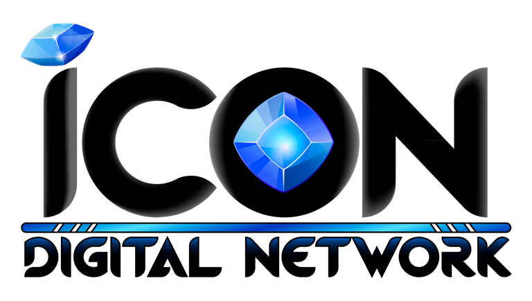
We're launching a huge new international crypto project within the advertising and marketing industry, and we invite our fellow Steemians to design the logo!
Are you a talented graphic artist? Enter our logo design contest for ICON DIGITAL NETWORK!
Rules of this contest:
*Winner will be chosen because we love the design and actually want to use it for our global venture ICON DIGITAL NETWORK. If we don't like any of the designs or can't use it for our project, no one wins. If we love what you've done, we may choose to work with you on future designs and projects.
Have fun, artists!
Details of ICON DIGITAL NETWORK tba 🤩
News, Announcements, & Upcoming Events:
Check out our new website: www.naturalhealthsupplements.shop for High Vibe Health!
THE GARDEN OF EDEN PROPERTY IN ARLINGTON, TEXAS IS NOW FOR SALE. We will be happy to negotiate offers in CRYPTO or USD!

The @truthproductions team:
@quinneaker

@everlove

@saramiller

@truelovelives

For inspiration, support, and service,
sign up to receive the Chronicles of Eden
delivered straight to your inbox once a week!
Contact Live Truth Productions
For more on who we are & what we're about, click here.
Go go go!
I hope this brings out some really juicy art!
💞💗💞
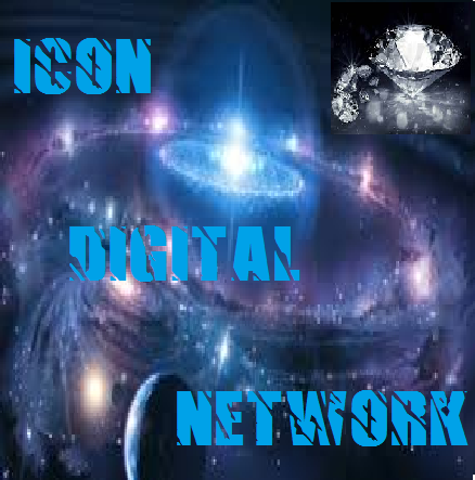
My logo entry No. 5:
https://busy.org/@everlove/my-logo-design-entry-no-5-icon-digital-network
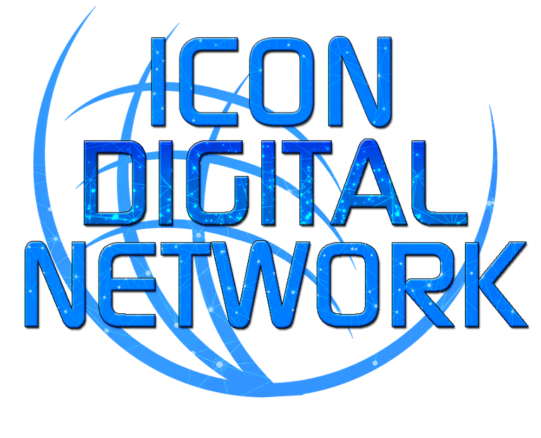
I made a design:
https://busy.org/@saramiller/icon-digital-network-logo-design-entry-1
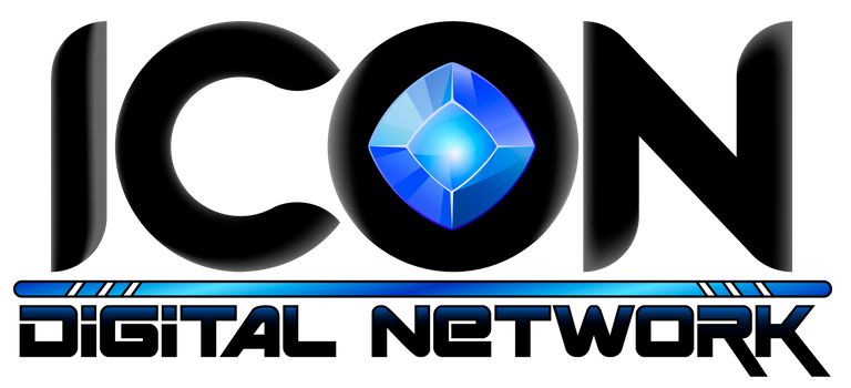
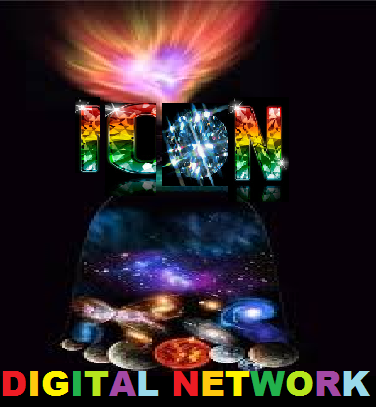
Still like this one a lot....Love the gem and the ICON font. Would like it brighter/shinnier would be awesome to have it be an animated one with sparkles!
Pretty cool, probably to long if you think how it will be used needs to be circular or at least square in dimensions.
I'm thinking just the diamond without the words for most purposes.
This is cool @saramiller. Kinda crown/chalice/diamond like....treasures fit for a king!
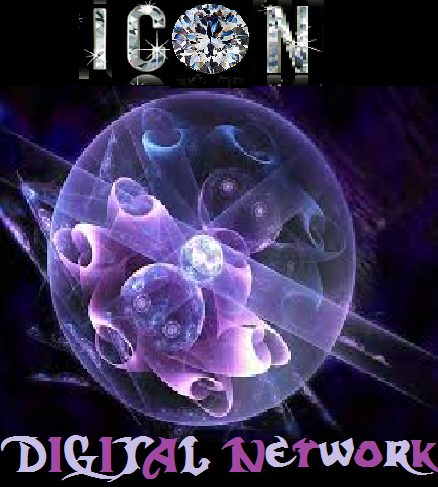
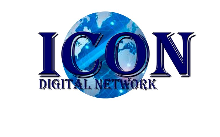
I made another:

https://busy.org/@saramiller/icon-digital-network-logo-design-entry-2
I like it
Cool
Combine this one with my gold one and see what comes! I love this!
@truthproductions Here is my entry!
Hope you like it
https://steemit.com/design/@silverdevil214/my-entry-for-icon-digital-network-logo-design
One of my favorite so far for sure....Maybe a little less "Aladdin" style logo?
There is

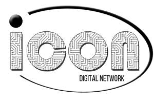
I love the gem inside the O.
Nice job!
Thanks! :)
Mmmm sure, I can change the typography in "Digital Network" and delete the second diamond in the "O". I guess that would be enough
Ooooo, I like this one! The colors are great, the variations in the wording give it great depth, yet it's simple. I like the diamond in the O better than for the dot of the i. Nice job @silverdevil214. One of my favs so far!
Great! Thanks
Nice! Digging the gem theme
there is my entry and my designs, hope you like. https://steemit.com/art/@zaxan/icon-digital-network-logo-design
Thanks for multiple variations! Love to see it on black AND white background. Very clean designs!
I like the top left one the best of these. Maybe a little bit more metallic gold and a little more bold in the ICON.
These are really great. So crisp and eye-catching. My favs are the first an the 4th. Thanks for such a fun entry @zaxan!
Hey, @truthproductions. Here is the first idea can be wordmark (monogram), logomark and also can be a combination mark logo.
They have been created with minimal designs based on
gridlinefor constructions logo. Here is also I put the trends to logo designs based onPushing metaphors to the extremewith a custom letterIDNwith network visual, also there is anExperimental techniquein typographyIDN, a logo can use only the monogram without the full textICON DIGITAL NETWORKAnd the logo is on Primary, Secondary and Icon logo. This is useful for being able to adjust the logo to a different place. For example, on the web using the primary, and in other places using secondary. and on the profile using the icon version.
Let me know what do you think. Regard.
WKWK MAN.Great! Bright colors, and love the IDN subtly worked into the design. Unique entry as no one else has though to do that yet. Also great to see so many mock ups of it!! Thank you for your entry!!
If you make a whole post about it, we will resteem your entry :)
Check out the post. The logo have been reconstructions :)
https://steemit.com/logo/@podanrj/my-logo-design-is-an-effort-to-participate-in-the-logo-design-contest-for-icon-digital-network
getting better & better !
Oh yeah!!!
I'm game to play!! https://steemit.com/art/@everlove/my-logo-design-entry-no-1-icon-digital-network
I like the colors and shape....The writing/letters aren't doing it for me though.
I'll work on that!
How about this version?
I made one.
Love the thumbprint & more inspiration!
Thanks for joining in @funkit! So glad you're bringing your creative spirit to the table.
And another one:
https://steemit.com/art/@funkit/logo-sketch-take-2
Hi there! Here's an entry. I put it on a green background so you could see the detail.
Hey @merej99 haven't seen you in a while, what a nice surprise!
I also like it, simple but unique, uniform....Do not like the green though....
Hi @quinneaker. I'm really glad to be back on the platform. :D
Logo challenges are super fun. I was basically thinking about something I might wear on a t-shirt.
The green background can easily be changed out to be any color. Since "Digital Network" is in white text, I knew it would be washed out if I posted the transparent background.
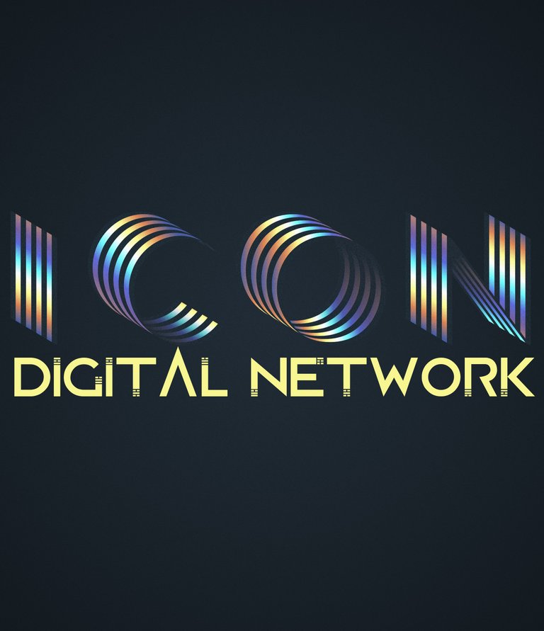
Here are a couple of examples with minor changes to it:
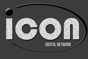
black text
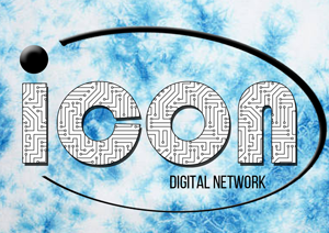
black text - blue tie dye
white text - gray background
Great to have you back!
Ya I get your point...can basically take that logo and put it on any background. I like the blue the best so far but would like to see something a bit stranger with POP as this is a digital advertising network which is all about the IMAGE of attention and PIZAZ!
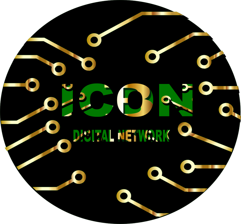
Very creative! Love that you filled in ICON with a circuit board pattern. Thanks for your entry!
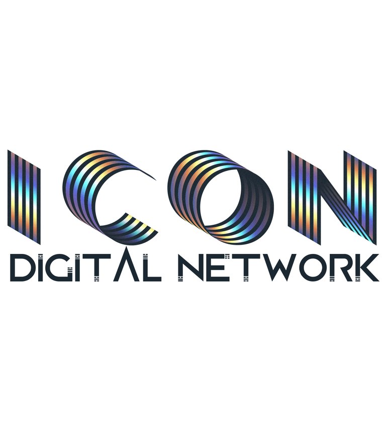
Yay @merej99. You answered the call. So glad to have your creativity up in the mix! I love the varied width swoop around the words, ending (or beginning) with the dot of the i. Nice texture on the letters too. Simple. The green isn't my favorite, but the design I like A LOT!
Yea!
and one
I love this one---so simple and catchy---just as intended! <3
My entry
https://steemit.com/steempress/@suheri/myentrylogodesigncontesticondigitalnetworkfortruthproductions-fzsw7uxn94
Its interesting, but to confusing, want something STRONG and clear, Iconic
Do I have to make others also not to look confused
You can do whatever you want
I like the connectedness of this image, and like it most on the more simple background, especially the black. The bottom background is fun as a piece of art, but pretty busy for quickly grabbing someone's attention. Thanks for the entry. So glad you're inspired to share.
thanks too for you ... do I have to make others also not to look confusing
Make as many as you want!
Sweet, like the variety of backgrounds that give it a different feel and the "connected" feel of it.
Thank very much
Mi propuesta de Logotipo
Mi enlace: https://steemit.com/icon/@tormenta/concurso-de-diseno-de-logotipo-con-recompensa-de-steem-llamando-a-todos-los-artistas-graficos
Thanks for entering your design! It looks very stately and official.
Definitely official looking. Get's the message across very quickly!
Here's my No. 3
Greetings this is my participation in the contest
https://steemit.com/art/@cetb2008/icon-digital-network-logo
I especially like the circular feel of things coming together to connect in your image. The O feels a bit distorted by the chunky pattern in the letter, and part of network feels a bit lost because of the black that is the background in the letters as well. I do like the way the gold bits are varied in shade, giving lots of texture, and the way they intrude on into the letters. Thanks for participating @cetb2008. I like where you are going with this.
Thank you
Here's my entry No. 2
This is the NASA logo, which we obviously won't use.
Here is my entry, hope you like it.
With a background
Hi! This is my entry:


Full post:
https://steemit.com/art/@imjosean/my-entry-for-the-logo-design-contest-icon-digital-network
Entry No. 4
https://steemit.com/art/@everlove/my-logo-design-entry-no-4-icon-digital-network
Hi this is my entry for contest
https://steemit.com/art/@eduardo.waldo/my-entry-for-icon-digital-network-logo-design-by-waldo
Proposal 1
Proposal 2
No. 6
https://steemit.com/contest/@truthproductions/icon-digital-network-logo-design-contest-deadline-last-chance-to-enter-for-your-chance-to-win-steem
You got a 26.40% upvote from @upmewhale courtesy of @saramiller!
Earn 100% earning payout by delegating SP to @upmewhale. Visit http://www.upmewhale.com for details!
That's good, thanks for the initiative, I'm going to participate
That's good, thanks for the
Initiative, I'm going
To participate
- cetb2008
I'm a bot. I detect haiku.
this is my entry to the contest
https://steemit.com/art/@lisbethseijas/icon-digital-network-logo
https://steemit.com/contest/@yusaymon/logo-design-contest-truthproductions-my-logo-entry-1
greetings!
Check my entry https://steemit.com/esteem/@yanyankaryana/my-entry-logo-design-contest-icon-digital-network-for-truthproductions-344bb51af9abb
PROPUESTA 2.
https://steemit.com/icon/@tormenta/ingrese-al-concurso-de-diseno-de-logotipo-para-icon-digital-network-para-ganar-steem

please check my update entry
https://steemit.com/esteem/@yanyankaryana/my-entry-logo-design-contest-icon-digital-network-for-truthproductions-344bb51af9abb
Nice
https://steemit.com/art/@visabella/my-logo-design-entry-no-1-icon-digital-network
Here are some simple designs, I hope you like it
Hi sir, check second my entry
https://steemit.com/truthproductions/@yanyankaryana/my-entry-logo-design-contest-icon-digital-network-for-truthproductions-2-8b583d66f6198
My entry nº1 Greetings @everlove, @truthproductions and organizer!

https://steemit.com/art/@mariabarreto/logo-desing-contest-icon-digital-network
My post #1 Regards and thanks @truthproductions For each art they choose I hope you like it..!
https://steemit.com/art/@airam05/logo-desing-contest-icon-digital-network
My post #2
https://steemit.com/art/@airam05/3z3cx5-logo-desing-contest-icon-digital-network
My Entry Nº2 Greetings @truthproductions and organizer!
https://steemit.com/art/@mariabarreto/27t4th-logo-desing-contest-icon-digital-network
Here is my Entry
https://steemit.com/art/@losthippie/logo-design-contest
Otras propuestas.
https://steemit.com/icon/@tormenta/4uyn4d-concurso-de-diseno-de-logotipo-con-recompensa-de-steem-llamando-a-todos-los-artistas-graficos
Please check my entry
https://steemit.com/truthproductions/@yanyankaryana/my-entry-logo-design-contest-icon-digital-network-for-truthproductions-2-8b583d66f6198

Hope you like it guys.
https://steemit.com/contest/@pepumu/icon-logo-contest-entry
Here is my take:
IDN initials are in the logo, the squares/rectangles represent the Billboards, n lines form, "the Network".. hope you like it.
I made a new post on my 3 designs, this is one of them:
My Entry 02
https://steemit.com/steempress/@suheri/myentry02logodesigncontesticondigitalnetworkfortruthproductions-xqtjpd4csy