As you’ve probably noticed, things are looking quite different on steemit.com. We’ve been working on these changes for some time, and we worked hard to have them polished and deployed in honor of SteemFest.
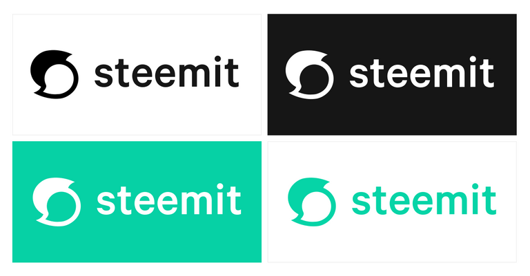
The new logo and design changes serve multiple functions. The primary motivation is to improve the user interface and user experience of steemit.com. The other important function is to clarify the distinction between Steem and Steemit.
The Steem blockchain supports a whole ecosystem of applications, most of which have been created by independent developers in our community. The Steemit company and Steemit website are a part of this ecosystem, but they are not the entire ecosystem.
The new Steemit logo
Everybody has a story to tell. Maybe it’s a tragic love story. Maybe it’s a world changing idea. Probably, it’s a meme post. No matter what, your voice is worth something.
Steemit gives people a powerful voice. We help them tell and spread their stories by providing an economic system with incentives that reward valuable contributions. Our new logo is a nod to the community, the conversations, and the powerful voices we aim to amplify.
The Steemit brand and logo are protected by intellectual property laws, including copyright and other proprietary rights of the United States and foreign countries. This is to allow Steemit to protect the brand and logo in ways that extend user safety. One may not make unauthorized commercial use of, reproduce, prepare derivative works, distribute copies, perform, or publicly display the Steemit logo or brand, except as permitted by the doctrine of fair use or as authorized in writing by us.
The Steem logo
The Steem logo remains unchanged, and will continue to be the logo for the Steem blockchain and STEEM currency.
The Steem logo is licensed under Creative Commons CC0, meaning you’re free to copy, modify, or distribute (even for commercial purposes) without needing to ask permission or give attribution.
![]()
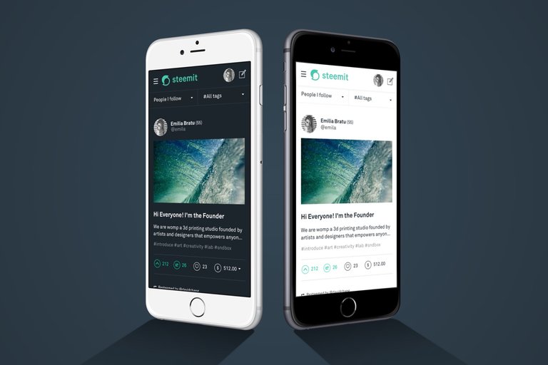
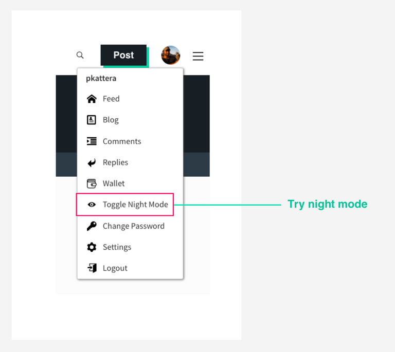
The new night mode
Today, we're also excited to introduce a new dark theme. It's been one of the most requested features and you can access it within the profile menu while logged in.
For now, the darker theme has been applied to a few of the major pages. We'll be applying this theme throughout the site in the coming weeks.
Stay tuned for more updates.
Steem on,
All the TEAM at Steemit
Love it!
Looks like quotation marks 69ing each other
But seriously it's pretty cool :)
Looks to me like a stingray turning around. 😕
The logo itself is ok, but the green color is too ugly. The green shadow behind the button and the window makes the page more ugly.
I can bear the green logo, green upvote, green shadow. What make me crazy is the color of the links is also bright green. When an article has many links, a whole area is bright green and very uncomfortable for the eyes.
Because of this, I am considering to use other UI, for example Busy.org, or steemkr.com
The advantage of Steem blockchain is that you can use any interface you want. You could even build your own interface.
Yes, we can use any interface. The issue is that I don't know whether I can trust the 3rd party products or not. For me, it's ok to use posting key, but I don't want to use the owner key for security concern. I tried to use posting key to login busy.org, but failed.
Once I reveal the fact that a reputation 69 spammer, a former steemcleaners member, adm of steemit.chat, spammed Steemit with a comment bot. The spammer, whose id is firepower, threatened me publicly on the block chain. He also banned my account at steemit.chat. We never know who is behind the 3rd party websites. That's another reason I cannot trust the 3rd party.
Yes, I am considering to build my own interface.
For all you Minnows that cant find the logo for your creating new posts and t-shirts, here it is. I created vector versions for you all. :)
Download the new Steemit Logo here and put it on T-Shirts, and share it with your friends. Thanks for supporting Steemit and for supporting your fellow Minnows!
https://steemit.com/steemit/@lifeinspired/download-steemit-s-latest-2018-logo-minnow-support-network-1
It looks like a ghost, Nintendo Boo style, with a trojan helmet on, traveling from left to right, lol.
Yes!! I couldn't put my finger on it.. but that's it! (kinda looks like Kirby, a little bit too now that I think of it...) Oh, and maybe he's in the Water Level too lol
Nailed it
Ha ha, thats pretty funny! lol
Best comparison for the logo I've seen!
yeaa. waiting for much memes about new logo.
I was thinking more like pleasingly plump Ying Yang figures...
please, get your mind out of the gutter!
=)
It is an awesome new symbol for our Steemit family. :)
Now that's the spirit! ;)
Love you millions more Steemit, especially with dark background!
schönes Logo
You crack me up @trafalgar 😂
My first thought was a Cuisinart blade turning fiat money into a puree, but now that you mention the 69, I can see it too. Night mode is really nice!
hahahaha
nice comment.
thats great!!!!
That is it exactly @donkeypong
teehee
:D
Epic way of using Cuisinart blade...Nice Work..
I like it! ha ha, the Boo with a Trojan hat is funny too!
Lol did you just make the logo dirty
:P
no, they did =)
Lol ..
why?
Lolz I was thinking the same; however now I think it's a dude with a rad 80s quiff :-). I think I like it as well; though it has nullified the usefulness of a million T-shirts in one fell swoop. :-)
Cg
Those t-shirts will be collectibles.
Aha @bbrewer, I see you're a make lemonade type person; good spot! :-)
Cg
haha ya I was thinking that too!
it's really fucked the ppl with all those posters and T shirts
ah well
Its unfair.... Lol the other versions was a bit faster.... And besides it kils the spirit of alot guys out there trying to help the platform... Because it now difficult to print T-shirt and banners.
Yeah I'm wondering about that; do people have to ask permission for every single promo? I'm sure not, but it will leave lots of people guessing.
Cg
Yes
you are right.
Lolz; I suppose they could cover up the 'i and t' of Steemit, seeing as it is still the Steem logo :-)
Cg
Lol
Looks like a hurricane. Not sure if that's good or bad.
Logo is cool. But that green is simply unreadable to say the very least. It's good for a night theme. I wish they get back to blue usernames and links... as this color yuck....
you are right, but i think this logo is also better in day. this is cool logo.
Totally agree. I can't stand the new coloring and the logo is just blah.
ROFLMAO! Loving night mode! :-D
I'm digging the night mode as well. I actually like the teal color as well. The logo is just ok though.
LOL'd
It certainly is quotation marks, steemit is about writing and commenting, I don't see any yin yang here
LOL
Take participate on donation for education for the poor student who can't afford the tuition fee.
Your small help will make other's future.
so make donation please at below link
https://www.youcaring.com/student-995545
And please share this link to your friend and family please!!!
Really liking this updated look.
Ha ha ha .... that is very true.
yep. love it too. It's beauty for me.
nice
for me it looks like Yin and Yang symbol, well I like it too even the color, lol
LOL
Definitely some 69 subliminal messaging going on... also looks like a chat bubble which makes sense. And I really like the color/font!
congratulations Steemit, a wonderful logo
Yes I like it alot @rafalgar, as indeed it does in oine simple visual form translate the very idea and purpose of social media, the meeting of two minds,ideas and thought ! Very nice feminine form with clear relationship to Ying and Yang and balance in consensus! Bravo Steemit.Inc ! I plan to make a post on this myself as I think our branding is important and this is a good thing to differentiate the coin Steem and the Social Media Website that helps to distribute it !!
Where are these mobile apps?
U show them without announcing launch date?
7.5$ good pay for comment. I wanna it too.
Create something unique that others want to see. That could work.
new logo is cool! What about color? I like blue.
I agree. eSteem sucks. We need something better.
the classic will always be dear to my heart, but I love the new look as well. nice colors and the drop highluights are a nice touch too. :)
thank you for your efforts
hi dengised. nice work taking you to create post. well done.
I like the new changes. What is required to get permission to make artistic variations of the steemit logo?
I hope we're at least allowed to copy it for posts!
In case it is currently a hang-up in creating those artworks, we are going to get more specific with the carve outs around "non-commericial" and posts earning STEEM here for the sake of the community soon. In the meantime, if the use is non-commercial and "fair use" (https://en.wikipedia.org/wiki/Fair_use), then it is totally OK!
-n
What are the requirements to use the new logo for merchandising products like logo-print on T-Shirts etc.
If anyone has questions like this they can feel free to contact me on steemit.chat or email me at [email protected].
Community Liaison, Steemit
I am emailing you now. Thanks.
I absolutely love the night mode. I was very surprised that it was added but it shows Team Steemit is listening to our requests. (I commented asking for a dark mode on a recent update, looks like a bunch of others did as well!) However, when navigating to a specific comment link on a post, where it is supposed to be highlighted, it currently looks like this: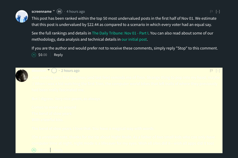
As you can see, the comment is totally invisible due to the highlighting colors chosen, so maybe change the text of a highlighted comment to black, or else change the color of the background highlight? Just wanted to bring that to attention. Thanks so much for all your hard work!
Myself and @steemitqa run http://steem.shop
We feature merchandise designed by artists on steemit.
How can we go about seeking permission to use the new logo in artwork?
We wouldn't be looking to create anything with just the logo by itself, but incorporated into fully unique artwork.
Any assistance is greatly appreciated.
My first reaction for new logo was: "ok, logo is not bad, but color is...well, I will need to get used to it..."
and then, I found "Toogle Night Mode" button, and I fell in love in it! (♥‿♥)
Great job!
PS.
So, having new logo of Steemit, could you finally set an avatar to @steemitblog? :D :)
Yeah. I always get queasy with green-on-white. Two colors that don't mix so well.
Not having beta is the bigger news if true.
How do you like the new logo?
@stellebelle made this via Giphy.
i like it so much. nice gif
Thanks to the
welcome
Nope, the beta is still there on the website ;)
I was wondering why beta would be removed without a big annou
what exactly is it !? Does anybody know !?
I think it is collection of two thoughtboxes, one empty and one filled. Is is an S in shape which stands for Steemit and the thought symbols stand for
Hum mm !? Sounds good !! I like it indeed , and the best explanation I have heard yet ! Thanks a bunch !!👍👍👍💚💚💚
That's your choice.
There's also http://stage.steemiz.io/
My reaction was the opposite. I like the color, but not so engaged by the logo.
Hell yeah, night mode is hot
Same here. The night mode got me.
yes please!!!!!
I was thinking the same, maybe they are too busy to change it. 😅
It's Halloween, it's a ghost!
Awesome and lovely logo
your profile pic is great , cute new style ! haha
well explained about new logo.
why devote my this comment.
Great job votup me please friends
and the night mode is well designed too! nice work !
I don't see 'beta' anywhere.
That is what I was wondering!
I still see it:
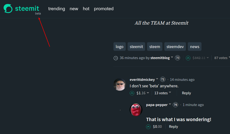
Okay, I wasn't on my end. Thanks @noisy.
how can you see it.
what is beta
Beta software refers to computer software that is undergoing testing and has not yet been officially released. The beta phase follows the alpha phase, but precedes the final version. Some beta software is only made available to a select number of users, while other beta programs are released to the general public.
It appears on my screen right beneath the "it" of steemit.
O Really ?
Cool logo!
Thanks for the new logo GOLOS!
I love the new logo! But I am not too big a fan of being tied to this green color scheme to be honest... I would love if it the color could be customized, or perhaps have several options available. The mint-green color looks great on the logo, but I feel it's sharp on the eyes on the rest of the site.
Another thing, from a graphics design perspective, the new logo isnice and curvy, but for the rest of the site there seems to be a really sharp, blocky design. I personally think it would look nicer if the rounded curves from the logo were integrated in the site layout.
Other than that, the handling of the site feels really great now!
Yea now colour toggling would definitely be amazing. What's with the ability to quote ppl? How do I do that. :D
Quote people
Use this operator >
I agree with your suggestion.
It would look more uniform to have 'Post' rounded, definitely.
Also, a rounded ring around the search area would make the top look uniform.
Further, a very thin cyan ring around the avatar would add to that uniform look.
The font also needs some modernizing. It is way too heavy. Specially on the dark theme.
Perhaps steemit should implement 'flavours' so that everyone can have their own look while keeping to the new look. Suddenly steemit is looking fresh and new.. a step in the right direction to appeal as an alternative to the standard.
Don't stop now though dev team. Innovation = admiration = adaptation.
I totally agree. Especially I dislike the old-style button-design with the shadow. This was done way back 30 years ago.
greate comment with great information about new logo.
I honestly think it's terrible. Those new colors make me sick 🤢 Switch back to the blue theme!
That green bar on the right is very annoying.
I agree, they should get rid of it. It's too much imo
I agree, first I thought 'hospital', then I thought of all those who made things with the old logo. I think they should concentrate on making the site work properly before messing with style sheets
I hate the new logo it looks like a hurricane symbol the weather channel uses. The green color is obnoxious. Why not work on the UI and add features, like tabs or something to make access to followers more streamlined. Auto markdown mode. Geez!
I agree with you
Love it and I had no idea that the Steem logo was free to use - that is very cool!
Nice xD
Here is little twin Golos
Kinda look like a trump haircut 😂
OMG, cannot unsee.
Exaactly!
hehe
Lolz; you mean a trump wig cut! :-D
Cg
like a Spartan! :D :)
Lol
nice image. i try golos but i didn't understand this language?
Haha :) fun!

Ha ha ha, maybe! Trump hair! 😂
I like the new logo and cool new features added like toggle night mode, it is really a good addition.
Looking forward to steeemit's own official app now
@steemitblog
😎
Don't you agree on the app idea?
I think this very clear visual distinction between steemit and steem will be incredibly helpful. I know many new users had a difficult time separating the two. It doesn't seem like much, but I can tell you from experience that this change will make a big difference.
I also like the sound of this "extend user safety".
I can't say that this interface is impressive however, kudos! to steemit for making that distinction and making it clear that steemit is not steem
Moving forward, i think this is positive development for steemit and it's team. and i'm hoping we can finally say goodbye to this beta version sooner!
Greatest idea the night mode. Won´t go blind anymore
That's my favorite feature... now I can actually use this at night :)
yeah I love that!
Night mode is my 24/7 mode, I love it in any light situation! Have not tried it on a sunny stainless steel café table top outside, but so far it is perfect everywhere.
Old one is always good and then new logo is technically perfect one.
nice You're doing a good work guys , keep it up.
Definitely love the new modern look. I always thought the old logo sort of looked like Java's logo.
Please tell us why you've made this decision
Thanks! replied with a small edit** below that sentence.
Because Steemit is a corporation. They're incorporated, it's the way of the road, the way she goes! It's a business.
It's just a logo. They made the logo and it's them being like "this is MINE, this is US, this is OUR logo, this is OUR property!" Standard copyright stuff. No big deal at all.
It's just a big fat S. Nothing to get worked up over.
It looks very hungry though. What does it eat?
They just did.
Loving the new design work Steemit Team! Also thanks for the shoutout ;)
what is this? is it steemit?
Woooottt! Love it guys! Can't wait for the next updates. Its like a christmas before christmas! 😃
LOL, yes :D
I'm also glad that the STEEM Cryptocurrency/Blockchain logo is not the same as Steemit's anymore; that probably confused a lot of users.
Smooth!
Worst font choice I've seen in a logo in a long time! The mark is good/not bad. The font though - WTF.
Loving the night-mode. Easy on the eyes!
Thanks for the options!
Night mode looks cool! Maybe it should be the default setting?
very exciting news @steemitblog. Please when IOS app will be updated?
I like the new color scheme and night mode! Didnt like the facebook blues that much...
Night node was needed for us night owls heheh
Absolutely! I work too often in bed, while @mama-pepper is trying to sleep. She likes it already!
So, what is the shade of green used for the new logo. The closest I could find for the logo was "persian green" The long bar to the left looks like "mint green"
Can someone post the Color Coordinates ?
Omg, I have to say I really love the night mode, which is something I want for a long time. Thanks!
New logo looks like a pigeon with a helmet
This is great! How did that logo come about? I see an "S" and a cartoon dialogue balloon. Is that what i am seeing? Very cool!
oh yeah! That new logo is hot... good job
It's looking great, find the night mode playing around what a nice looking feature.
Looking forward to more updates.
Love the new UI and the new logo. It definitely helps clarify any confusion about STEEM vs Steemit. Also, the new UI is really responsive. Great work. And I'm loving night mode. Thank you!
I made my original comment before I checked out night mode. I normally don't care too much about the aesthetics, but this actually looks really cool.
It looks like it was a great time for me to join the Steem!
I wish I had joined a couple weeks or month earlier when my friend started telling me about it, but that's okay. There is no time like the present!
Who knows, maybe next year my earnings from Steemit can pay for my trip to SteemFest 3! If not, that's okay...I'll host a local meetup instead.
Hope there are more updates and improvements rolling out over the next 5 days! Keep us posted!
Thx
I like the new logo with vibrant green color. what are the color code and specific name of the color?
Also.
Does this mean we can't reproduce it say to make a Tshirt, personal brand or sourvenir and stuff?
Can you use Nike or Reebok logos to make t-shirts showing their logo? It would be considered counterfeiting a known brand protected by intellectual property right.
Understand. One more concern, as this was put to place, all the tshirts that promote some hashtag in Steemit maybe #teamCountryX , followed by Steemit new logo-- by the means of creating awareness (like it been produce a lot lately) can't be done now? Am I right?
IF ANY t-shirt says the word "steemit"
AND/OR
Has the new green logo on it
It is in violation of their intellectual property right to their brand.
--
If any t-shirt being sold or given out has the OLD steemit logo, (but still steemit name), it will also be in violation. It's not just the logo (but the steemit name itself)
If you used "STEEM" (and not STEEMIT) then you're okay.
If you make 2 cents on this post where you have used the Word "STEEM(it)" you are also in violation - commercial gain from using their name.
You can use the word Steemit in discussions.. that's fair use.
You can feel free to use the Steem logo instead. The purpose of this policy is to enable us to protect the brand and the community from malicious actors like people who are seeking to defraud others through phishing schemes (as just one example). We have no plans to file suit against innocent users, however, if we find that use of our brand could be confusing to people we may ask you to remove it. But we must always retain the right to file suit because if we do not we lose that right. The important point is that this policy is not a money-making scheme and we do not intend to use it as such. It is an important way to protect the site and the community members.
Community Liaison, Steemit
Thank you @andrarchy for the explanation.
and also, if your post has pay... then you may not use it there
▀
esta la leya
▀
no tengo
Good question! This seems bad for promoting the platform. It's better that people spread the logo around.
"fair use" means they get to use it first, and the best... once it's common sight it's fair use, but maybe I'm wrong, I'm not a lawyer.
common sight?
who knows. fair use is so vague.... intentionally. that was just my interpretation of how I can understand... otherwise, I don't comprehend legal talk, i tried a little.
Put it this way, there is tons of "fair use" litigation that has gone through courts and probably we'll continue to see a lot more of that...
If you're not a trained journalist, I'd stay away from fair use when possible, it is just easier. :)
:bow:
I was needing a simplified answer, so thank you for making it more clear. I've been trying to understand "fair use" and came to the conclusion exactly what you said... trained journalist or not... best to avoid fair use for commercial works....
which (almost) everything published on steemit is commercial
Fair use means you can talk about Kleenex® when referring to a box of facial tissue. You can say Kleenex®, you can write Kleenex®, you can write about Kleenex® you can make a painting of a box of Kleenex®.
However, you cannot put their logo on anything else. You cannot make T-shirts with Kleenex brand. You cannot make prints of the painting (above) and sell them.
Basically, you may not use their logo in anything mass produced. Fair use means that you can use it once, in almost any way. If you couldn't, then it would be like preventing you from saying "Kleenex®" But, using it for anything other than talking about it, especially anything where you will make money from it, is a breach of copy-right.
Since this is a community work, It is best to get this clarify the soonest.
I agree
I'm thoroughly into it! Nice touch.
Night mode is GUCCI!
Just saw that night mode too! @mama-pepper is happy about that!
nice name papa-pepper.
So much slicker
The new logo is really cool! And I already started using Night mode, I'm tellingy you these are such a cool features